

The Power of Color
Your office walls are more than just a backdrop; they're a powerful tool in shaping the identity and atmosphere of your professional environment. Choosing
the right paint colors can significantly influence employee morale, productivity, and client perception. In 2026, a thoughtful selection of hues can elevate your workspace beyond the ordinary, imbuing it with a distinct character and purpose. From calming blues that encourage creativity to warm browns that promote focus, each shade carries a psychological weight. Understanding these effects is key to creating a space that not only looks good but also functions optimally, fostering a positive and efficient work culture. This guide delves into the most influential color choices and combinations to consider for your office renovation or refresh, ensuring your workspace makes a lasting impression.
Classic Neutrals & Sophistication
White, in its myriad forms like eggshell, off-white, and ivory, remains a perennial favorite for office spaces, conveying a sense of cleanliness, purpose, and professionalism. These versatile shades work well across all areas, from individual workstations to communal lounges. Grey offers a more sophisticated and elegant ambiance, with variations ranging from deep muted tones to sharp steel. Pairing grey walls with wooden furniture and ambient lighting can add depth and warmth, creating a polished look. Beige, a softer iteration of brown, cultivates a welcoming and cozy environment, striking a perfect balance between professional seriousness and gentle approachability. It's an excellent choice for creating an inviting atmosphere for both employees and visitors, subtly reflecting a balanced approach within the workspace.
Bold Hues for Impact
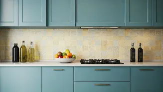
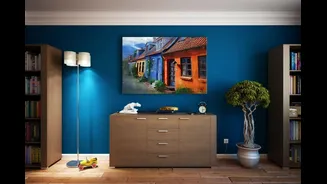
For those seeking to inject personality and energy, certain bolder colors can be incredibly effective when used strategically. Dark blues, such as navy or Prussian blue, exude a strong business-like aura, making them ideal for corporate settings. They pair beautifully with white accents and wooden furnishings. Brown shades, particularly chocolate brown, bring an earthy, homely charm, suitable for both business and home offices, fostering a cozy feel. Purple, in softer shades like lilac or mauve, can add a touch of grace and beauty, offering a delicate contrast when paired with sleek furniture. Even red, often underestimated, can bring glamour to an office when used on an accent wall, especially when complemented by white and intricate decor, revitalizing the daily routine.
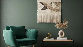
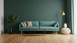
Calming & Creative Palettes
Green is a standout choice for its inherent calming and soothing properties, ideal for creating an eco-friendly and tranquil workspace. Whether opting for emerald or leafy green, the various shades can be adapted to your comfort level. This color promotes an environment conducive to focus and well-being, especially when paired with natural elements like plants and exposed wood. Light blue offers a relaxed and breezy feel, perfect for fostering an efficient and casual work environment, and it harmonizes well with various furniture styles and natural decor. Yellow is another excellent option for injecting brightness and cheerfulness, effectively illuminating spaces with limited natural light and creating a vibrant, energetic atmosphere.
Unique & Inspiring Choices
Orange and black present a dynamic combination, striking a balance between fun and professionalism, making them excellent for start-ups and energetic home offices. Teal is a timeless choice that signifies a curt and professional environment, conveying the seriousness of the business. For a more rustic and natural feel, a brick-colored accent wall can add significant character, especially when contrasted with white or cream walls and complemented by open wooden shelving. Gold and silver tones offer a regal and lavish aura, best used on main walls with minimalist decor and soft pastel-toned accent walls to maintain an elegant feel. Fuchsia, when used as an accent on a select wall, can transform a regular office into an elevated space, but should be used sparingly to avoid overwhelming the senses.
Vastu-Approved Colors
For those who adhere to Vastu Shastra principles, specific colors are recommended to promote harmony and positive energy in the workplace. Green is highly regarded for its association with creativity and innovation, also helping to reduce eye strain. White is seen as a symbol of purity, bringing cleanness and openness to the office. Yellow is believed to be a 'money magnet,' attracting prosperity and joy, making it a beneficial choice for financial well-being. Blue enhances communication and is excellent for brainstorming environments. Orange is recommended for its warmth and ability to bring nourishment and energy to the workspace, fostering a lively atmosphere.
Colors to Approach with Caution
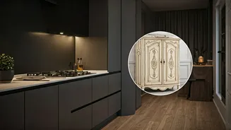
While many colors can enhance a workspace, some require careful consideration to avoid negative impacts on productivity and mood. Excessive use of red, despite its potential to energize, can lead to over-stimulation and irritability. Similarly, too much grey can create an unmotivating, sterile, and suppressive atmosphere. Bright greens, like lime, can be too loud and hinder concentration, though hints can foster creativity. Bright pink, while perhaps suitable for personal spaces, can be distracting and unsettling in a professional setting, lacking the sincerity needed for focused work. Dark hues like black and deep browns, while sophisticated, can dampen energy and kill an inspiring, creative aura, making them less ideal for high-energy workspaces.
The Impact of Lighting
It's crucial to remember that paint colors do not exist in isolation; their appearance is significantly altered by lighting conditions. Natural sunlight tends to make colors appear brighter and truer, while warm artificial lights can cast a softer, slightly yellow hue. Conversely, cool white lights can make colors appear sharper and sometimes lighter. Poor lighting, regardless of the paint choice, can render even vibrant colors dull and unappealing. Therefore, always test paint samples in your specific office environment at different times of the day and under various lighting scenarios—morning, afternoon, evening, and under artificial light—to ensure the color translates as intended and avoids the need for costly repainting.
Dynamic Color Combinations
Moving beyond single colors, strategic combinations can create a more dynamic and engaging workspace. Chrome Yellow paired with a warm White offers vibrant vitality, perfect for creative industries like media and art, making spaces feel larger and more spacious. A sophisticated blend of Ice Blue and Charcoal Grey, accented with white borders and warm lights, provides a tried-and-tested match for larger offices, maintaining visual uniformity. The underrated combination of Vanilla Coffee and dark Brown strikes an ideal balance between professionalism and warmth, boosting work drive and energy, especially when enhanced with indoor plants and wall art for a spectacular finish.