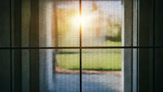


The Deceptive White Trap
While a pristine white exterior often evokes timeless elegance, this shade can be a magnet for every speck of dust and pollution. Weather elements and urban
grime can quickly transform a bright white facade into a dingy, yellowish, or grayish mess. Instead of stark white, consider opting for softer, warmer off-white tones or creamy shades. These alternatives offer a similar brightness without the high maintenance and tendency to highlight every imperfection, providing a more forgiving and consistently clean appearance against the backdrop of natural light and varying weather conditions.
Grey's Tricky Nuances
Light grey has long been a popular neutral choice for home exteriors, but it can be surprisingly unforgiving. This color is prone to accentuating streaks left by rainwater and can easily pick up the gray tones from pollution. If grey is your desired aesthetic, it's crucial to pair it strategically with complementary window trim colors. For a more robust and visually appealing grey, look for shades that incorporate beige or greige undertones. These warmer, more complex grays add depth and are less likely to appear washed out or dirty, offering a sophisticated and resilient finish.
Dark Hues and Fading
While dark colors like black can offer a dramatic and modern look, they come with significant drawbacks for exterior paint. These deep shades readily showcase dust, water spots, and general environmental fallout, making them appear dirty very quickly. Furthermore, prolonged exposure to sunlight can cause dark finishes to fade unevenly, leading to a patchy and neglected appearance over time. A smart alternative is charcoal grey, which provides a similar striking impact with less susceptibility to fading and easier maintenance than pure black, ensuring a more enduringly sharp look.
Yellowish Beige Pitfalls
Beige tones that lean heavily towards yellow undertones can unfortunately give the impression of a home that is constantly soiled or unkempt. This specific cast can clash unpleasantly with the natural greens of surrounding foliage, further exacerbating the dingy effect. To achieve a cleaner and more contemporary aesthetic with beige, opt for neutral taupes or sandy beiges. These shades possess more balanced undertones, contributing to a refreshed and updated look that harmonizes better with the natural environment and avoids an aged or dirty appearance.
Pastels' Limited Appeal
Light pastel shades, such as pale pink or mint green, typically look their best in very specific settings, like coastal areas or on historic period homes. When applied to more modern properties or in urban environments, these delicate colors can appear chalky and lack depth, potentially looking faded or flat. For a similar personality without the visual drawbacks, consider muted or dusty versions of these pastels. These nuanced shades offer a more sophisticated and contemporary take, providing visual interest without the risk of looking worn or poorly maintained.
Cold Blues' Harshness
While striking, cool or icy blue exterior paints can unfortunately highlight imperfections in the home's surface and aging. They have a tendency to emphasize uneven weathering and can appear quite stark and unwelcoming, especially during overcast or gloomy weather conditions. To achieve a more inviting and visually durable blue exterior, consider shades that lean warmer, such as blue-greens like slate or teal. These richer hues offer greater depth and are more forgiving of environmental wear, maintaining a more consistent and appealing look over time.
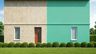
Murky Olive Greens
Olive green can be a beautiful, nature-inspired choice, but the wrong shade can negatively impact your home's exterior appearance. Some olive tones, particularly those with a strong brown undertone, can appear murky and heavy when applied to large surfaces. This can make the house look drab and unappealing. For a refreshed and grounded look, consider mid-greens or sage tones that have subtle grey undertones. These variations offer a cleaner, more balanced earthy aesthetic that complements the surroundings without appearing dull or muddy.
The Glossy Mistake
Regardless of the color chosen, a high-gloss finish on exterior paint is a common pitfall. The reflective nature of gloss amplifies every imperfection, including dust accumulation, water streaks, and minor scuffs, making the house look perpetually dirty. To ensure your exterior paint remains looking good for longer, always opt for matte or satin finishes. These finishes are inherently more forgiving, scattering light rather than reflecting it, which helps to disguise minor blemishes and maintain a cleaner, more cohesive appearance in various outdoor conditions.