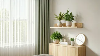


Serene Neutrals
Designers frequently turn to a palette of sophisticated neutrals when aiming for a clean and welcoming ambiance. Think of soft, muted grays with subtle
undertones, creamy off-whites that offer warmth without being stark, and warm beiges that create a cozy yet elegant foundation. These shades are incredibly versatile, providing a calming backdrop that allows furnishings and artwork to shine. They are particularly effective in smaller spaces, as they can make rooms feel more expansive and airy. The key is selecting a neutral with the right undertone to complement your existing decor and the natural light in the room. A good neutral shouldn't feel boring; instead, it should offer a sense of quiet confidence and understated luxury, making it a reliable choice for a broad range of interior styles, from modern minimalist to classic traditional.
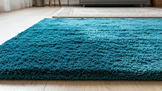
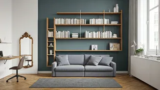
Calming Blues
When seeking a sense of tranquility, interior designers often gravitate towards various shades of blue. This includes everything from deep, moody indigos that evoke a sense of sophisticated calm to soft, sky-blue hues that bring a sense of openness and peace. Muted, dusty blues can also be incredibly effective, adding a touch of color without overwhelming the senses. Blues are known for their ability to promote relaxation and are excellent choices for bedrooms, bathrooms, or any area where a serene atmosphere is desired. The right blue can also be surprisingly versatile, pairing well with both warm and cool tones in your decor. Consider how natural light interacts with the blue you choose; a north-facing room might benefit from a warmer blue, while a sun-drenched space could handle a cooler, more intense shade.
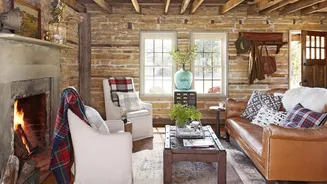
Warm Earth Tones
For designers looking to inject immediate warmth and coziness into a home, earth tones are an indispensable tool. This category encompasses a rich spectrum of colors, including terracotta shades that offer a rustic charm, deep ochres that bring a touch of artisanal warmth, and muted olive greens that connect the interior with nature. These hues are perfect for creating inviting living spaces and dining areas, fostering a sense of grounded comfort. They pair beautifully with natural materials like wood, stone, and rattan, enhancing the organic feel of a room. When using earth tones, consider balancing them with lighter accents or contrasting textures to prevent the space from feeling too heavy. These colors have a timeless quality, making them a safe yet impactful choice for a home seeking a welcoming and grounding presence.
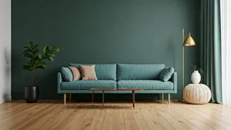
Invigorating Greens
Various shades of green are consistently favored by designers for their ability to refresh and energize a space while also evoking a connection to the natural world. This includes lush forest greens that add depth and drama, softer sage tones that promote a sense of calm, and brighter, more vibrant emeralds that introduce a pop of sophisticated color. Green is incredibly versatile and can work in almost any room, from a lively kitchen to a tranquil bedroom. It pairs exceptionally well with wood finishes, brass accents, and white or cream decor, creating a balanced and harmonious aesthetic. Incorporating green through paint is a fantastic way to bring the outdoors in, contributing to a feeling of well-being and vitality within the home's interior.
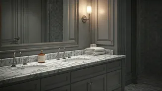
Sophisticated Grays
When a modern, chic, and versatile backdrop is required, designers frequently opt for sophisticated shades of gray. These aren't just flat, dull grays; instead, they often possess subtle undertones of blue, green, or even purple, giving them a nuanced and dynamic quality. Warm grays can lend a cozy feel, while cooler grays offer a crisper, more contemporary edge. Grays serve as an excellent canvas for a wide array of decor styles, allowing bolder furniture choices, vibrant artwork, or metallic accents to stand out without clashing. They are a powerful tool for creating a sense of understated elegance and can make a space feel both polished and inviting. Proper lighting is key to ensuring gray doesn't feel too somber, so consider how natural and artificial light will interact with your chosen shade.
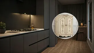
Deep, Moody Hues
For a touch of drama and undeniable sophistication, designers aren't shy about recommending deep, moody paint colors. Think rich navy blues, velvety charcoals, deep forest greens, and even dark, saturated plum or burgundy tones. These intense colors are incredibly effective at creating intimate, enveloping spaces, and they can surprisingly make a room feel larger by blurring the edges of the walls. They work exceptionally well in dining rooms, studies, or even as an accent wall in a bedroom to add a sense of luxurious enclosure. Pairing these deep shades with metallic accents, such as gold or brass, can elevate the look further, while lighter furnishings provide a beautiful contrast. These colors are a bold statement that can transform a room into a cozy, enveloping sanctuary.
Timeless Beiges
While sometimes overlooked, timeless beiges and warm neutrals remain a go-to for designers seeking to create a welcoming and enduringly stylish interior. These shades offer a subtle warmth that can make any space feel more inviting and comfortable, acting as a perfect counterpoint to cooler design elements or bolder accent pieces. Unlike stark whites, beiges provide a softer, more grounded feel, making them ideal for living areas and bedrooms where relaxation is key. The versatility of beige means it pairs effortlessly with a wide range of decor styles, from rustic farmhouse to contemporary chic. It's about choosing the right beige with the correct undertone to complement your existing furnishings and the natural light in your home, ensuring a look that is both classic and contemporary.
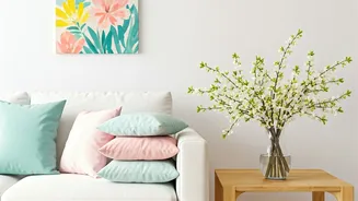
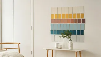
Bold Accent Colors
Designers often employ bold accent colors strategically to inject personality and visual interest into a space without overwhelming it. This might involve a vibrant coral on an interior door, a striking emerald green on a single wall in a hallway, or a cheerful yellow in a breakfast nook. These pops of intense color can serve as focal points, drawing the eye and adding a dynamic element to an otherwise neutral scheme. They are a fantastic way to experiment with color in a controlled manner, allowing for a significant impact with minimal surface area. The key is to select an accent color that complements the existing palette and reflects the desired mood of the room, turning ordinary spaces into something truly memorable and engaging.
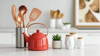
Soft Terracottas
For a gentle yet impactful infusion of warmth, soft terracottas and muted clay tones are frequently recommended by interior designers. These colors evoke a sense of natural earthiness and provide an approachable warmth that feels both grounding and inviting. They are particularly effective in creating cozy living spaces or dining areas, offering a subtle yet distinctive character. These shades pair beautifully with natural materials like wood, linen, and woven textures, enhancing an organic and comfortable aesthetic. Unlike brighter, more intense reds, these softer versions add a sophisticated, understated richness that can make a room feel more lived-in and welcoming, avoiding any harshness and promoting a serene, earthy vibe.
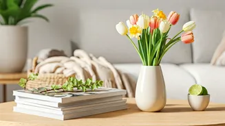
Chic Off-Whites
When aiming for an airy, bright, and sophisticated aesthetic, designers consistently turn to chic off-white paint colors. These shades offer a softer alternative to stark, pure white, providing a subtle warmth and depth that prevents rooms from feeling sterile. Variations range from creamy ivories and pale, warm grays to whites with a hint of beige or even a very subtle touch of color. Off-whites are exceptionally versatile, serving as a clean and elegant backdrop that enhances natural light and makes spaces feel more expansive. They pair seamlessly with nearly any color or material, making them an ideal choice for creating a cohesive and timeless interior design scheme that feels both modern and inviting.