


The 60-30-10 Rule
One of the most effective methods for achieving colour harmony is by adhering to the 60-30-10 rule. This classic interior design principle dictates a specific
distribution of colours within a space. Sixty percent of the room should be dominated by a primary colour, often seen on walls, large rugs, or significant furniture pieces. This dominant hue sets the overall tone. Following this, a secondary colour should occupy approximately thirty percent of the visual space, typically found in elements like upholstery, curtains, or larger furniture items that complement the primary shade. Finally, the remaining ten percent is reserved for accent colours, which are introduced through smaller decorative items such as cushions, vases, artwork, or small decorative objects. When a room feels excessively busy or chaotic, it often indicates that the accent colours have encroached upon the territory designated for more dominant or secondary hues, disrupting the intended visual hierarchy and balance.
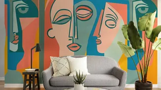
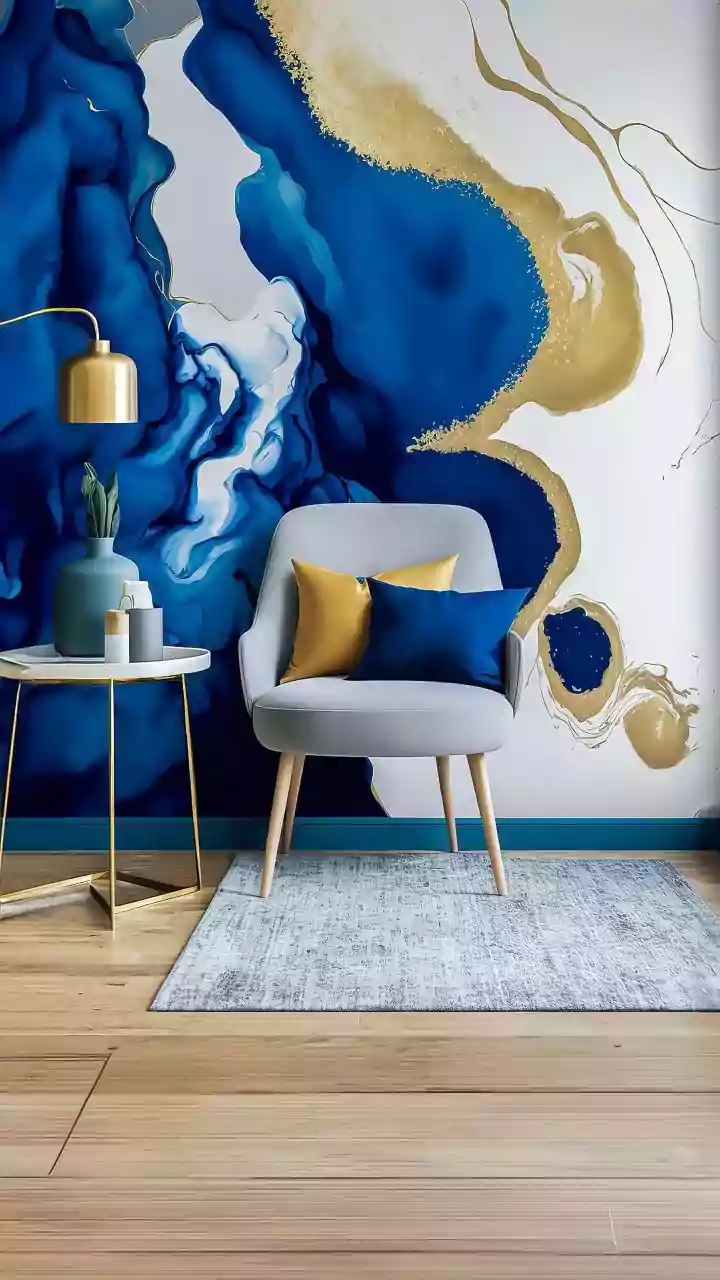
Strategic Colour Schemes
Before diving into decorating, establishing a clear colour scheme is paramount to prevent an overabundance of clashing hues. Consider a monochromatic scheme, which involves using various shades, tints, and tones of a single colour to create a sophisticated and unified look. Alternatively, an analogous scheme, featuring colours that are adjacent to each other on the colour wheel (like blue, blue-green, and green), can offer a harmonious yet varied palette. For those seeking more contrast, a complementary scheme, which uses colours directly opposite each other on the colour wheel (such as blue and orange), can create a vibrant and dynamic space when applied thoughtfully. Having a pre-defined plan significantly reduces the likelihood of randomly adding colours that might not work well together, ensuring a more cohesive and intentional design.
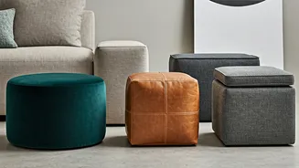
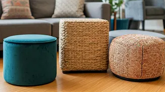
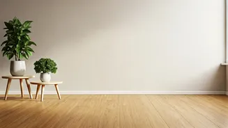
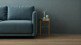
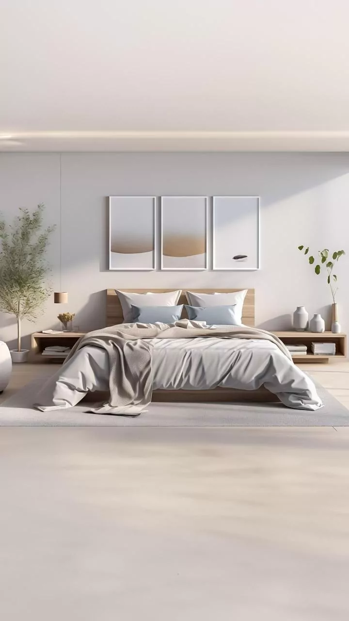
Embrace Neutrals Wisely
Neutrals, including shades like white, grey, beige, and even black, are indispensable tools for introducing calm and order into colourful interiors. They act as visual breathing room, providing a calming influence that allows bolder colours to shine without overwhelming the senses. Neutrals are not merely an absence of colour; they are often the most powerful design decisions. They can be effectively used for foundational elements like walls, large furniture pieces, or flooring, serving as a sophisticated backdrop. Introducing neutrals as buffers between stronger, more vibrant colours creates a sense of spaciousness and prevents the overall aesthetic from feeling too intense. Their presence helps to ground the palette, making even the most daring colour combinations feel more approachable and elegantly balanced.
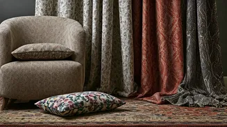
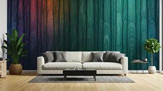
Balancing Warm & Cool Tones
Achieving a visually pleasing interior often involves a careful interplay between warm and cool colours. Warm colours, such as reds, oranges, and yellows, tend to evoke feelings of energy, warmth, and coziness. Conversely, cool colours, like blues, greens, and purples, often create a sense of calm, serenity, and spaciousness. When a room leans too heavily towards one spectrum, it can feel monotonous or unbalanced. For instance, a space dominated by warm tones might feel overly intense or stimulating, while an exclusively cool palette could feel stark or uninviting. Introducing elements from the opposing spectrum helps to create visual interest and depth, preventing the room from feeling one-dimensional. This strategic balancing act ensures that the chosen colours complement each other, leading to a more dynamic and aesthetically pleasing environment.
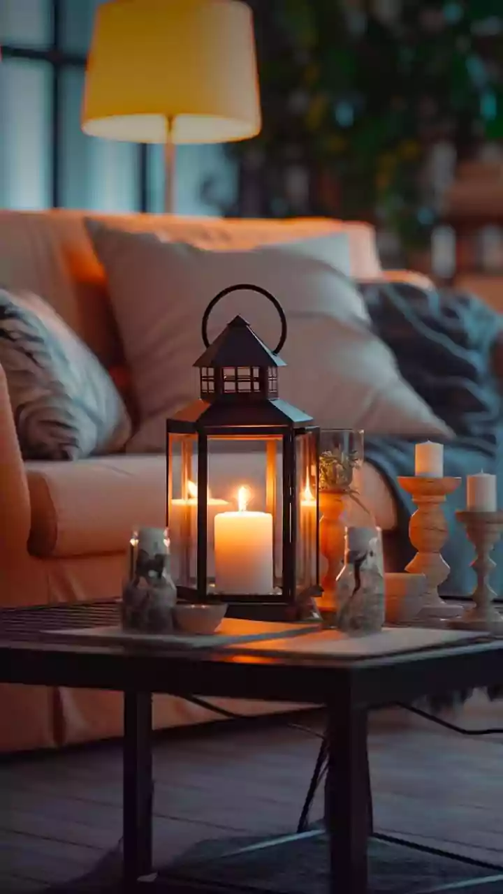
Colour Threading for Flow
To ensure a sense of cohesion and flow throughout a room, employing the technique of colour threading is highly effective. This method involves repeating a specific colour in at least three different places within the space. For example, if you have a dominant blue sofa, you might introduce a cushion with a touch of blue, a framed piece of art that incorporates blue, and perhaps a decorative vase or candle in a similar shade. This repetition creates a visual rhythm that guides the eye around the room, connecting different elements and making even a bold or complex colour palette feel intentionally curated and harmonious. This deliberate echoing of colours ensures that each element feels deliberately chosen and contributes to a unified overall design, preventing the space from feeling like a random assortment of items.