


Color Clashes Unveiled
One of the most critical, yet often overlooked, aspects of kitchen painting is the interplay of colors. In a space brimming with fixed elements like countertops,
backsplashes, flooring, and lighting, the undertones of your chosen paint colors are paramount. When cabinet or wall hues compete with these existing features rather than harmonizing with them, the result can be visually jarring and lead to significant regret. The key is to select paint colors that thoughtfully complement the dominant undertones already present in your kitchen. To truly grasp how a color will perform in your unique environment, it's highly recommended to test actual paint samples directly on your walls, rather than relying solely on small color swatches, which can be misleading under different lighting conditions.
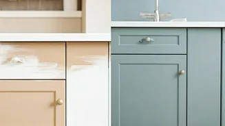
Trim Tint Troubles
The assumption that a crisp, bright white is the universally correct choice for kitchen trim and ceilings is a common misstep. In reality, the selection of your trim color should be intricately linked to the color of your cabinetry. For instance, if your cabinets sport a soft cream or a warm white, and you opt for a ceiling white with blue undertones, the contrast can make the cabinets appear dull and visually dissonant. A more harmonious approach involves ensuring that any white elements, whether trim, ceilings, or even paint on adjacent walls, share similar undertones – either cool or warm. This mindful coordination will foster a cohesive and pleasing ambiance throughout the entire room, preventing unintended visual friction and ensuring a polished final appearance.
White on White Woes
Beyond just trim, the careless combination of disparate white tones can present a significant aesthetic challenge within a kitchen. The fundamental principle that undertones dictate visual harmony applies across all surfaces. When you incorporate white paint for walls alongside white cabinets, a white backsplash, or white countertops, pay very close attention to the specific shade of white. If these whites have conflicting undertones, the overall effect can be less than ideal, making the space feel disjointed rather than unified. Ensuring that all white elements share a common undertone, whether it leans cool or warm, is crucial for creating a sophisticated and cohesive kitchen design.
Finish Faux Pas
The chosen paint finish significantly impacts how your kitchen's surfaces look and function. A flat finish on walls, while initially appearing elegant, has the drawback of absorbing light and making every scuff mark or fingerprint glaringly obvious. Conversely, overly glossy finishes can amplify minor imperfections in the wall surface and create distracting glare under task lighting. For walls, a durable matte or a soft eggshell finish is generally the most practical and aesthetically pleasing choice, as these options are easier to clean and maintain, which is essential in a high-traffic area like the kitchen. When it comes to kitchen cabinetry, a lower sheen finish is often recommended for its longevity and ability to withstand daily wear and tear over time.
Dark Hue Dilemmas
The kitchen is often considered the heart of the home, a space intended for lively gatherings, culinary adventures, and family connection, and as such, it should generally feel bright and welcoming. Opting for excessively dark or moody colors can inadvertently dampen this vibrant atmosphere. If a deep, rich hue is strongly desired, it is imperative to test this color thoroughly in your actual kitchen space before committing to its widespread application. This preliminary testing will provide a realistic preview of how the shade appears under your home's specific lighting conditions throughout the day, offering a far more accurate representation than a simple paint chip or digital swatch.