


A Spectrum of Choices
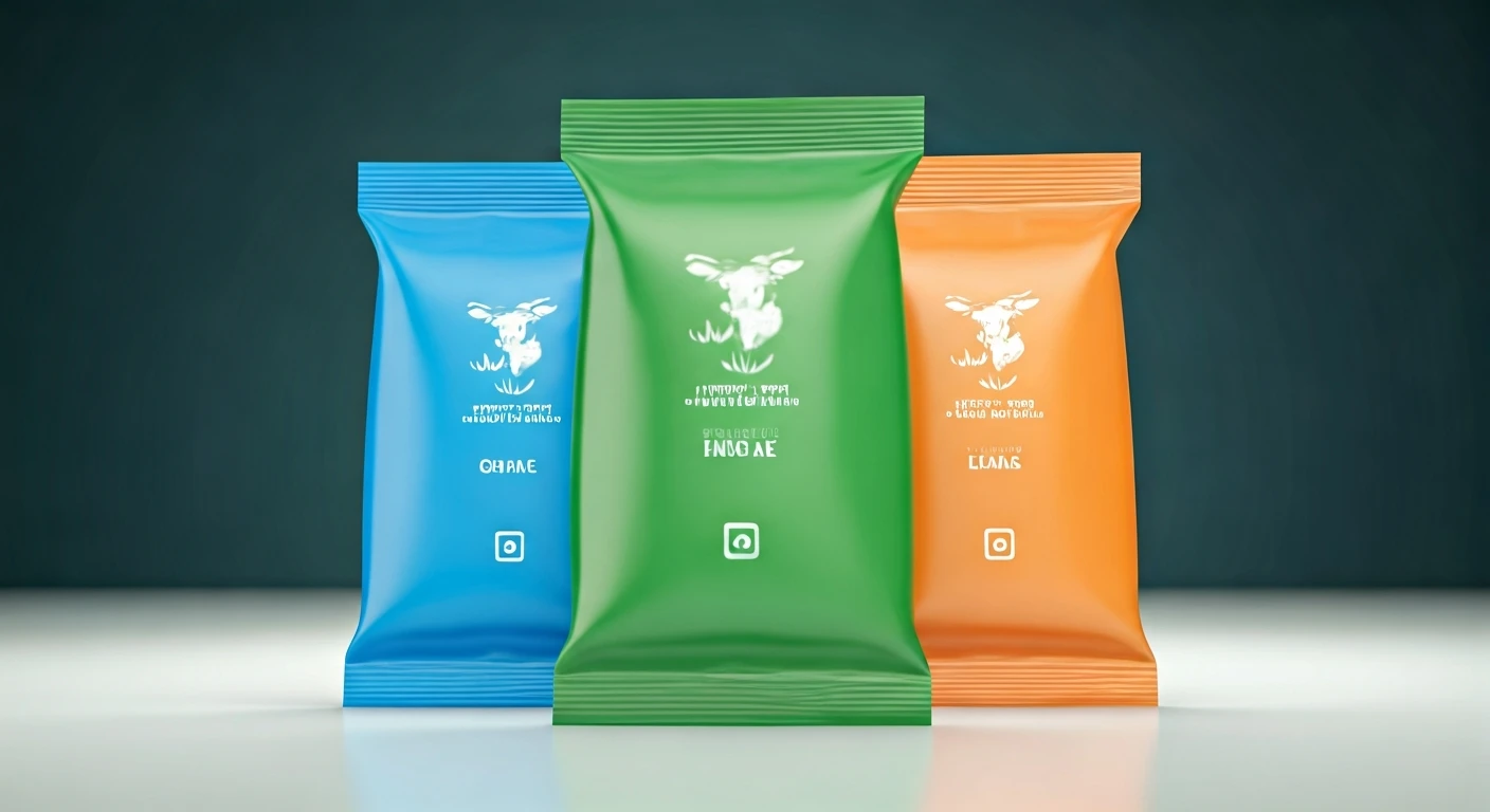
Stepping into any Indian dairy section reveals a visual feast, where milk packets aren't just plain white but adorned with distinct colors like blue, green,
and orange. This intentional color scheme serves as an immediate identifier, guiding shoppers towards specific milk types even before they read the detailed labels. It's a sophisticated yet simple visual language that has evolved into an indispensable tool for consumers, enabling them to select the right milk variant swiftly and without needing to delve into technical specifications. This system transcends mere packaging; it's an integral part of product identity and consumer convenience, built on a foundation of readily understandable visual cues that cater to diverse household needs and preferences, making the daily milk purchase a seamless experience.
Color Codes Explained
While food safety regulations are overseen by bodies like FSSAI, the specific colors adorning milk packets are a branding choice made by individual dairies to denote fat content and milk variety. The logic is straightforward: color acts as a visual shortcut. Broadly following government guidelines, blue typically signifies toned milk with approximately 3.0% fat. Green represents standardized milk, usually around 4.5% fat, and orange denotes full cream milk, boasting around 6.0% fat. Some brands also employ magenta for double-toned milk, which has a lower fat content of about 1.5%. This organized system ensures that consumers can instantly recognize the milk type they need, whether it's for everyday tea, making sweets, cooking, or preparing curd, thereby transforming a technical detail into an accessible piece of information.
Beyond Aesthetics: Functional Design
Milk, being a daily staple, is often purchased without much conscious thought. In the fast-paced world of consumer goods, decision-making speed is paramount. Implementing a color-coded system significantly cuts down potential confusion, especially when multiple product variations are shelved side-by-side. This approach ingeniously converts a technical attribute like fat percentage into instantly understandable information. This is particularly beneficial in a country with a diverse consumer base. Many households maintain a consistent product preference over long periods, making brand differentiation through distinct colors crucial for quick selection and product recall. This branding isn't just about looking good; it facilitates swift customer choices, aids in remembering preferred variants, and prevents mix-ups, often making the color as memorable as the brand name itself.
Quality vs. Type
A common misunderstanding is that brighter or darker colors on milk packets imply superior quality. This perception doesn't align with the function of the color-coding system. The colors primarily indicate the type of milk and its corresponding fat content, rather than signifying one packet's absolute superiority over another. Each category serves a distinct purpose: double-toned milk is the lightest, toned milk offers a middle ground, standardized milk is richer, and full cream milk is the richest. Consequently, determining the 'best' packet is subjective, depending entirely on individual household preferences. Some prefer lighter milk for daily consumption, while others favor fuller-bodied milk for its enhanced taste and texture, or for cooking. The color coding thus streamlines the consumer's decision-making process, eliminating the need to scrutinize nutritional labels daily.
Integrated into Daily Life
The integration of these milk packet colors into the daily vernacular of Indian households is remarkable. Consumers may not always recall precise fat percentages, but they readily identify milk types by their colors—blue, green, and orange. This color coding has evolved into a generational shorthand, allowing family members to request specific milk types simply by mentioning the color, with everyone understanding the implication. This makes milk packets feel almost personal, carrying a sense of household memory. The color associated with the milk a person grew up with often remains their preference, shaping purchasing habits even after conscious label reading has faded. This simple design choice has a profound impact on routine consumer behavior.
Convenience Through Design
While initially appearing as mere aesthetic branding, the array of colors on milk packets functions as a compact, user-friendly language. Hues like blue, green, and orange empower shoppers to make rapid purchasing decisions, distinguishing between milk types and selecting products suited to their specific needs. Within official dairy classifications, these colors are not arbitrary but are meticulously linked to defined fat percentages and distinct milk categories. This fundamental utility is the reason behind the color coding system's enduring effectiveness. Its inherent simplicity, memorability, and practicality make it exceptionally efficient. In the context of modern, fast-paced living, this is the hallmark of excellent design, providing significant convenience through a small visual cue.