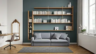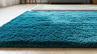


Cool-Toned Gray's Fade
The ubiquitous cool-toned gray rug, once a staple in modern decor, is now considered by interior designers to be a relic of the early 2010s. Its stark,
monochromatic appearance can lend a chilly and one-dimensional feel to a room, clashing with the warmer, more nuanced palettes favored in current design trends. Designers suggest moving away from these cold, solid gray options towards hues that introduce a sense of warmth and depth, reflecting a broader shift towards more inviting and comforting interior aesthetics. Embracing warmer undertones in your rug choices can significantly contribute to a more contemporary and welcoming atmosphere, making your space feel current rather than stuck in a past design era.
Beige's Flatness
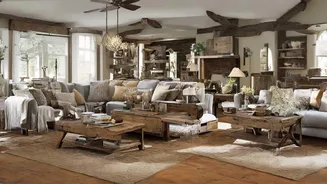
While neutral tones are generally appreciated for their calming effect, a simple, solid beige rug can fall into the trap of appearing bland and uninspired, according to interior design professionals. Such rugs tend to make a room feel visually flat, lacking the essential layering and textural elements that add character and personality. For those seeking a neutral foundation, designers recommend looking beyond monochromatic beige. Opting for rugs with subtle textures, interwoven contrasting threads, or a mix of complementary neutral shades can introduce much-needed dimension and visual interest, elevating the space from merely neutral to elegantly understated. This approach ensures the rug serves as a grounding element without sacrificing aesthetic appeal.
Bright Red's Intensity
Traditional bright red rugs, particularly those with intricate floral patterns like classic Turkish designs, are being widely recognized as outdated. Their intense color and busy, small-scale patterns can make a space feel visually heavy and even claustrophobic, recalling past design sensibilities rather than contemporary ones. Designers note that this vivid shade of red can dominate a room, making it appear smaller and overwhelmingly loud. For those who are drawn to the warmth red can impart, seeking out softer alternatives like muted coral, faded brick reds, or rich terracotta shades offers a more sophisticated and versatile way to achieve a similar cozy ambiance without the overwhelming impact of stark, traditional reds.
Stark White's Impracticality
Much like stark white paint with cool undertones has fallen out of favor, so too have intensely bright, solid white rugs in interior design. These rugs are not only prone to showing every speck of dirt, making them highly impractical for everyday living, but they can also create an unwelcoming and sterile atmosphere. The fear of staining can put guests on edge, detracting from a relaxed environment. Designers suggest that if a fresh, clean look is desired, it's better achieved with softer, warmer neutrals. A very light, warm tan or cream color can offer a similar airy feel while being more forgiving and creating a cozier, more inviting ambiance for the inhabitants and their guests.
Monochromatic Black & White
The striking black and white geometric rug, a popular choice around the mid-2010s, is now considered by many designers to be past its prime. These high-contrast patterns, often seen in loft apartments during that era, can now appear overly harsh and dated. While bold patterns remain a design element, the starkness of black and white geometric designs has given way to softer, more nuanced combinations. If you still appreciate the impact of a significant pattern, consider rugs that utilize less visually jarring pairings. Think about subtle contrasts like light and dark brown, or a sophisticated blend of white and tan, which offer a modern take on statement rug design without the dated aesthetic.