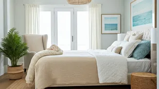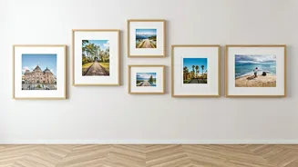


The Gallery Wall Guide
Creating a gallery wall can seem daunting, but it's a fantastic way to showcase various photos and art pieces. The key is balance and intentionality. Before
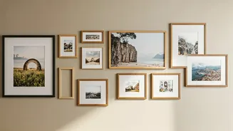
hammering any nails, arrange your frames on the floor. This lets you play with different layouts and see how the pieces interact. Consider symmetry for a structured look or embrace asymmetry for a more relaxed, modern vibe. Use painter's tape to mark the wall where the frames will go; this saves you from unnecessary holes. A helpful tip is to leave consistent spacing between frames – roughly 2-3 inches usually works best. Finally, ensure the gallery wall has a cohesive theme, whether it's the frame style, color palette, or subject matter of the photos, to tie everything together. Remember, the goal is to create a visually appealing, unified display that complements your space, not overwhelms it.
Balance and Symmetry
Symmetry and balance are fundamental principles in interior design, easily applied to photo arrangements. In symmetrical layouts, the arrangement is mirrored on either side of a central axis, creating a formal and visually stable feel. This works well in spaces like hallways or above a sofa. You can achieve symmetry by using matching frames and similar-sized photos or by creating a balanced arrangement with varying sizes. If you want a more casual look, aim for a balanced, but not perfectly mirrored, display. Consider the weight of your images; heavier frames or those with darker tones can visually weigh down one side, so balance them with lighter frames or brighter images on the opposite side. This ensures that the arrangement does not feel lopsided. A balanced display creates a harmonious atmosphere and is visually pleasing.
The Rule of Thirds
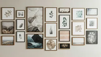
The rule of thirds is a powerful compositional technique, derived from art and photography principles, that can elevate your photo arrangements. Imagine dividing your wall into a 3x3 grid. The key to a visually appealing arrangement lies in placing the most important elements of your display at the intersection points of these grid lines or along the lines themselves. When arranging your photos, consider the focal point. Place your most significant image or frame near one of the intersections. This draws the eye naturally and gives the viewer a clear point of focus. You can arrange the remaining photos around this focal point, using the grid to maintain balance and visual interest. This technique adds dynamic energy to your photo wall by creating a sense of movement. Experiment with different arrangements, using the grid as a guide, until you find a layout that feels balanced and engaging.
Frame and Matting
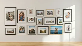
The frames and matting you choose can significantly impact the final look of your photo arrangement, potentially transforming an otherwise simple display into something truly elegant and polished. Frames should complement your photos and the style of your room. For a classic look, consider matching frames, while mixing styles can add a more eclectic vibe. If you have several photos with different sizes, using matting can provide visual consistency and enhance the presentation. Matting creates a white or colored border around the photo. This border not only frames the image but also makes the photo appear more prominent, giving the eye a rest before moving to the next one. The color of the matting can be chosen to complement the photo's colors or match the wall color to create an integrated look. Careful selection of frames and matting provides a cohesive, refined aesthetic, increasing the impact of your displayed photos.
Create Visual Flow
To make your photo arrangement more engaging, guide the viewer’s eye through the display. This is a crucial element that ties everything together. One method is to arrange photos in a sequence that tells a story, such as a timeline of family milestones or a series of travel images. This draws the viewer in and encourages them to spend more time exploring the display. Another approach involves using a consistent color palette or subject matter across all the photos. This creates visual harmony and helps the arrangement feel cohesive. Vary the sizes of the frames but maintain a visual connection, for example, by using similar frame styles. By considering the narrative and visual flow, you can transform a collection of photos into a captivating and inviting display. This will naturally draw people's attention, and make your space a more interactive experience.