
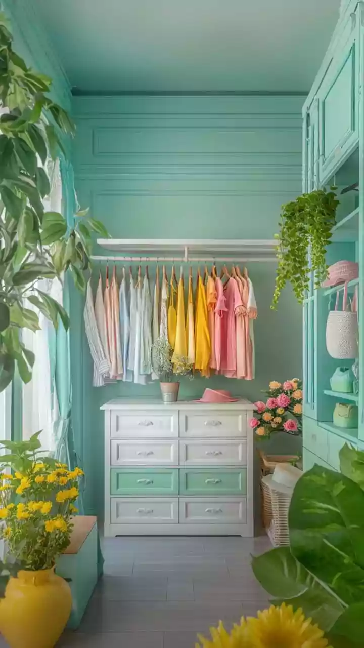

Butter Yellow's Farewell
While once a charming choice, butter yellow is now considered by many interior designers to be a color that instantly dates a space, evoking a nostalgic
but ultimately outdated '90s aesthetic. Experts suggest moving towards yellows with more character and depth, such as muted ochre or earthy wheat tones, which offer a more grounded and sophisticated feel without abandoning the warmth of yellow altogether. These contemporary alternatives provide a sun-washed, natural ambiance that aligns better with current design sensibilities, offering a refreshing update while still embracing the inherent cheerfulness of the color family.
Bright Red's Demise
Bold and attention-grabbing, bright red is finding itself on the out list for many designers who prefer its moodier, more complex cousins. The vibrant, primary version of red is seen as lacking the nuanced dimension and depth that today's interiors are aiming for. Instead, design professionals are championing richer, more sophisticated shades like deep burgundy or luxurious oxblood. These alternatives offer a sense of drama and elegance without the potential harshness of a bright, fire-engine red, allowing for a more layered and inviting atmosphere within a room.
Plum Purple's Exit
The opulent plum purple, while having seen a surge in popularity, is now being reconsidered by designers. Its tendency to overwhelm a space rather than complement it is a primary concern. While its moody allure is acknowledged, the color can easily dominate the room's design, making it feel less about enhancement and more about imposition. Designers are seeking hues that integrate more harmoniously, allowing other elements of the interior to shine through, rather than a color that demands all the attention.
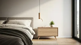
Cool White's Severity
The starkness of cool white is proving to be a drawback for many designers, particularly in spaces intended to feel warm and welcoming. This shade can come across as overly severe and one-dimensional, lacking the inviting quality that makes a home feel lived-in and cozy. The advice is not to abandon white entirely, but to opt for variations that possess more warmth. A chalky off-white, for instance, offers a softer, more approachable alternative that creates an inviting atmosphere, differentiating it significantly from a bleached or sterile appearance.
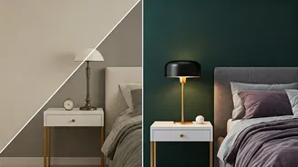
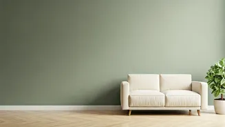
Gray's Fading Charm
Gray, once a ubiquitous neutral, is now being perceived by designers as a hue that has thoroughly completed its trend cycle. Its extensive use over past decades has led to it being considered dated. The current sentiment is to either embrace bolder, more definitive colors or to gravitate towards lighter, warmer neutral tones that offer a fresher, more contemporary feel. This shift signifies a move away from the safe, perhaps predictable, nature of gray towards more personality-driven or subtly inviting color palettes.
Greige's Lost Soul
Even the popular greige (a blend of gray and beige) is facing a critique for becoming too commonplace, losing its distinctive appeal through sheer ubiquity. Designers feel that its widespread adoption as a default choice has stripped it of its unique character. The recommendation is to explore alternative warm neutrals that offer a more thoughtful and pleasing impact on a space. These fresh selections can provide a more nuanced and sophisticated foundation for interior design compared to the now-predictable greige.