
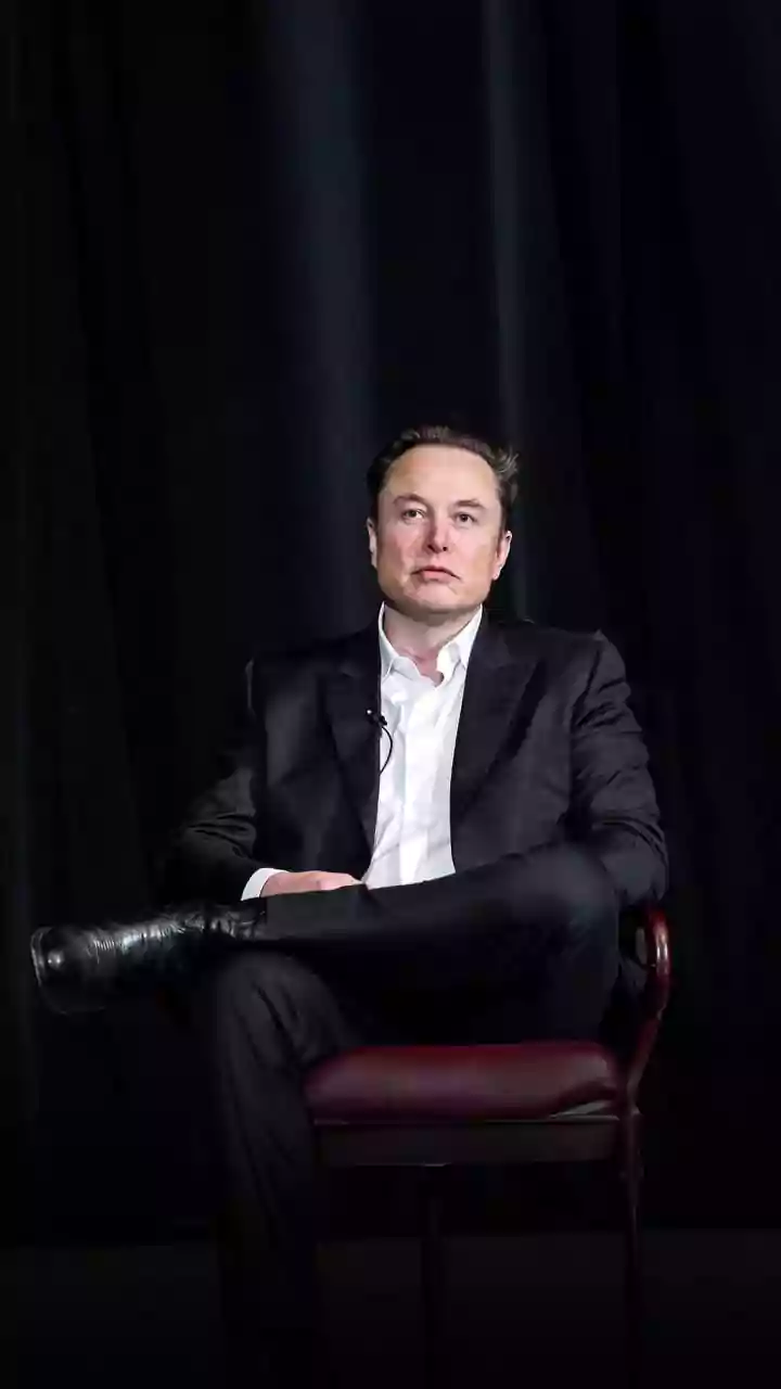
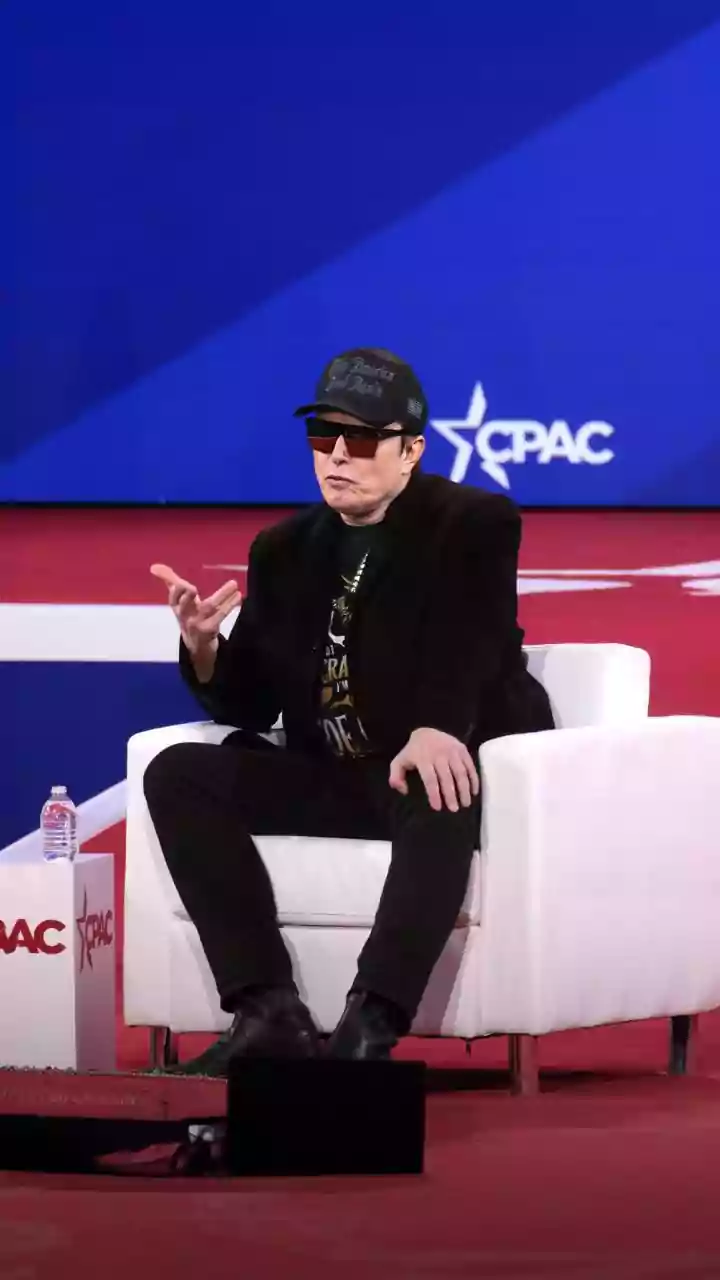


Elon Musk has thoughts on many things—from space travel to artificial intelligence. Now, he's turned his attention to punctuation. A recent proposal has sparked a surprisingly lively debate about one of grammar's most divisive marks: the em dash.
Musk's Punctuation Proclamation
In a
characteristically direct post on his social media platform, X, Elon Musk suggested that the rules of English grammar need an update. His target was the em dash (—), the long dash used to indicate a break in thought or a parenthetical phrase. According to Musk, when used without spaces around it—as is standard in many style guides—the em dash makes a phrase 'presently too much resemble a hyphenated word'. He argued for adding spaces around the dash and even suggested the shorter en dash (–) is a 'better length' for the job. This seemingly minor observation tapped into a long-running, if niche, debate among writers, editors, and typographers.
The Dash Deep Dive: Meet the Em Dash
So, what exactly is this punctuation mark causing all the fuss? The em dash is the longest of the common horizontal lines used in writing. Its name comes from typography, where it was traditionally the width of the capital letter 'M'. Its primary role is to create a strong, dramatic break in a sentence. Think of it as a more emphatic version of a comma or a less formal alternative to parentheses or a colon. It can set off an amplifying clause, signal an abrupt change in thought, or add emphasis to a phrase—like this one. The mark has a rich history, rising to prominence with printers in the 15th century and used artfully by writers like Emily Dickinson to create rhythm and emotion.
Hyphens and En Dashes, Explained
To understand Musk's point, it's crucial to distinguish the em dash from its shorter cousins. The hyphen (-) is the shortest of the three and is used to join words together, as in 'state-of-the-art' or 'well-being'. It's a connector of words, not sentences. The en dash (–), named for the width of the letter 'N', is the middle child. Its main job is to indicate a range, like 'pages 10–15' or 'the years 2024–2026'. It essentially stands in for the word 'to'. Using the wrong one is a common slip-up, but each has a distinct function that keeps sentences clear and readable.
Does Musk Have a Point?
Musk's argument centers on visual clarity. Without spaces, a phrase like 'word—anotherword' can, in some fonts or at a quick glance, look like a compound term rather than a parenthetical aside. His proposed solution—adding spaces around the dash—is not a new idea. In fact, it's a major stylistic divide. The Chicago Manual of Style, a bible for many book publishers, calls for no spaces. However, the AP Stylebook, used by most journalists, requires spaces around the em dash. British English often favors a spaced en dash for the same purpose. So, Musk's preference aligns with a well-established journalistic style. His critique that the em dash is an 'unpleasantly long a line' is a matter of pure aesthetic preference, but one shared by some typographers who find the mark a bit old-fashioned.
The Unlikely Star of Punctuation
The em dash has seen a recent surge in usage, partly fueled by its frequent appearance in AI-generated text. Some have noted that large language models seem to love the em dash, using it as a kind of 'syntactic duct tape' to connect clauses without committing to stricter punctuation like a semicolon or colon. This has led to some readers viewing the em dash as a telltale sign of AI writing, even though it has been a staple of human writers for centuries. The debate Musk waded into is therefore not just about a fussy grammar rule; it's about readability, style, and how technology is shaping the way we write and perceive language.