





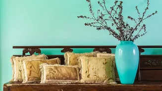
Start with a Shared Colour Story
The single most important rule for successfully mixing patterns is to establish a unified color palette. Before you even think about the prints themselves, decide on a colour story of two to four complementary tones. These colours will act as the bridge
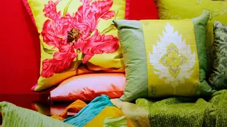
that connects different patterns, making the combination feel intentional rather than accidental. Pick one dominant colour that will appear in most of the patterns, then choose one or two accent shades. Even if the patterns are wildly different, repeating the same hues throughout the room creates a sense of harmony and visual flow.
Choose a Dominant Pattern
Every room needs a star, and the same goes for your patterns. To avoid a look where everything is competing for attention, choose one pattern to be the focal point. This 'anchor' piece is often the largest or boldest pattern in the room, typically on a rug, a feature wall of wallpaper, or a large piece of furniture like a sofa. This lead pattern sets the tone and colour scheme, and all other prints should serve as accents that support it. Once you have your anchor, you can build layers around it with smaller, complementary pieces.
Play with the Scale of Prints
A common mistake is choosing multiple patterns that are all the same size, which can make a space feel busy or monotonous. The key to balance is varying the scale. A classic design formula involves combining one large-scale pattern, one medium-scale pattern, and one small-scale pattern. For example, you might pair a large floral wallpaper with medium-sized geometric cushions and a small, delicate stripe on a lampshade. This difference in size allows each pattern to have its own space and be appreciated without overwhelming the eye.
Balance Pattern Types
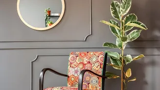
Just as you vary scale, it helps to mix different types of patterns. Pairing structured, linear patterns like stripes and geometrics with soft, organic ones like florals creates a dynamic yet balanced look. The straight lines of a geometric rug can ground the romantic feel of a floral armchair. You can even consider animal prints or paisleys as part of your mix. As a general guideline, try to limit yourself to three or four distinct patterns in a single room to keep the design feeling curated and cohesive, not cluttered.
Let the Room Breathe
Patterns need room to shine, which means incorporating solid colours is crucial for balance. These solid 'breathing spaces' give the eye a place to rest and prevent the room from feeling visually overwhelming. You don’t need every surface to be covered in a print. Anchor the space with neutral elements like a plain sofa, solid-coloured walls, or simple wood furniture. These quiet moments not only provide balance but also help your carefully chosen vintage patterns stand out even more. Textural fabrics like velvets, knits, or linens can also function like solids while adding another layer of depth.