
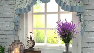
Defining Your Vintage Inspiration
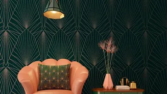
The term 'vintage' can span many eras, so the first step is to narrow down your vision. Are you drawn to the soft, pastel florals and gentle curves of the 1940s, or the bold, graphic energy of Art Deco? Perhaps it's a more general sense of nostalgia you're
after. Choosing an era helps guide your palette and furniture choices. A vintage look often incorporates furniture with some history, whether it's a family heirloom or a flea market find. Look for pieces with character, like distressed wood, carved legs, or unique frames. Remember, the goal is a collected, personal feel, not a museum replica, so feel free to mix these finds with contemporary items for a balanced home.
Choosing Your Statement Floral
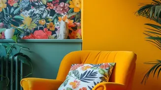
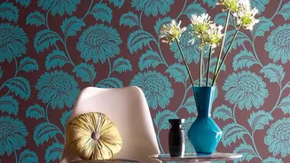
In a room that mixes patterns, it's best to start with a 'hero' print that will be the main focus. In this case, that's your floral wallpaper. This dominant pattern sets the tone for the entire space. Let this be the element you want people to notice first. A large-scale floral can act as an anchor for the room, making a dramatic statement. Once you've chosen this lead pattern, every other print you introduce should support it rather than compete with it. If you choose a wallpaper with multiple hues, you can pull colours from it to use throughout the room for a cohesive look.
Layering with Geometric Accents
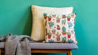
With your floral wallpaper as the foundation, it's time to introduce geometric prints. The easiest way to do this successfully is to combine organic floral patterns with repetitive geometrics like stripes, checks, or trellis designs. These can be brought in through smaller items like throw pillows, rugs, curtains, or artwork. This contrast is what brings balance and modernises the romantic feel of the florals. The key is to ensure the geometric prints don't fight for attention but rather complement the main wallpaper. Using them in smaller doses prevents the room from feeling visually chaotic.
Unifying with a Cohesive Palette
The single most important rule for mixing patterns is maintaining a consistent colour palette. This is the thread that ties everything together. Choose two to four core colours and repeat them across the different patterns. For instance, if your wallpaper has shades of blue, green, and cream, your geometric pillows could feature a blue and cream stripe, and your rug a subtle green pattern. This shared colour story makes the mix feel intentional and harmonious. Neutrals like white, grey, or beige can also provide 'breathing room' for the eye, preventing the patterns from feeling overwhelming.
The Importance of Scale and Texture
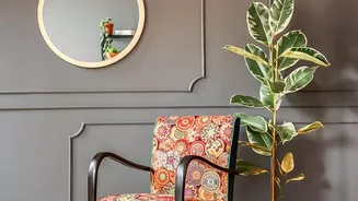
To avoid a clashing look, vary the scale of your prints. A well-balanced room often includes a large-scale pattern (your wallpaper), a medium-scale pattern (on chairs or curtains), and a small-scale pattern (on accent pillows). Using multiple patterns of the same size makes it hard for the eye to know where to focus. Texture is equally important, adding depth and richness. Balance the smooth surface of the wallpaper with different textures like a woven rug, a velvet cushion, or a linen throw. This interplay of textures creates a dynamic, multi-dimensional space that is interesting to both see and touch.
Furnishings that Fit the Frame
The right furniture will ground your patterned space. Look for pieces that complement your chosen vintage era, such as soft chairs with rounded legs or a wooden cabinet to display treasured items. Don't be afraid to reupholster a found piece of furniture to better fit your colour scheme; focus on the frame and functionality when buying secondhand. To balance the visual weight of patterns, incorporate solid-coloured furniture, like a neutral sofa. This creates a calm resting spot for the eyes and allows your carefully chosen patterns to truly shine without overwhelming the space.