




Choose a Leading Pattern
Every room needs a hero, and when you're working with patterns, this is the perfect place to start. Before you begin mixing and matching, select one dominant pattern that will serve as the room's anchor. This 'lead' pattern is your focal point and will set
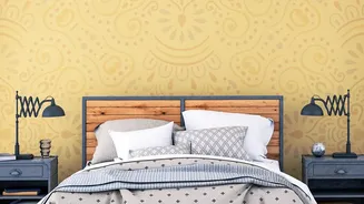
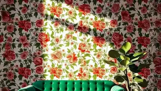
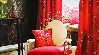
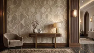
the tone for the entire space. It could be a large-scale floral wallpaper behind a bed, a striking geometric rug in the living room, or a bold botanical print on a pair of curtains. By giving one pattern the starring role, you ensure it makes a statement without having to compete for attention, which is often what leads to a sense of visual clutter. Once you have your star, every other element you introduce is there to support it.
Play with Scale
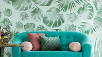
One of the most effective principles in pattern mixing is varying the scale. To avoid having patterns shout over each other, combine large, medium, and small-scale prints. If your main pattern is an oversized floral, pair it with a smaller, more subtle geometric or a simple stripe. This contrast in size allows the eye to differentiate between the patterns, creating a layered, curated look rather than a jumble. A large print can surprisingly make a small room feel more intentional and immersive, while tiny, busy repeats are often what make a space feel cramped. The golden rule is to ensure one pattern is clearly the lead, while the others play supporting roles.
Unify with a Colour Story
Colour is the bridge that connects different patterns, making them feel like they belong together. Even if you're mixing a classic floral with a modern chevron, a shared colour palette will create a cohesive look. Pull one or two shared colours from your main pattern and repeat them in the other patterns and solid elements in the room. For instance, if your vintage wallpaper has notes of deep green and blush pink, echo those shades in your cushions, throws, or a smaller secondary pattern. This ensures the room feels harmonious and intentional, preventing the patterns from clashing.
Leave Room to Breathe
Just as important as the patterns you use is the space you leave empty. Negative space, or 'visual rest', is crucial for preventing a room from feeling overwhelmed. Not every surface needs to be covered. Balance bold wallpaper or upholstery with solid-coloured furniture, neutral walls, or simple, un-patterned curtains. These areas of calm give the eye a place to land, which helps to frame and appreciate the patterned elements you've chosen. Without these moments of quiet, even the most beautiful patterns can get lost in the noise, making a room feel messy and visually stressful.
Mix in Solids and Textures
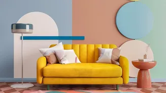
Patterns aren't the only way to create visual interest. To add depth without adding more 'busyness', incorporate a variety of textures. Think of a chunky knit throw, a velvet cushion, a woven basket, or a smooth wooden coffee table. These textural elements provide a different kind of sensory information that complements, rather than competes with, your vintage prints. Pairing nostalgic patterns with clean-lined, modern furniture in solid colours is another powerful technique. This juxtaposition creates a sophisticated contrast, allowing the vintage pieces to feel fresh and deliberate rather than dated. The solid pieces act as a grounding force that elevates the entire scheme.
Start in Small Doses
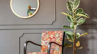
If you're hesitant to go all-in with a full wall of patterned paper, start small. Vintage patterns can make a huge impact even in small applications. Test the waters by introducing a bold print on throw pillows, a lampshade, an upholstered ottoman, or even framed art. Small spaces like a powder room or an entryway are also fantastic candidates for dramatic patterns, as they can handle the personality without overwhelming a primary living area. This allows you to experiment with your favourite prints and build confidence without committing to a large-scale, expensive change right away.