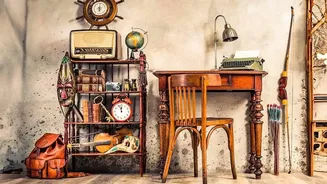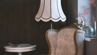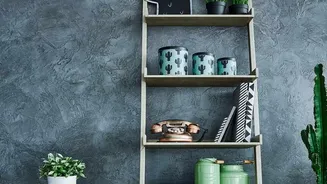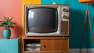

Start With a Neutral Foundation
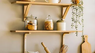
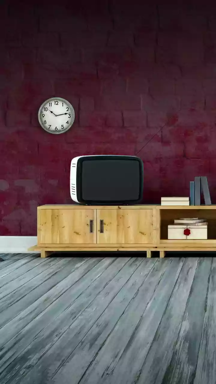
One of the easiest ways to introduce vintage colours is to start with a neutral backdrop. Instead of stark, brilliant white, think in terms of warmer, softer shades. Creams, warm whites, sandy beiges, and soft taupes create a calm canvas that allows bolder
vintage colours to stand out without overwhelming the space. This approach ensures that your home feels nostalgic and modern at the same time. This neutral foundation can be on your walls, but also consider it for larger furniture pieces. A beige sofa or ivory curtains can anchor a room, giving you the freedom to play with more colourful accessories.
Embrace Earthy Tones
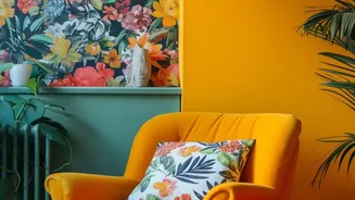
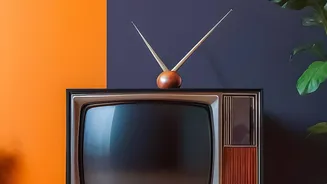
Colours rooted in nature are a hallmark of many vintage aesthetics, particularly those inspired by the 1970s. Shades like mustard yellow, olive green, terracotta, and burnt orange bring an immediate sense of warmth and groundedness to a room. These colours are surprisingly versatile and pair beautifully with natural materials like teak or walnut furniture and timber features. You could paint an accent wall in a deep ochre or introduce an olive green armchair. For those in India, these earthy tones like mustard yellow and terracotta resonate deeply with traditional design palettes, making them a natural fit for many homes.
Play with Dusty Pastels
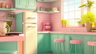
Vintage doesn't always mean dark and moody. Softer, desaturated pastels can evoke a romantic, nostalgic feeling. Think of shades like dusty rose, sage green, powder blue, or a soft lavender. These colours are often described as having a slightly greyish or weathered quality, which gives them their vintage character. A combination of dusty rose and sage green, for instance, creates a serene and calming atmosphere that feels both lived-in and intentional. These shades are perfect for bedrooms, bathrooms, or any space where you want to create a peaceful retreat. They can be used on walls or brought in through textiles like cushions and throws.
Use Jewel Tones for Rich Accents
For a touch of opulence and drama, look to the rich jewel tones popular in Art Deco and other glamorous eras. Deep emerald green, royal blue, and ruby red can infuse a space with energy and sophistication. Because these colours are so bold, they often work best as accents. Consider a velvet ottoman in sapphire blue, a lacquered side table in emerald, or statement artwork featuring a deep burgundy. These pops of intense colour stand out beautifully against a neutral or earthy background, creating striking focal points that draw the eye and add a sense of luxury.
Master Vintage Colour Combinations
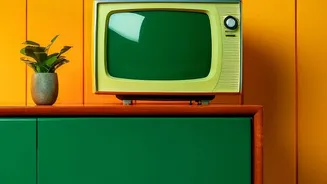
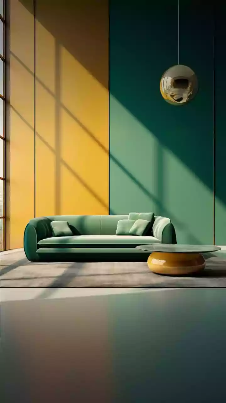
Certain colour pairings are quintessentially vintage. For a fun, mid-century feel, try combining mustard yellow with teal. This vibrant duo can be used in geometric patterns on wallpaper or balanced with a neutral grey. For a more subdued and classic look, pair dusty blue with a warm taupe or chocolate brown. Another popular combination in Indian homes is a soft yellow with lavender, which feels both energetic and gentle. The key is to find a balance; use one colour as your dominant shade and the other as an accent to create a cohesive and stylish look.
Layer with Textures and Patterns
Colour is only one part of the vintage story. To truly bring the aesthetic to life, you must also consider texture and pattern. Vintage colours are enhanced by materials like velvet, corduroy, tweed, and natural wood. For example, a mustard yellow colour looks even more inviting on a plush fabric. Similarly, don't shy away from patterns. Floral wallpapers, damask upholstery, or classic herringbone flooring can add a subtle nod to the past. Integrating these elements with your chosen colour palette will create a space that feels layered, full of character, and uniquely yours.