


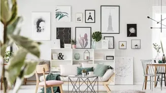
Why Neutrals Are Your Best Friend
When decorating with bold, intricate vintage patterns—be it floral, geometric, or toile—the goal is to let them shine without creating visual noise. Neutral colours are the perfect supporting act. Shades like white, cream, beige, grey, and taupe provide
a calm, clean backdrop that allows the eye to rest. This foundation makes your chosen vintage pieces the undeniable focal point, preventing the room from feeling too busy or cluttered. Think of a neutral base as the gallery wall and your patterned items as the art.
Start with a Dominant Pattern
Before you begin, choose one main vintage pattern to be the star of the show. This might be a large-scale floral on a statement armchair, a geometric rug, or dramatic wallpaper on an accent wall. This primary pattern will anchor your design and inform your other choices. Trying to incorporate too many large, competing patterns is a common mistake that leads to a chaotic feel. By giving one pattern priority, you create a clear visual hierarchy and a more intentional, layered look.
Apply the 60-30-10 Rule
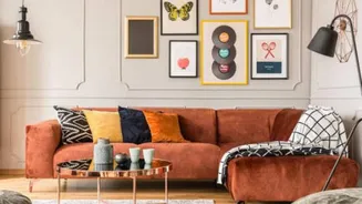
A classic interior design principle, the 60-30-10 rule is perfectly suited for this task. Here’s how to adapt it: - 60% Neutral Dominant Colour: This should be your main neutral shade, used on large surface areas like walls, sofas, or large rugs. This creates the essential calm backdrop. - 30% Secondary Neutral or Texture: Your secondary colour should be another neutral that complements the first, or a solid texture like natural wood, linen, or wool. This adds depth and prevents the neutral palette from feeling flat. - 10% Vintage Pattern: This is where your chosen pattern comes in. Use it on accent pieces like throw pillows, curtains, a single chair, or lampshades. This measured dose ensures the pattern makes an impact without taking over.
Vary the Scale of Your Patterns
If you want to use more than one pattern, the key is to vary the scale. If your main pattern is a large, bold floral, pair it with a much smaller, more subtle secondary pattern, like a thin stripe or a small geometric print. As long as they share a common colour from your neutral palette, they will feel connected rather than clashing. For instance, a sofa with large-print floral cushions can be paired with smaller striped pillows, all grounded by a shared cream or grey background colour.
Choose the Right Neutrals
Not all neutrals are created equal. The five basic neutrals are white, grey, black, beige, and brown. Beyond that, 'near-neutrals' like greige (grey-beige), mushroom, and charcoal carry subtle undertones that can add warmth or coolness to a room. For a warm, inviting feel that complements many vintage styles, consider palettes built around cream, sand, and oatmeal. For a more contemporary, crisp look, pair your vintage patterns with cool greys and bright whites. Look at the colours within your vintage pattern and pull a subtle neutral shade from it to use for your walls or larger furniture items.
Incorporate Texture for Depth
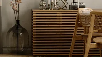
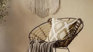
A room full of flat, solid neutrals can feel one-dimensional. The key to preventing this is texture. Layering different materials like chunky knit throws, linen curtains, woven jute rugs, and aged wood furniture adds visual interest and a cosy, lived-in feeling. These textural elements complement both the neutral colours and the vintage patterns, creating a rich sensory experience that feels sophisticated and thoughtfully curated.