


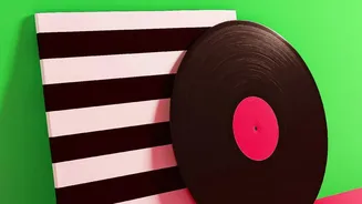
The Art of Restraint
In interior design, what you leave out is just as important as what you put in. This is the power of negative space—the intentionally 'blank' area around and between objects. Far from being empty, this space gives your eyes a place to rest, preventing
a room from feeling cluttered and chaotic. It helps to highlight the focal points of a room, whether that’s a piece of furniture, a light fixture, or a bold block of colour. By keeping some wall areas unadorned, you create a sense of balance and harmony, allowing the features you want to showcase to truly stand out. Think of it as creating breathing room in your decor; it’s the quiet that makes the music audible.
What is Colour-Blocking?
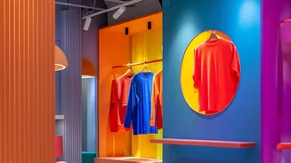
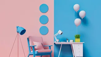
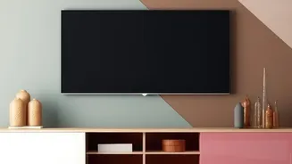
Colour-blocking is an interior design technique where you use two or more solid blocks of colour side-by-side. The goal is to create a deliberate and structured visual statement using colour itself as the main element. Originating in fashion—think of the iconic Mondrian dress of the 1960s—the concept translates perfectly to interiors, turning a plain wall into a canvas for geometric expression. This isn't about randomly accumulating colours; it's a disciplined approach where large, solid fields of paint or other materials define shapes and create a visual rhythm. The shapes can be simple rectangles, elegant arches, or dynamic stripes, each one transforming a wall into a deliberate piece of art.
A Perfect Pair: How They Work Together
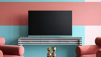
When colour-blocking meets negative space, the result is both dynamic and serene. The bold, geometric shape—the 'positive' element—draws your eye and creates a focal point. The surrounding blank wall—the 'negative' space—frames this shape, giving it room to breathe and amplifying its impact. This combination is a masterclass in visual balance. A brightly painted arch behind a simple console table, for example, instantly creates a designated zone and adds architectural interest without any construction. The bare wall around the arch prevents the feature from overwhelming the room, resulting in a look that feels confident and intentional. This interplay is why minimalist geometric art is so effective; it uses form and emptiness to create a feeling of sophisticated order.
Bringing the Look Home
You don’t need to be a professional designer to make this trend work. The easiest way to start is with paint and some good-quality painter's tape for crisp lines. Begin with a simple project, like painting a large circle or rectangle behind your sofa or bed to act as a 'faux' headboard. You could also use colour to highlight an existing architectural feature, like a nook or alcove. Horizontal stripes can make a room feel wider, while vertical ones can create the illusion of higher ceilings. When planning your design, a good rule of thumb is to stick to two or three colours to avoid a chaotic look. The key is careful planning and precise execution.
Choosing Your Colours and Shapes
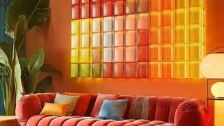
Your colour palette will define the mood. For a bold, high-energy look, choose complementary colours that sit opposite each other on the colour wheel, like teal and terracotta. For a more subtle and calming effect, try a monochromatic approach, using different tones of the same colour, such as a dark forest green paired with a lighter sage. Earthy and neutral tones also work beautifully for a sophisticated, modern aesthetic. As for shapes, let your room guide you. Soft arches can add a sense of flow above a doorway or bed. Sharp, angular geometric patterns bring a dynamic, modern energy perfect for a living room or home office.