
The Golden Rule: Start With a Neutral Base
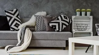
The single most important principle for making bold, retro patterns work is to give them a calm backdrop. Think of plain surfaces as the supporting act that allows your statement pattern to be the star. When walls, flooring, or large furniture pieces
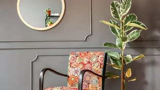
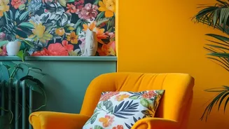
like a sofa are in neutral shades—such as creams, greys, or soft whites—you create a visual resting place for the eye. This prevents the room from feeling busy or overwhelming. A vibrant, psychedelic-print armchair, for example, looks intentional and chic against a simple beige wall, but it might get lost or feel jarring in a room where everything is competing for attention. This neutral foundation allows the pattern's personality to shine through without creating clutter.
Choose Your 'Hero' Pattern
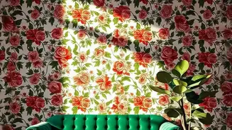
Instead of using several bold patterns at once, select one 'hero' print to be the focal point of the room. This could be a large-scale floral wallpaper on an accent wall, a set of curtains with a mesmerizing geometric design, or an eye-catching area rug. Popular retro choices include large paisley motifs, abstract shapes, checkerboard prints, and nature-inspired florals in earthy tones like avocado green, burnt orange, and mustard yellow. By committing to one primary pattern, you give the room a clear design direction. All other elements in the space should then serve to complement this main feature. This approach creates a powerful visual impact while maintaining a sense of order and sophistication.
The 80/20 Guideline
A helpful guideline used by many designers is the 80/20 rule, which can be adapted for patterns. Aim for about 80% of your room to be composed of solid, neutral, or subtly textured surfaces, with the remaining 20% dedicated to your bold retro print. Some designers suggest a more generous split, like 70/30, but the principle remains the same: solids should dominate. This ratio ensures that your chosen pattern provides a pop of energy and personality without overpowering the space. The '20%' can be concentrated in one place, like a statement rug, or distributed through smaller items like throw pillows, artwork, or a single upholstered ottoman.
Unify With a Cohesive Colour Palette
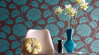
To make different elements feel like they belong together, stick to a cohesive color palette. Pull two or three key colors from your hero pattern and repeat them in solid forms throughout the rest of the room. For instance, if your retro floral print contains mustard yellow and deep teal, incorporate those colors in solid-colored cushions, vases, or a throw blanket. This simple technique creates a sense of harmony and intentionality, tying the bold pattern to the calmer, plain surfaces. It tells a consistent color story that makes the entire design feel curated and complete.
Layer with Scale and Texture
If you want to introduce a second or third pattern, the key is to vary the scale. A large, bold print pairs best with a much smaller, more subtle one, such as a delicate stripe or a small polka dot. As a general rule, try not to use more than three patterns in one space, and ensure they share that common color palette. Furthermore, plain surfaces don't have to be boring. You can add depth and interest through texture. Think of a nubby wool blanket, a smooth leather chair, or linen curtains. These textures provide richness and prevent the neutral areas of your room from feeling flat without competing with your main pattern.