





The Punctuation Police's Newest Recruit
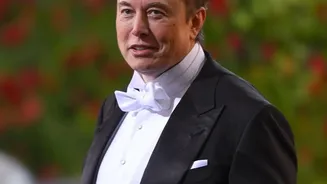
In a recent post on X, the platform he owns, Elon Musk weighed in on the finer points of English grammar. Responding to a post that used em dashes—the long dashes used for parenthetical phrases—Musk suggested the rules of English need an update. He argued
that spaces should be added around em dashes because, without them, they can resemble hyphenated words. He then went a step further, stating, 'Also, “—” is an unpleasantly long a line. The en dash, “–“, is a better length'. In an instant, the billionaire tech mogul had waded into one of the most niche but fiercely contested battles in the world of typography: the war of the dashes.
A Tale of Three Dashes
For many, a dash is just a dash. But in the world of professional writing and design, there are critical differences. The shortest mark is the hyphen (-), which is used to join words together (like 'state-of-the-art') or break a word at the end of a line. Then come the two main contenders in this debate. The en dash (–) is traditionally the width of the letter 'n' and is used to indicate a range of values, like 'pages 10–20' or a 'Delhi–Mumbai flight'. The em dash (—), meanwhile, is the longest of the three, roughly the width of the letter 'm'. Its primary job is to create a strong break in a sentence, setting off a phrase for emphasis or to add an explanation—much like parentheses, but with more drama.
The Case for the Dramatic Em Dash
The em dash is a favorite of writers who want to inject rhythm and voice into their prose. It allows for a sudden, sharp interruption or a trailing thought, creating a more conversational and energetic tone. Think of it as a dramatic pause. Style guides like The Chicago Manual of Style, a bible for many in book publishing, have long advocated for the em dash, specifically without spaces on either side. This 'closed' style is meant to create a seamless, if emphatic, connection between clauses. For its fans, the em dash isn't just punctuation; it's a powerful stylistic tool for controlling the pace and flow of a sentence, a function the shorter, more utilitarian en dash simply can't replicate with the same flair.
Musk’s Point: The Clean, Uncluttered En Dash
Musk is not alone in his preference for a shorter dash. His argument that the en dash is 'easier on the eye' aligns with a school of thought in typography that prioritizes a clean, even-textured page. The influential typographer Robert Bringhurst, in his book 'The Elements of Typographic Style', recommends using a spaced en dash ( – ) instead of a closed em dash (—). The argument, echoed by Musk, is that the long, unspaced em dash can be visually disruptive, creating what some designers call 'typographic rivers' or just an unpleasantly dense mark in a block of text. Many newspapers and publications that follow the AP style guide also prefer to put spaces around an em dash, suggesting a broader discomfort with the dense, unspaced version.
The Great Style Divide
Ultimately, the debate isn't about a right or wrong answer but a difference in stylistic conventions. Editorial style guides (like Chicago) often focus on grammatical function, while typographic style guides (like Bringhurst's) focus on visual harmony. The rise of digital media has further complicated things. On websites and mobile screens, the difference between the dashes can be less clear, and not all keyboards make the en dash easy to find. This has led to a freefall in many corners of the internet, where double hyphens (--) are still used as a standin for a proper dash—a holdover from the typewriter era. Some have also noted that AI‐generated text tends to overuse em dashes, leading some human writers to avoid them to prove their authenticity.