

The Golden Rule of Balance
Decorating with vintage patterns—be it floral wallpaper, a paisley rug, or striped upholstery—infuses a space with personality and history. These elements tell a story and create a collected-over-time feel. However, the biggest mistake in vintage-inspired
design is visual overload. When too many patterns compete for attention, the room can feel chaotic and cluttered rather than charming. That’s why the most important rule is to balance busy patterns with solid, plain surfaces. These quiet areas give the eyes a place to rest, allowing your chosen patterns to truly shine instead of getting lost in the noise. Think of plain surfaces as the supporting cast that makes your 'hero' patterns the star of the show.
Start with a Hero Piece
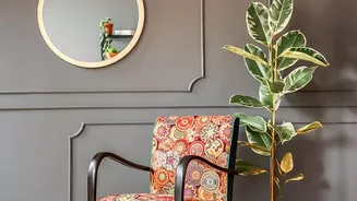
To avoid a jumbled look, begin by choosing one dominant, large-scale pattern that you absolutely love. This will be your 'hero' piece and the focal point of the room. It could be a statement vintage-style rug with a bold medallion design, an armchair upholstered in a dramatic floral, or an accent wall covered in retro wallpaper. Once you have this main pattern in place, it becomes the anchor for the rest of your design decisions. Building the room around a single statement piece is far easier than trying to make multiple, competing bold patterns work together from the start. This focal point sets the tone and the colour palette for the entire space.
Let Plain Surfaces Do the Heavy Lifting
Plain surfaces are your most powerful tool for achieving balance. This doesn't mean your room has to be boring. Use solid colours on the largest surfaces to create a calming backdrop. Neutral-coloured walls in shades of white, beige, or grey provide a versatile canvas that allows your patterns to pop. Large furniture items, like a sofa or a large cabinet, are also excellent candidates for solid colours. These substantial pieces provide visual weight and a sense of order, preventing the patterns from taking over completely. If you have patterned curtains, consider a solid-coloured sofa. If your rug is busy, keep the walls simple. This give-and-take is what creates a harmonious interior.
The 60-30-10 Guideline for Patterns
A helpful interior design principle to follow is the 60-30-10 rule, which can be adapted for patterns. Let 60% of your room be a dominant solid colour—this includes your walls and large furniture. Let 30% be a secondary pattern or texture; this could be your curtains or an accent chair. The final 10% is for your boldest accent pattern, which you can use on smaller items like throw pillows, lampshades, or decorative objects. This framework encourages a layered approach. You can mix patterns, but by varying their scale and prevalence, you ensure they complement rather than clash. For instance, a large floral print (10%) works well with a smaller, more subtle stripe (30%) when both are set against a solid backdrop (60%).
Incorporate Calming Textures
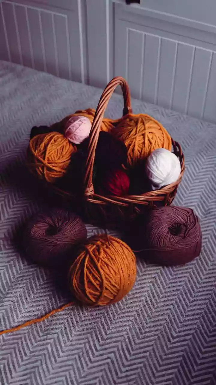
A plain surface doesn't have to be flat or uninteresting. Layering different textures is a sophisticated way to add depth without adding more patterns. Think of a plush velvet sofa, a chunky knit throw blanket, woven baskets, or the smooth finish of a wooden coffee table. These textural elements provide visual interest and a tactile quality that enriches the room. They function almost like subtle patterns, breaking up the monotony of a solid colour without creating the busyness of a print. Aged finishes like distressed wood or metals such as brass and copper also contribute to the vintage feel while providing a sense of calm complexity.