




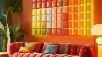
Understanding Palette Balance
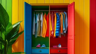
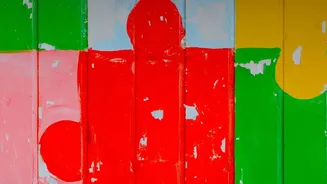
Palette balance is the art of combining colours so they feel harmonious rather than haphazard. It’s not just about picking shades you like; it’s about how those colours interact to create a specific mood and visual structure. In colour-blocking, where
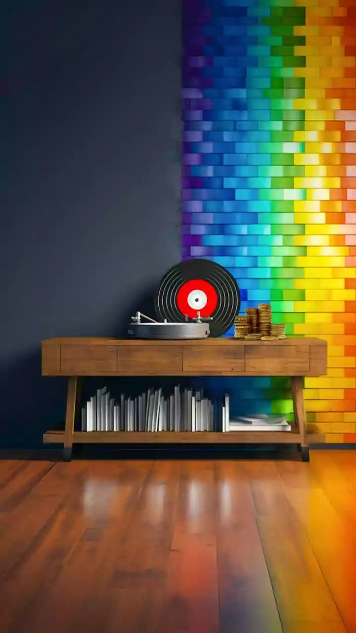
large, solid fields of colour are placed next to each other, balance is everything. An unbalanced palette can make a space feel disjointed or visually heavy. The goal is to create a scheme where each colour has a clear role, resulting in a cohesive and intentional look that guides the eye through the room.
The 60-30-10 Rule: A Designer’s Blueprint
A classic guideline for achieving colour balance is the 60-30-10 rule. This principle suggests your palette should be composed of three parts: 60% dominant colour, 30% secondary colour, and 10% accent colour. For a colour-blocked wall, your dominant shade might be the room's main wall colour or largest block. The secondary colour would take up a smaller, but still significant, portion, providing contrast or harmony. The final 10% is your accent—a bold or bright pop of colour used sparingly to add personality and a focal point. This formula provides a structured approach that prevents any single colour from overwhelming the space.
Choosing Your Colour Story
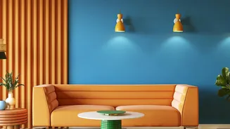
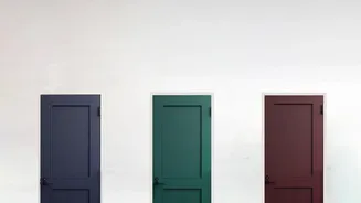
The first step is deciding on the relationship between your colours. You might opt for a monochromatic scheme, using different tones of the same colour for a subtle, layered effect. An analogous palette uses colours that sit next to each other on the colour wheel (like blue and green), creating a serene and harmonious look. For a high-impact, dramatic statement, a complementary scheme uses colours from opposite sides of the colour wheel, such as blue and orange or purple and yellow. It is generally advised to stick to no more than three main colours to keep the look clean and intentional.
Weight, Temperature, and Tone
Beyond the basic hue, consider the 'feel' of your colours. Warm tones (reds, oranges, yellows) tend to feel energising and intimate, while cool tones (blues, greens, purples) create a sense of calm and openness. Balancing warm and cool tones can create depth. Similarly, pay attention to undertones; a grey with blue undertones will feel different from one with green undertones. Darker, more saturated colours feel visually 'heavier' than light, airy pastels. A successful colour-blocked design often balances these weights, for instance by using a darker colour on the bottom half of a wall to ground the space and a lighter one on top to create a sense of height.
Beyond Paint: The Role of Texture and Finish
Palette balance isn't just about colour; it's also about texture and finish. The same shade can look dramatically different depending on the surface and how it reflects light. A matte finish absorbs light and gives colours a soft, muted appearance, while a satin or glossy finish is reflective, making colours appear brighter and more intense. Incorporating different finishes can add subtle depth. Likewise, the texture of the wall itself—whether it's perfectly smooth or slightly rough—will create highlights and shadows that alter colour perception. Combining a smooth, matte block with a textured one can add a tactile dimension to your design.
Shapes and Placement Matter
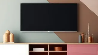
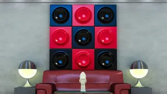
Finally, the shapes you create and where you place them are crucial for balance. Colour-blocking can be used to highlight architectural features, create a focal point, or even carve out a 'zone' in an open-plan room. You can use painter's tape to create crisp, geometric shapes for a modern look. A single, bold shape on a neutral wall can have a huge impact. Consider how the shapes relate to the room's furniture and overall flow. Whether you choose symmetrical stripes or an organic, free-form design, the goal is to create a composition that feels deliberate and integrated into the space.