





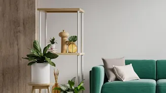
Identify Your Room’s Dominant Colours
Before you start shopping, take stock of your room's primary and secondary colours. Look at your walls, large furniture pieces like sofas and rugs, and curtains. These form your foundational palette. Is your room dominated by cool tones like grey, blue,
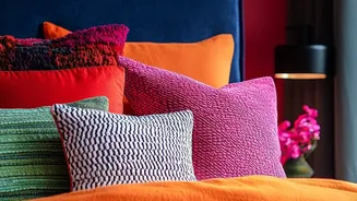
or crisp white? Or is it warmer, with shades of cream, beige, or terracotta? Identifying this main colour story is the first step. This doesn't mean you have to match everything perfectly; it’s about understanding the environment your new basket will live in. Don't forget to consider smaller accent colours in pillows, artwork, or hardware, as these can provide a wonderful opportunity for a basket to tie the room together.
Understand the Undertones of Natural Fibres
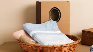
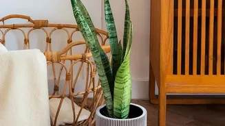
Not all natural fibres are the same. A common mistake is to think of all baskets as just 'brown' or 'tan'. In reality, materials like seagrass, rattan, jute, and wicker have distinct undertones. Some baskets have a golden or yellow hue, which works beautifully in warm, sunny rooms. Others might have a cool, greyish or ashy undertone that pairs perfectly with modern, minimalist, or Scandinavian aesthetics. There are also baskets with reddish or orange undertones, which can add a rustic, earthy feel. When choosing, hold the basket up to other items in your home if possible, or compare it closely online to your room's colours. This will help you see if the undertones clash or harmonize.
Choose Between Harmony and Contrast
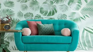
Once you understand your room's palette and the basket's undertones, decide on your goal: do you want harmony or contrast? For a harmonious, serene look, choose a basket with undertones that match your dominant wall or furniture colour. For example, a light, ashy-toned basket will blend seamlessly into a room with cool grey walls. This creates a calm, layered effect. Conversely, if you want the basket to be a statement piece, opt for contrast. A dark, richly-toned basket can create a dramatic focal point against a crisp white wall. Similarly, a vibrant, colourful woven basket can inject energy into a neutral space. This is all about balancing visual weight and making a deliberate design choice.
Don't Underestimate Texture and Weave
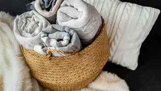
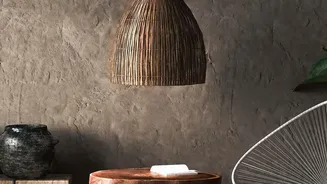
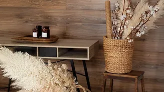
Colour is only part of the story; texture plays a huge role in how a basket interacts with a room. The intricate patterns of a woven basket add depth and visual interest that paint alone cannot. A tightly woven, smooth basket can feel more modern and sleek, while a chunky, open-weave basket provides a more rustic, casual vibe. This texture can either complement or contrast with the other surfaces in your room. For example, placing a rough, natural basket on a smooth, polished concrete floor creates a beautiful tactile contrast. When mixing and matching different baskets, using varied textures and weaves can make the collection feel more curated and dynamic.
A Quick Pairing Guide for Common Colours
To make it even simpler, here are some go-to pairings for popular wall colours: For White or Cream Walls: You have immense flexibility. Golden or honey-toned baskets add warmth, while dark brown or black baskets create a striking graphic contrast. For Grey Walls: Look for baskets with cool, ashy undertones to blend in. For a pop of warmth, a basket with a slight golden or reddish tone can work, provided it connects to another warm element in the room, like wood furniture. For Blue Walls: Sandy-beiges and light, natural tones evoke a coastal feel. Darker, espresso-coloured baskets can also ground a blue room and add sophistication. For Earthy Green or Terracotta Walls: Lean into the warmth with baskets in similar deep, rich tones. Rattan and water hyacinth, which often have warmer hues, are excellent choices here to create a cohesive, nature-inspired look.