
Start with a Plan
Before you start buying paint and furniture, it's helpful to pick a specific era as your inspiration. The colours that defined the opulent 1920s are very different from the earthy, laid-back tones of the 1970s. Focusing on one period will help you create
a cohesive look rather than a chaotic mix. Once you have a decade in mind, consider the 60-30-10 rule. This timeless design principle suggests that 60% of your room should be a dominant colour (like the walls), 30% a secondary colour (furniture and textiles), and 10% an accent colour (decor and art). This framework is perfect for balancing the often-bold palettes of vintage styles.
Art Deco Decadence (1920s-1930s)
The Art Deco period was all about luxury, glamour, and optimism. Its colour palette is dramatic and bold, favouring deep, saturated jewel tones. Think emerald green, sapphire blue, ruby red, and rich plum. These colours were often contrasted with high-shine metallics like gold, chrome, and brass, as well as stark black and white accents to create a feeling of drama. To bring this look into your home, consider a deep green accent wall in a living room or bedroom. Incorporate the palette through velvet upholstery on a sofa, lacquered furniture, and geometric patterned rugs. Don't forget the metallic details—a gold-framed mirror or a chrome floor lamp can serve as the perfect finishing touch.
Mid-Century Modern Mood (1950s-1960s)
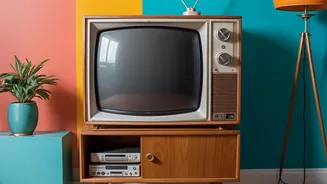
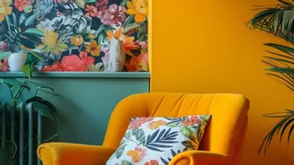
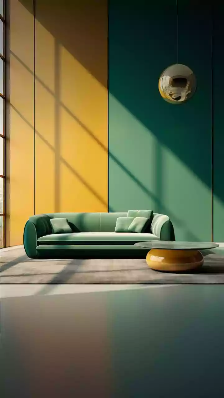
The Mid-Century Modern (MCM) aesthetic is defined by its connection to nature, clean lines, and a sense of optimism. The colour palette reflects this with a mix of earthy, warm tones and bright, playful accents. Dominant colours include earthy greens like olive and moss, warm browns found in teak and walnut furniture, and saturated hues like mustard yellow, burnt orange, and terracotta. These bolder shades are often balanced with calming neutrals like warm whites and greys. A classic way to introduce this palette is through a statement piece of furniture, such as a mustard yellow armchair. You can also paint a feature wall in a deep teal or olive green. Pair these colours with the natural grain of wood furniture and geometric-patterned textiles to achieve an authentic MCM feel.
70s Bohemian Groove (1970s)
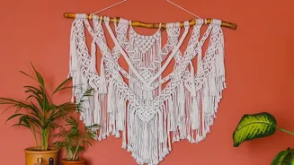
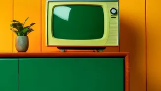
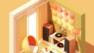
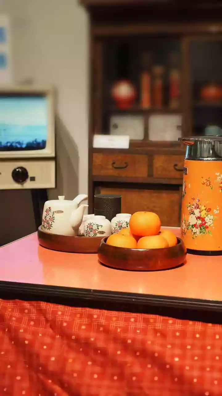
The 1970s embraced a warm, earthy, and relaxed vibe, and the era's colours reflect a return to nature. The quintessential '70s palette includes shades like avocado green, harvest gold, rust, and lots of brown. These were often combined with textures like macrame, rattan, and shag carpeting to create a cosy, layered look. To get the look today without it feeling dated, use these colours as accents. Think rust-coloured throw pillows, an avocado green planter, or a vintage rug that incorporates several of these tones. Pair these with plenty of natural materials like wood and wicker, and don't forget the greenery—houseplants were a key part of '70s decor and are essential for capturing that bohemian spirit.
Tying It All Together
No matter which era you choose, the key to a successful vintage look is balance. If you go for a bold, patterned wallpaper, keep the rest of the room relatively simple. If your walls are neutral, you have more room to play with colourful furniture and accessories. Texture is just as important as colour in creating a vintage feel; mix materials like wood, velvet, metal, and natural fibres to add depth and interest. If you're hesitant to commit, start small. Introduce a new colour palette through affordable items like throw pillows, artwork, or a small area rug. This allows you to experiment with the look before making a larger investment.