




What is Colour-Blocking?
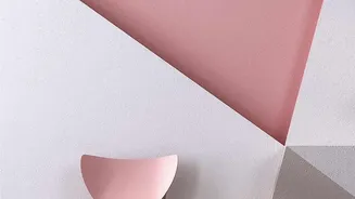
Colour-blocking is an interior design technique that uses two or more solid blocks of colour to create a graphic, high-impact effect. The trend, which has roots in the art of painters like Piet Mondrian and 1960s fashion, has become a popular way to transform
a room affordably. The idea is to use contrasting or complementary hues to define spaces, create a focal point, or simply add a dose of creativity to a plain wall. It's not about random splashes of colour, but a deliberate placement of shapes—like rectangles, arches, or stripes—to build a cohesive and striking visual statement.
The Case for Paint: An Architectural Statement
Using paint is the most direct way to achieve a colour-blocked look. This method allows you to make a bold, architectural statement that feels fully integrated with your space. You can paint geometric shapes, create a two-tone split wall, or even wrap colour around a corner to define a specific zone, like a reading nook or home office area. It’s a fantastic way to highlight features like doorways or create the illusion of height by using a darker shade on the bottom half of a wall and a lighter one on top. Getting started is a beginner-friendly DIY project. With painter's tape, a level, and a couple of paint colours, you can design a bespoke mural that's entirely your own. This approach is perfect for homeowners who are ready to commit to a look and want to make a lasting, high-impact change.
The Case for Framed Art: Flexible and Textured
If the idea of painting geometric shapes directly onto your walls feels too permanent, framed art offers a wonderfully flexible alternative. By grouping together artworks with solid blocks of colour, you can create a gallery wall that mimics a colour-blocked effect. This approach has several advantages. It's ideal for renters or for those who enjoy frequently changing their decor. You can experiment with different arrangements and colour combinations without the commitment of paint. Furthermore, using art adds texture and allows you to introduce patterns or subtle gradients within your colour blocks. You can even create your own colour-blocked art by painting over thrifted prints or creating a 'dipped' effect on existing photos and frames. This method allows for a more layered and easily adaptable take on the trend.
Paint vs. Art: Which Is Right for You?
Deciding between paint and art comes down to your personality, lifestyle, and home. Choose paint if you are decisive and want to create a strong, architectural focal point that defines the room's character. It’s a commitment, but one that delivers a powerful, seamless look. Choose framed art if you value flexibility and want the freedom to evolve your decor. It’s perfect for renters, those who are still experimenting with their style, or anyone who wants to start small. A gallery wall can be built over time and rearranged whenever you crave a refresh. Art also allows you to ground the trend by tying into the colours of your furniture and textiles.
Tips for Choosing Your Palette
Whether you choose paint or art, your colour selection is key. A common rule of thumb is to stick to two or three main colours plus a neutral to keep the look intentional rather than chaotic. For a harmonious scheme, consider the 60-30-10 rule: 60% of the space is a dominant colour, 30% is a secondary colour, and 10% is a small pop of an accent colour. You can find inspiration from the colour wheel—pairing complementary colours like blue and orange creates high contrast, while using different tones of the same colour results in a softer, monochromatic look. Don't be afraid to try unusual combinations; sometimes the most unexpected pairings, like saffron and a soft neutral, can be the most effective.