



Beyond Bold Stripes
For years, colour-blocking in home decor has meant pairing two or more distinct, solid colours to make a statement. Think of a wall split in half with contrasting paints or a series of vibrant geometric shapes. This technique is beloved for its ability
to create a focal point, define a space, or simply inject a dose of playful energy. While still popular, the trend is evolving. The new approach isn't just about choosing colours that pop; it's about arranging them with a sense of visual equilibrium, creating a composition that feels intentional, artistic, and balanced.
The Core Idea: Palette Balance
Palette balance is about treating your wall like a canvas and considering the 'visual weight' of each colour. Visual weight refers to how much a specific element draws the eye. A small, bright shape can feel as 'heavy' as a large, pale one. Achieving balance means these different weights work together in harmony, so the overall design feels cohesive rather than chaotic or lopsided. This fresh angle moves beyond rigid, symmetrical blocks and embraces more dynamic, artistic arrangements.
A Framework: The 60-30-10 Rule
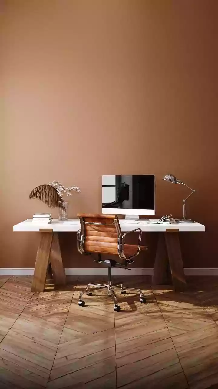
A classic interior design principle, the 60-30-10 rule, is a perfect starting point for achieving palette balance. It provides a simple formula for creating a harmonious scheme. Your dominant colour should take up about 60% of the space, typically on the walls, setting the overall mood. The secondary colour comprises 30%, often found in furniture, curtains, or a large secondary block of colour. Finally, a 10% accent colour adds that final pop through smaller decor items or a sharp, focused block of paint. This hierarchy ensures that no single colour overwhelms the space.
Embrace Asymmetrical Design
The real game-changer in modern colour-blocking is the use of asymmetrical balance. Instead of mirroring shapes and sizes, this approach involves arranging different elements to achieve equilibrium. Imagine a large, sweeping curve of a soft, neutral beige on one side of a wall. To balance it, you wouldn’t add another identical curve. Instead, you might place a much smaller, intensely saturated block of navy or terracotta on the opposite side. The smaller, bolder colour carries enough visual weight to balance the larger, paler shape, creating a design that feels more organic and visually interesting.
The Role of Texture and Sheen
Balance isn't just about colour; it's also about texture and finish. A flat, matte paint absorbs light and feels visually lighter, while a high-gloss or metallic finish reflects it, making colours feel more energetic and 'heavy'. Incorporating different textures can add depth and prevent your design from looking flat. For instance, you could pair a large block of matte paint with a smaller, textured wallpaper panel or a high-gloss accent shape. This interplay between surfaces adds a sophisticated, tactile layer to your wall art, enhancing the overall balance.
Making It Work On Your Walls
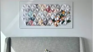
Ready to try it? Start by sketching your design, considering existing furniture and room features. Use architectural elements like alcoves or archways as natural starting points for your colour blocks. You can create abstract, free-flowing shapes for an artistic look or use painter's tape to define crisp, geometric forms. Consider using a tonal approach, applying different shades of the same colour family for a subtle, layered effect. You could also use multiple canvases or panels to create a single, cohesive colour-blocked piece that can be moved or reconfigured later.