



The Power of the Pattern
From the intricate florals of Victorian parlours to the graphic geometrics of the Art Deco era, patterns have always been a powerful tool for adding character to a room. They introduce movement, texture, and a focal point, preventing a space from feeling
one-dimensional. The beauty of vintage-inspired design is its versatility. You can choose to make a dramatic statement with a large-scale, colourful pattern or create a serene backdrop with something more muted and delicate. The key is understanding how to harness their power to reflect your taste, creating an atmosphere that is both personal and inviting.
Go Bold: Damask and Daring Florals
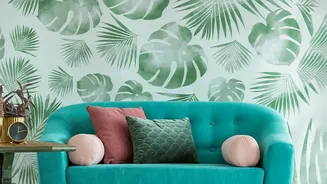
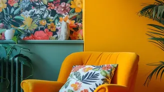
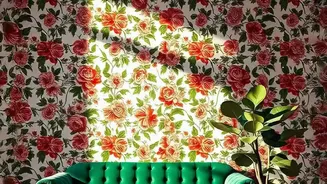
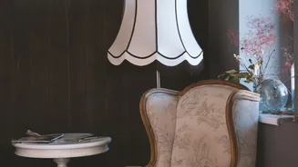
For those who believe more is more, bold vintage patterns offer an immediate dose of glamour and confidence. Damask, with its rich history dating back centuries, is a prime example. Characterised by its reversible, swirling motifs woven directly into the fabric, damask brings an undeniable elegance to any space. It works beautifully on an accent wall, as upholstery on a statement chair, or across a luxurious area rug. Similarly, large-scale floral prints can energise a room. Think bold, expressive botanicals on wallpaper or curtains. These patterns act as artwork, turning a simple wall or window into a stunning feature. When using such strong designs, it helps to keep surrounding furniture and decor relatively simple to let the pattern take centre stage.
Embrace the Subtle: Toile and Paisley
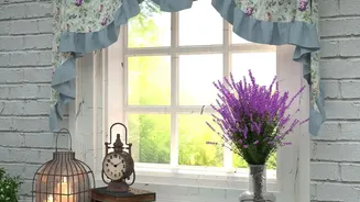
If your style leans more towards understated elegance, subtle vintage patterns provide texture and interest without overwhelming the senses. Toile de Jouy, often shortened to just 'toile', is a classic French pattern from the 18th century. It typically features a single-colour pastoral or narrative scene repeated on a cream or white background. This delicate, almost storybook-like quality makes it perfect for creating a soft, romantic atmosphere in bedrooms or sitting areas. Paisley is another pattern that can be used subtly. While it can be bold, versions with a smaller scale or a tonal colour palette add a sophisticated, bohemian touch to textiles like throw pillows, bedding, and light upholstery. These quieter patterns are ideal for layering and add a sense of history and charm.
Get Graphic with Geometric Prints
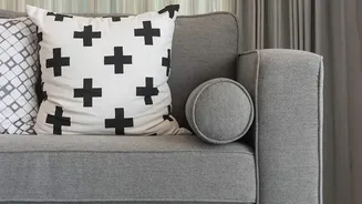
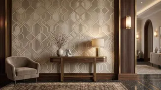
For a retro feel that channels the mid-century modern and Art Deco periods, geometric patterns are a perfect choice. Think repeating squares, circles, zigzags, and abstract lines. These patterns can be both bold and subtle depending on the scale and colour palette. A black-and-white checkerboard floor, for example, is a classic vintage statement that feels fresh again. Art Deco designs often feature sleek, symmetrical lines and high-contrast colours that exude sophistication. You can introduce these patterns through tiles, wallpaper, or even a statement rug. When paired with clean-lined furniture, geometric prints create a look that is both nostalgic and strikingly modern.
Tips for Mixing and Matching
The art of using vintage patterns often involves learning how to mix them. To do so successfully, start by establishing a cohesive colour palette. Choose two or three main colours and ensure they appear across the different patterns you select. This will tie the look together, even if the prints themselves are very different. Another key tip is to vary the scale. Combine a large, dominant pattern with smaller, more intricate ones. For example, a sofa with a bold floral print can be paired with cushions in a small stripe or geometric design. Finally, balance busy patterns with solid colours. These solid 'resting points'—whether a plain rug, solid-coloured curtains, or a neutral wall—give the eye a place to land and prevent the overall design from feeling chaotic.