



The Powerful ‘Pretty is Healthy’ Illusion
We have all heard the saying 'we eat with our eyes first,' but research shows this goes far beyond simple appetite. A growing body of evidence reveals a strong psychological link between a food's aesthetic appeal and its perceived healthiness. This phenomenon,
often called the 'health halo effect', can make us believe that beautifully presented food is more nutritious, lower in calories, and more natural than the exact same ingredients presented messily. Studies show that when food is arranged in a neat, orderly, or symmetrical pattern, people consistently rate it as healthier. This bias is so strong that it can even influence how much people are willing to pay for a dish, with attractively plated meals commanding higher prices based on this perceived health boost.
The Cues That Trick Our Brains
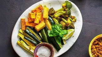
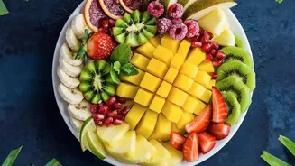
Our brains use mental shortcuts, or heuristics, to make quick judgments, and food is no exception. Several specific visual cues have been identified as key triggers for the 'pretty is healthy' bias. One of the most powerful is order. A study involving avocado toast found that when the avocado was sliced and arranged in a neat pattern, participants perceived it as significantly healthier and more natural than when the avocado was simply smeared on the bread, even though they knew the ingredients were identical. Another cue is what researchers call 'classical aesthetics'—patterns like symmetry and order that are common in nature. Because we associate nature with health, food that mimics these patterns gets an undeserved health halo. Interestingly, this doesn't apply to 'expressive' aesthetics, like cutting food into fun shapes, which doesn't trigger the same naturalness and healthiness perception.
The Potent Role of Colour and Garnish
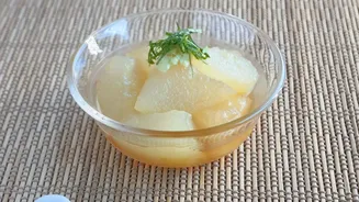
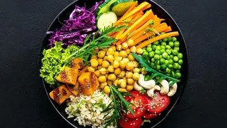
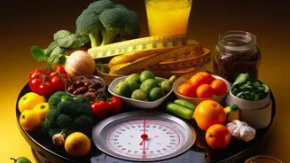
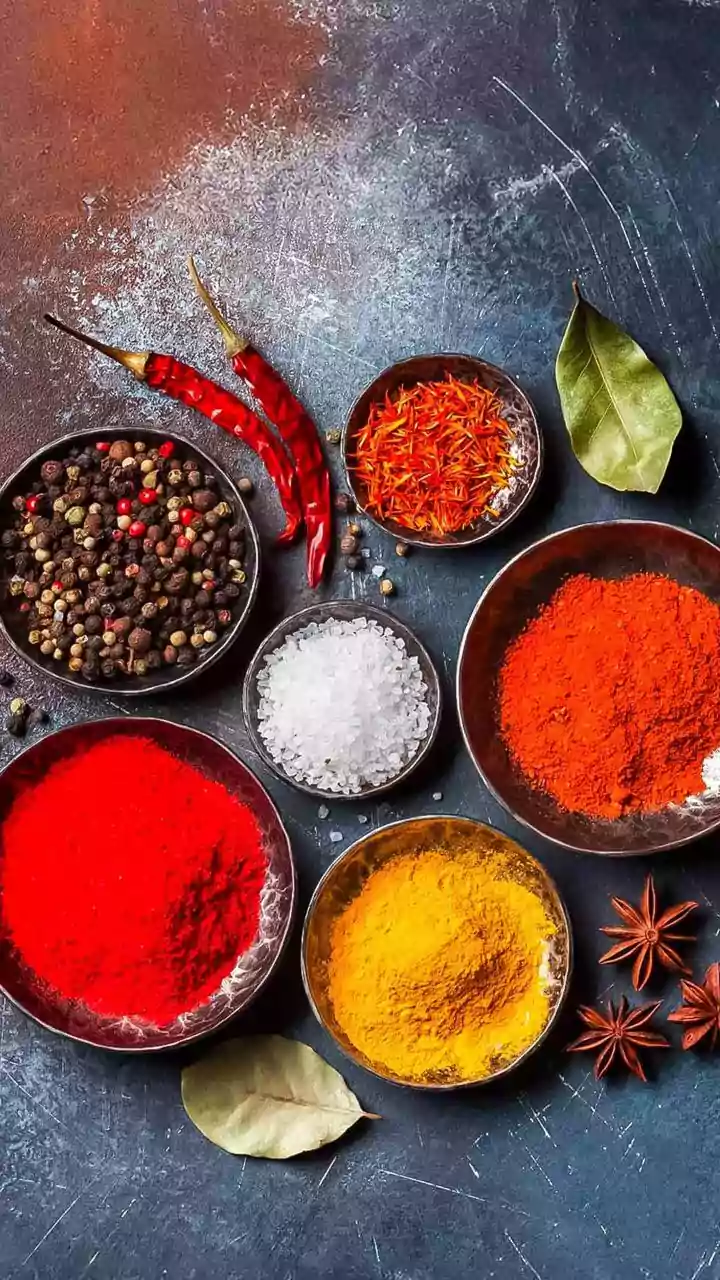
Colour is another major factor in our perception of health. For instance, the colour green is so strongly associated with health that adding a green element can make an entire dish seem more wholesome. This is something chefs and food marketers have long known. A sprinkle of parsley or a few artfully placed microgreens can elevate a dish’s perceived health value. Similarly, packaging for snacks and beverages often uses fruit imagery or green colour schemes to enhance perceived healthiness, regardless of the actual nutritional content. While eating a 'rainbow' of colourful, plant-based foods is genuinely good for health due to the different phytonutrients each colour provides, the visual cue of colour alone can be misleading when it is just a garnish or part of processed food packaging.
From Plating to Calorie Miscalculation
This perception gap doesn't just affect our opinion; it affects our behaviour. The perceived healthiness of a dish often leads to a critical miscalculation: underestimating its calorie count. In one study, people were more likely to incorrectly identify a pretty dish as the lower-calorie option, even when it cost them money to be wrong. This happens because our brains mistakenly bundle the idea of 'pretty' and 'natural' with 'low-calorie.' A recent study from Japan highlighted this by looking at sauce presentation. Diners perceived a dish as significantly healthier when the sauces were placed separately on the plate rather than drizzled all over it, suggesting that 'minimal' or 'clean' plating signals health. This can be deceptive, as rich sauces and dressings, even when placed on the side, can add substantial calories, fat, and sugar to a meal.