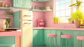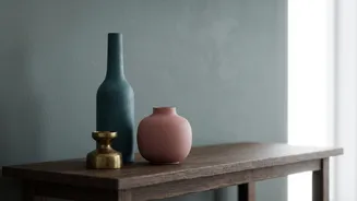




Start with a Neutral Foundation
Before you dive into bold hues, the secret to a sophisticated vintage look is starting with a neutral base. Think in terms of warm, inviting shades like cream, beige, tan, and even soft greys. These colours provide a calming backdrop that allows your
chosen vintage accents to truly shine without overwhelming the space. A neutral foundation is versatile, working for everything from the glamour of Art Deco to the earthiness of the 70s. It ensures the room feels cohesive and curated rather than chaotic, giving you the perfect canvas to layer upon.
Channel the 70s with Earthy Tones
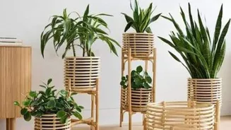
The 1970s aesthetic is making a huge comeback, defined by its connection to nature. This palette is all about warm, grounding colours that create a cosy and relaxed atmosphere. Think of shades like burnt orange, mustard yellow, olive green, and rich browns like walnut. These colours pair beautifully with natural materials such as rattan furniture, macrame wall hangings, and warm-toned wood. You can introduce these hues through an accent wall, plush velvet cushions, or a statement rug to infuse your space with a free-spirited, bohemian vibe.
Embrace Mid-Century Modern Optimism
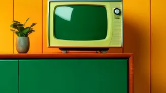
The mid-century modern era was defined by clean lines, organic forms, and a wonderfully optimistic colour palette. Classic shades include earthy greens, vibrant teal, warm oranges, and iconic mustard yellow. This style is known for its expert pairing of natural wood, particularly teak and walnut, with pops of saturated colour. To get the look, you don't need to go all out. Consider a statement armchair in a bold orange, a streamlined wooden credenza, or graphic-print curtains that feature these cheerful hues. The key is balancing the playful colours with the simplicity of the furniture forms.
Go Glam with Art Deco Jewel Tones
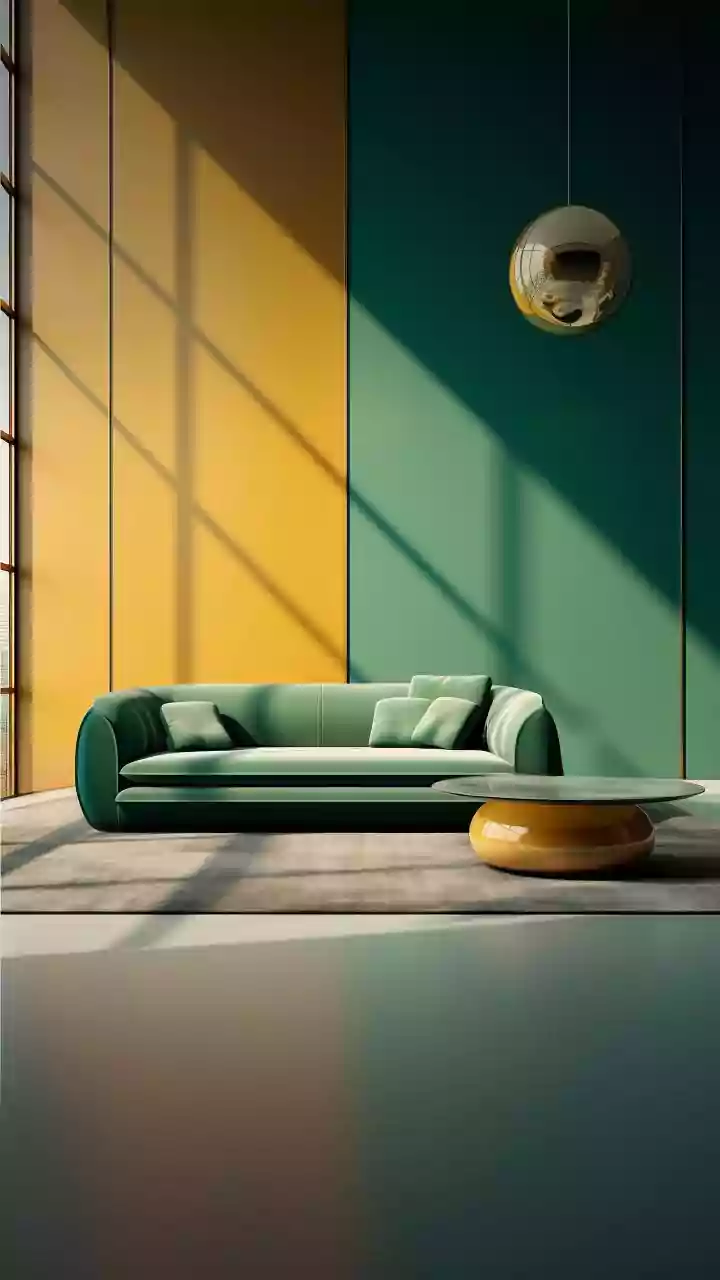
For a touch of pure luxury and drama, look to the Art Deco period of the 1920s. This style is characterized by bold, rich colours that make a strong statement. Deep jewel tones like emerald green, royal blue, and rich reds are hallmarks of this era. These vibrant shades are often punctuated with metallic accents like gold, chrome, or silver, and contrasted with black for added drama. Introduce this palette through a lacquered side table, a velvet ottoman, or even by painting a small powder room in a deep, glamorous shade of navy or green for an unexpectedly elegant touch.
Use the 60-30-10 Rule
A classic design principle that works beautifully with vintage palettes is the 60-30-10 rule. This helps create balance and visual harmony. Here’s how it works: 60% of your room should be a dominant, neutral colour (like those foundational shades we discussed). 30% should be a secondary colour, which could be your main vintage hue, like an olive green or terracotta. The final 10% is for your accent colour—a bold pop of mustard yellow or a metallic gold, for example. This structured approach allows you to play with vibrant vintage colours without them competing for attention, ensuring a polished and intentional look.
Incorporate Colour Through Textiles and Accessories
If painting walls feels too permanent, textiles and accessories are your best friends for experimenting with vintage colours. It's a low-commitment way to bring in character. Think about adding throw pillows, curtains, or a patterned rug in a classic mid-century or bohemian design. Scour thrift stores or antique shops for smaller decor items like coloured glassware, vintage posters, a lava lamp, or even a rotary phone for a truly nostalgic touch. These small details can collectively build a strong vintage aesthetic and tell a story, adding personality and charm to your space.