


The Art of Colour
The colour of your planter is the first thing people notice, and it's your best tool for integrating a plant into your decor. The goal is harmony, not competition. Neutral tones like white, grey, beige, or black are a timeless choice; they provide a clean
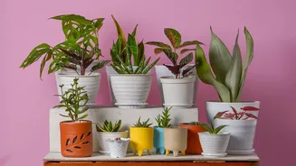
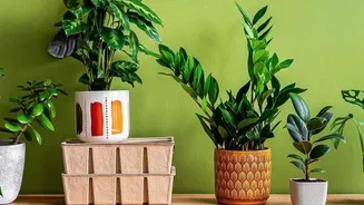
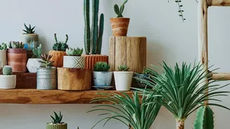
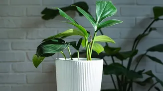
backdrop that makes the green foliage pop and allows the plant to be the star. A crisp white pot has a modern, minimalist feel, while earthy terracotta or warm beige can create a serene, natural ambiance. If your room's decor is largely neutral, a brightly coloured pot can act as a vibrant accent piece, but it should still connect to your overall scheme. Consider picking a planter colour that echoes an accent colour already in the room, such as from throw pillows or artwork, to create a cohesive feel.
Complementary and Contrasting Hues
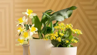
Colour theory offers a simple guide for more intentional pairings. For a bold statement, choose a complementary colour—one that sits opposite your plant's main colour on the colour wheel. For most green plants, this means pots in shades of red or pink, which create a striking contrast. For a more subtle and calming effect, an analogous scheme using colours next to each other on the wheel works well. For a green plant, this could mean a blue or yellow-green pot. You can also consider the plant's own variegation or flower colour. A pot that picks up on the subtle pink tones in a calathea's leaves, for instance, creates a sophisticated and unified look.
Mastering Shape and Form
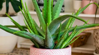
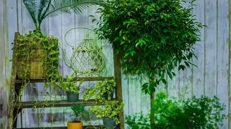
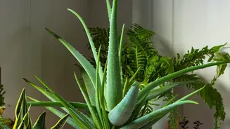
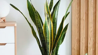
The shape of the planter should complement the natural growth habit of the plant. A tall, upright snake plant, for example, can look visually unbalanced in a tall, narrow pot; it often looks more anchored and stable in a lower, wider container. Conversely, trailing plants like pothos or string-of-pearls benefit from height. Putting them in a tall planter or a hanging basket allows their vines to cascade downwards, creating a beautiful flowing effect that would be lost in a low pot. For plants with a clumping, rounded growth habit, like many ferns, a round pot mirrors their natural shape beautifully. Sharp, angular pots tend to lend a more modern, architectural feel, while soft, rounded pots create a calmer, more organic impression.
Getting the Scale Just Right
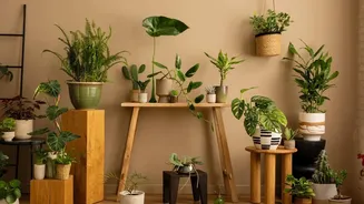
Scale is about the relationship between the planter, the plant, and the surrounding space, including furniture. A common mistake is using too many small pots in a large space, which can look cluttered and visually insignificant. Often, fewer, larger pots create a calmer and more impactful statement. As a general rule for plant-to-pot ratio, the planter should be about one-third of the total height of the plant and planter combined. For the pot's width, choose one that is 1-2 inches wider in diameter than the plant's nursery pot for smaller plants, and 2-3 inches wider for larger ones, to give roots room to grow.
Matching Planters to Furniture
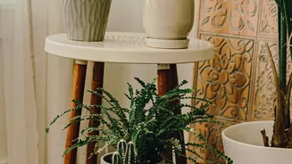
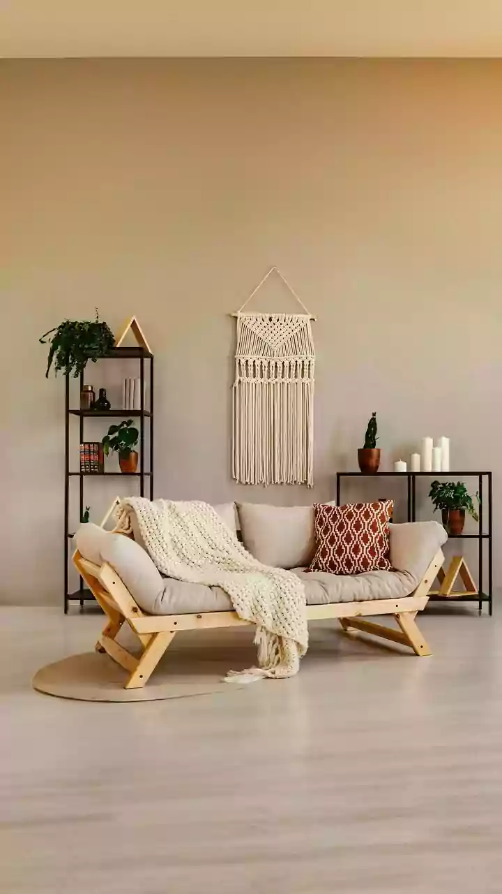
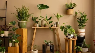
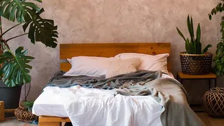
The planter is the bridge between the plant and your furniture. Its scale should feel appropriate for the furniture it's near. A tiny pot next to a large, overstuffed sofa will look lost. That same corner might need a large floor planter to feel balanced. Medium-sized planters are perfect for placing on consoles or side tables, filling the visual space between tabletop decor and larger furniture. Also, consider matching materials and styles. Sleek, minimalist planters work well with modern metal furniture, while textured terracotta or woven baskets complement rustic or bohemian wicker pieces. Positioning planters near furniture with similar design elements creates a harmonious and intentional look.