

Start with a Strategy: The 60-30-10 Rule
Integrating new colours can feel daunting, but a classic design principle makes it manageable. The 60-30-10 rule provides a simple framework for a balanced room. Your dominant colour, often a neutral like warm white or soft grey, should cover about 60%
of your space (think walls and large furniture). Your secondary colour takes up 30%, which is where your main vintage hue can shine—perhaps through an accent wall or a significant piece like a sofa. Finally, 10% is for accents. This is your chance to introduce a complementary vintage shade through cushions, art, and decor. This measured approach prevents the vintage tones from overwhelming the modern aesthetic, creating harmony rather than a chaotic clash.
Embrace Earthy Tones of the '70s
The warm, grounded colours of the 1970s are incredibly versatile in a modern context. Think mustard yellow, terracotta, olive green, and burnt orange. These shades bring an immediate sense of warmth and cosiness. Mustard yellow, in particular, adds energy without being aggressive. It pairs beautifully with the natural materials common in today's decor, like warm woods and linen. Try painting a single feature wall behind a sofa in a matte mustard or terracotta. Then, layer in the other tones through textiles. A mustard cushion on a grey sofa, a terracotta pot holding a plant, or an olive green throw blanket can tie the room together, creating a look that feels both earthy and sophisticated.
Introduce Rich Jewel Tones
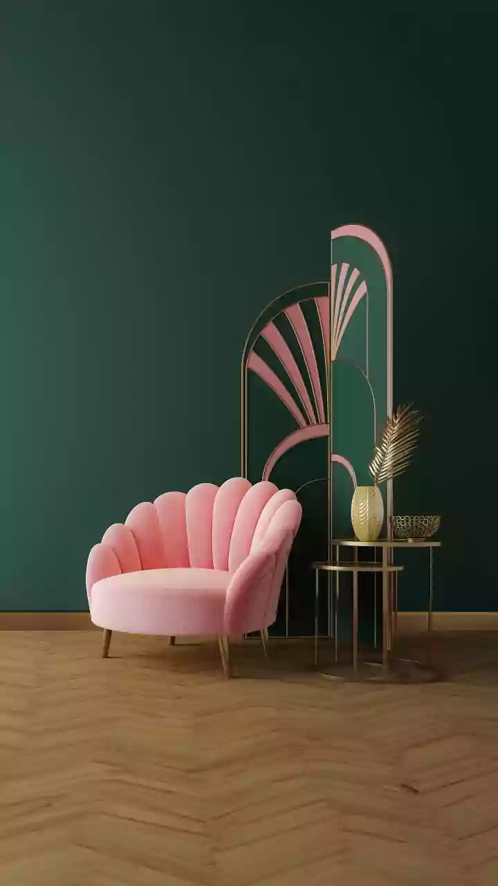
For a touch of opulence and drama, look to the jewel tones that defined eras like the Art Deco period. Deep emerald green, sapphire blue, ruby red, and rich burgundy can infuse a modern space with luxurious depth. Because these colours are so saturated, they work best as accent shades that command attention. Consider a pair of velvet armchairs in emerald green to anchor a neutral living room, or a lacquered sideboard in a deep royal blue. If you're hesitant to commit to furniture, start smaller. Velvet cushions, a patterned rug featuring these deep hues, or even a bold piece of abstract art can serve as striking focal points against a backdrop of cream, beige, or charcoal grey.
Don't Underestimate Muted & Dusty Hues
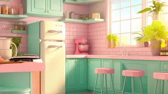
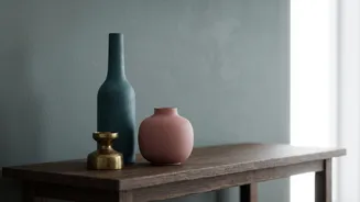
Not all vintage colours are bold. Many classic palettes are defined by their soft, desaturated quality, which gives them a timeless and calming feel. Colours like dusty rose, sage green, and faded teal can introduce a gentle, nostalgic vibe without disrupting a minimalist or contemporary design. These shades are often easy to incorporate on a larger scale. For instance, kitchen cabinets painted in a muted sage green can feel both current and classic. In a bedroom, dusty pink or soft lavender can create a serene and welcoming atmosphere. These colours work well when layered with other soft textures and natural materials, such as light woods, rattan, and bouclé fabrics, enhancing their gentle, time-worn character.
Ground the Look with the Right Neutrals
The secret to making vintage colours work in a modern home often lies in the neutrals you pair them with. Stark, cool whites can make warm vintage tones like mustard look out of place. Instead, opt for warmer neutrals like cream, beige, taupe, and warm greys. These off-white and earthy neutrals share a similar underlying warmth with many vintage palettes, creating a more cohesive and intentional look. A warm cream on the walls provides a perfect canvas for a burgundy accent, while a charcoal grey sofa can make mustard yellow pillows pop. By choosing your neutrals carefully, you ensure the vintage colours feel like a sophisticated, integrated part of the design rather than a random addition.