

Establish a Cohesive Colour Palette
The single most important rule for successful pattern mixing is to establish a unified colour story. Even the most diverse patterns—from florals to geometrics to tribal prints—will feel harmonious if they share a few common colours. Start by choosing
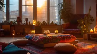
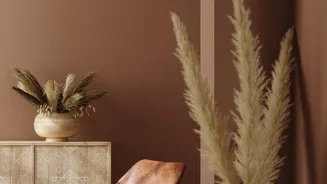
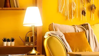
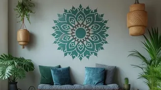
two to three main colours and one or two neutral shades like beige, cream, or soft grey. These hues should appear across your different patterned pieces, whether it’s the background of a cushion or a detail in a rug. This shared palette acts as the visual thread that ties everything together, creating a sense of intention rather than chaos.
Vary the Scale of Your Patterns
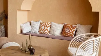
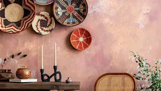
One of the most common mistakes that leads to a cluttered look is using patterns that are all the same size. When every print competes for attention at the same 'volume', the eye doesn't know where to focus. A foolproof formula is to combine one large-scale pattern, one medium-scale pattern, and one small-scale pattern. Your large-scale pattern can serve as the 'hero' piece—think of a statement rug or a bold duvet cover. Then, layer in a medium-scale print, like striped or geometric cushions. Finish with a small, more subtle pattern, such as a delicate print on a throw blanket or lampshade. This variation in scale creates visual hierarchy and rhythm.
Ground the Room with Neutrals and Solids
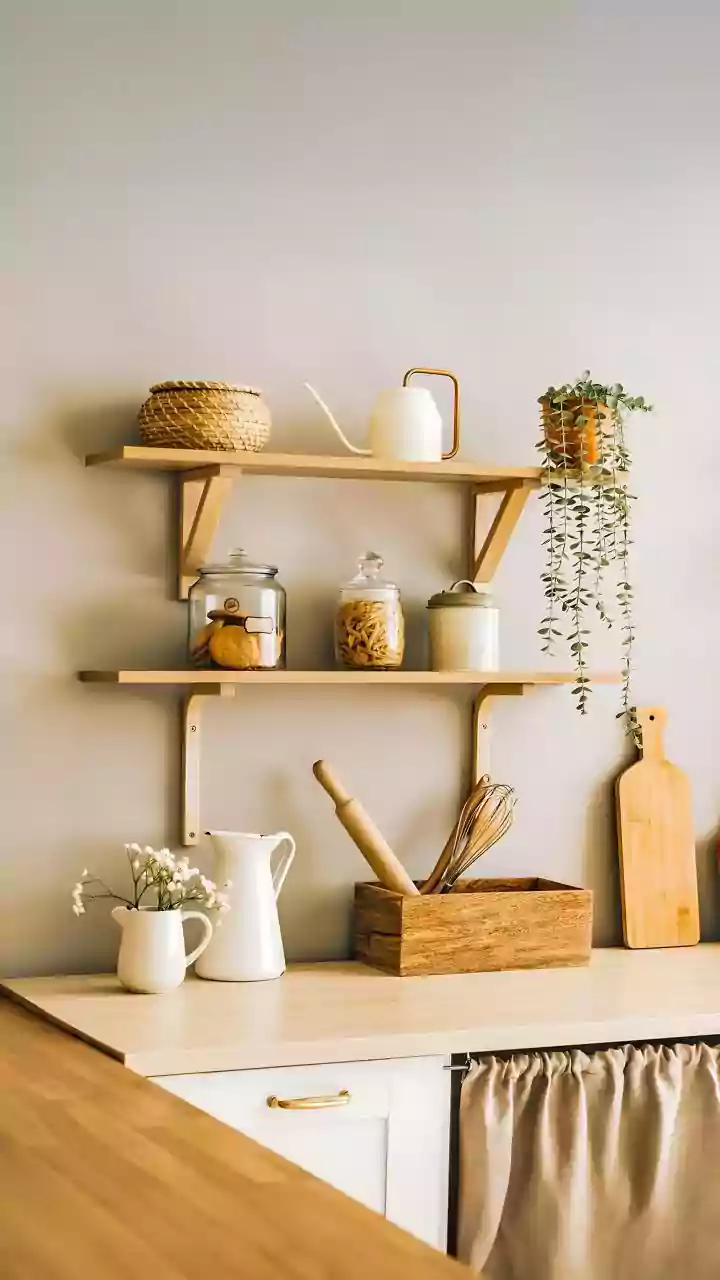
Patterns need space to breathe. To prevent visual overload, it's crucial to incorporate solid-coloured elements into your design. These are your visual 'resting places' that balance the busyness of the prints. This doesn't mean your room has to be boring; it’s about creating contrast. A solid-coloured sofa can serve as the perfect backdrop for a collection of patterned pillows. Similarly, neutral walls, a simple jute rug, or plain curtains can provide a calm foundation that allows your chosen patterns to truly shine. The goal is to strike a balance where patterns add energy without overwhelming the senses.
Embrace Texture as a Subtle Pattern
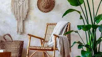
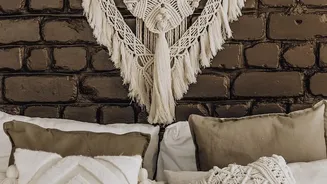
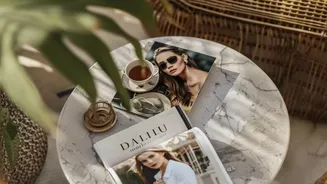
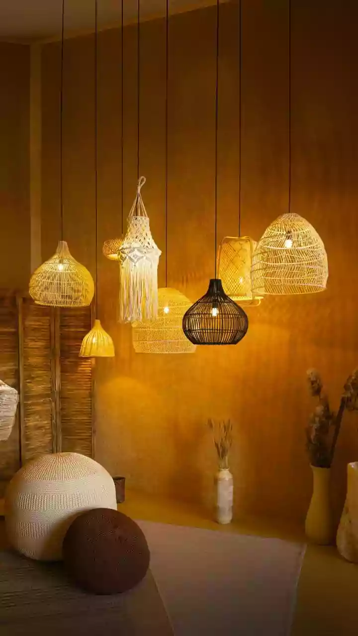
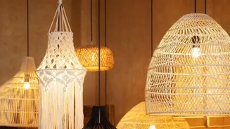
In bohemian decor, texture is just as important as printed patterns. In fact, think of texture as a pattern in itself. Woven materials like macrame wall hangings, chunky knit blankets, rattan furniture, and jute rugs add depth and a tactile quality that is essential to the boho aesthetic. These textured pieces introduce a layer of visual interest without competing directly with your bold prints. They provide complexity and warmth, preventing the space from feeling flat while also helping to break up areas of dense pattern. Layering different textures like velvet, linen, and wool is a sophisticated way to enhance the collected, well-travelled feel of your room.
Mix Different Types of Prints
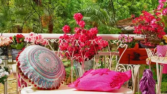
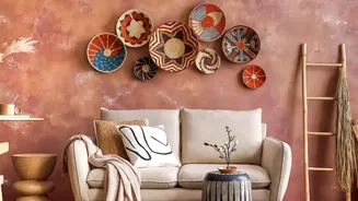
A truly authentic bohemian space feels collected over time, featuring treasures from different places and styles. Reflect this by mixing different types of patterns. Don't be afraid to pair a structured geometric print with a soft, organic floral. Combine a traditional paisley with a modern abstract design. Mixing stripes with florals, for example, is a classic design strategy. This combination of styles—tribal, floral, geometric, and abstract—adds depth and personality, telling a more interesting story than a room where all the patterns are from the same family. The key is to lean on your established colour palette to ensure the eclectic mix feels cohesive.