




The 'Pretty Equals Healthy' Bias
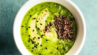
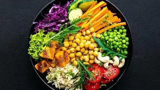
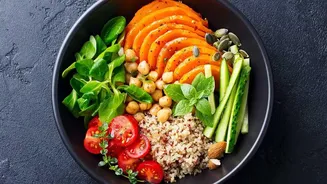
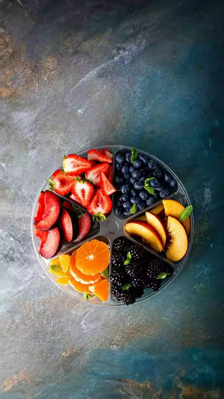
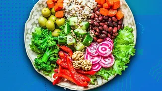
Groundbreaking research has confirmed what many have long suspected: we are psychologically wired to believe that pretty food is healthy food. A key study published in the Journal of Marketing by researcher Linda Hagen explored this very idea. The research demonstrated
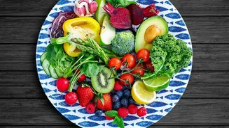
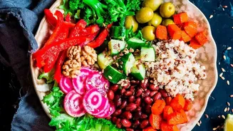
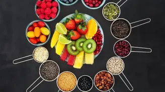
that when food is presented according to 'classical aesthetics'—principles like symmetry, order, and balance—people perceive it as being healthier. This bias is so strong that participants in the studies rated prettier versions of the same food as being more nutritious, less fatty, and lower in calories. This happens whether the food is a salad, a slice of avocado toast, or even a cupcake. The core reason for this bias is that our brains associate classical beauty with patterns found in nature, like honeycombs or butterfly wings. This triggers a mental shortcut: pretty equals natural, and natural equals healthy.
How the Study Uncovered Our Deception
To test this theory, researchers conducted several experiments. In one, participants were shown pictures of both a neatly arranged, 'pretty' avocado toast and a messy, 'ugly' one. Despite having identical ingredients, the pretty toast was consistently rated as more natural and healthier. In another clever setup, participants were simply told they were about to see either a beautiful or a flawed image of food. Even with this pre-suggestion, when shown the exact same photo, those expecting beauty rated the food as more natural and nutritious. This shows how powerfully our expectations, shaped by aesthetics, can influence our judgment before we even take a bite. The effect was consistent across a range of foods, proving that this isn't just about salads; it's a fundamental aspect of our food perception.
The 'Health Halo' and Marketing Tricks
This visual bias is amplified by a psychological phenomenon known as the 'health halo'. The health halo effect occurs when we see one positive attribute, like 'organic', 'low-fat', or even just an appealing package, and we allow it to cast a positive 'halo' over the entire product. This can lead us to overlook high sugar or sodium content simply because a single claim on the box caught our eye. Marketers and food stylists are masters of using this to their advantage. They employ techniques like using specific colours—greens and browns to suggest earthiness, or vibrant reds and oranges to signal ripeness—and arranging food in orderly patterns to trigger our 'pretty equals healthy' bias. From the slim, curved shape of a bottle suggesting a 'skinny' drink to the use of transparent packaging to imply freshness, every detail is designed to influence our perception.
It's Not Just About Symmetry
Interestingly, not all forms of 'pretty' have the same effect. The studies found a difference between 'classical aesthetics' (order, symmetry) and 'expressive aesthetics' (imaginative or fun arrangements, like food cut into shapes). While both might be considered equally attractive, only the classical, nature-mimicking arrangements boosted the perception of healthiness. This is because the expressive styles don't trigger that same 'naturalness' connection in our brains. Furthermore, even simple choices like how a sauce is plated can make a difference. One recent study found that a dish was perceived as significantly healthier when the sauce was placed neatly on the side compared to when it was drizzled all over, possibly because it looked less messy and gave the diner a sense of control.
How to Be a Smarter Eater
Knowing that our brains can be so easily tricked, how can we make genuinely healthier choices? The first step is to cultivate a healthy dose of scepticism. Be aware that what looks 'healthy' isn't always what will nourish you best. The most effective tool at your disposal is the one that marketers hope you'll ignore: the nutrition label and ingredients list. Look past the appealing photo on the front of the package and turn it over. Focus on the facts—sugar content, sodium levels, saturated fats, and the presence of whole food ingredients versus highly processed ones. Question claims like 'natural' or 'wholesome', as these often have no regulated definition. By consciously overriding your initial visual impression with factual information, you can close the gap between what looks healthy and what truly is.