



Understanding Vintage Patterns
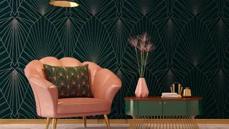
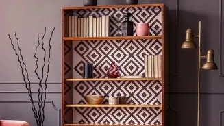
Diving into vintage patterns is like opening a design history book. Florals are a classic, ranging from delicate, small-scale 'ditsy' prints to large, bold botanicals that make a statement. Geometric patterns, popular in the Art Deco and Mid-Century Modern
eras, bring a sense of structure with repeating shapes and lines. For a more storied feel, look to Indian heritage motifs like paisleys, ikats, or block prints, which carry a rich history of craftsmanship. Toile, with its pastoral scenes, adds a touch of rustic European charm. Understanding these basic categories will help you identify the mood you want to create, whether it’s cosy and traditional or bold and graphic.
Start with a Cohesive Colour Palette
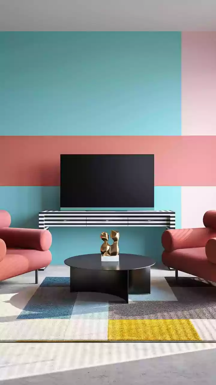
The secret to preventing pattern chaos is a disciplined colour palette. Before you even think about patterns, decide on two or three key colours that will act as your guide. A simple method is the 60/30/10 rule: 60% of your cushions feature a dominant colour (perhaps pulled from your sofa or rug), 30% a secondary, complementary shade, and 10% a bold accent colour for a pop of energy. This framework ensures that even the most diverse patterns—from a navy floral to a mustard geometric—will look intentionally curated and harmonious because they share a common colour thread.
The Art of Mixing: Vary Your Scale
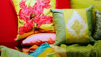
One of the most important rules in pattern mixing is to vary the scale. Combining patterns of a similar size can look busy and confusing. Instead, aim for a balanced trio: one large-scale pattern, one medium-scale, and one small-scale. For example, pair a cushion with a large, bold floral print (your 'lead' pattern) with a medium-scale stripe or check. Then, add a third cushion with a subtle, small-scale dot or a solid texture to ground the arrangement. This variation creates visual hierarchy and allows each pattern to stand out without competing with the others.
Balance Different Pattern Types
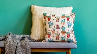
Beyond scale, think about the type of patterns you're mixing. A great way to create balance is to pair an organic pattern with a more structured, geometric one. The soft, flowing lines of a floral or paisley print contrast beautifully with the crisp, clean lines of a stripe, plaid, or geometric design. This creates a dynamic interplay that feels sophisticated and visually interesting. You can also introduce texture as a pattern. A solid-coloured velvet, linen, or knitted cushion adds depth and tactile interest, serving as a 'breathing space' that supports the bolder prints.
Arrangement and Placement Matter
How you arrange your cushions is the final touch. For a classic, balanced look on a sofa, start with the largest pillows in the corners and layer smaller ones in front. Using an odd number of cushions—like three or five—tends to look more modern and relaxed than a perfectly symmetrical pair. Don't be afraid to mix shapes as well. Combining standard square cushions with a rectangular lumbar pillow in the centre adds variety and makes the arrangement more inviting and thoughtfully designed. On a bed, you can create a more luxurious, layered look by stacking pillows against the headboard.
Sourcing and Caring for Your Covers
Finding vintage and vintage-style cushion covers is a treasure hunt. Online marketplaces like Etsy and eBay are great sources for authentic vintage pieces, while many home decor brands offer new collections with heritage-inspired prints. When you find a true vintage textile, handle it with care. Check for fabric integrity before purchasing. To preserve the colours and fibres, it's best to spot clean or gently hand-wash covers. Avoid placing them in direct sunlight for prolonged periods, as this can cause fading. With proper care, these small pieces of art will bring character to your home for years to come.