


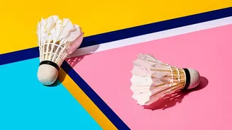

What is Geometric Colour Blocking?
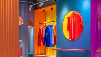
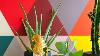
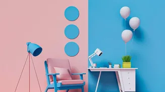
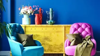
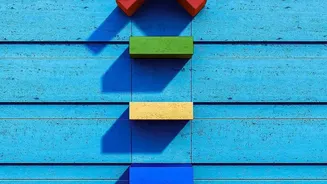
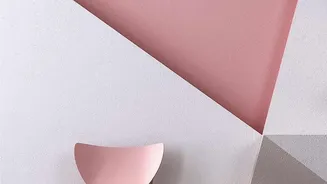
At its heart, colour blocking is the art of pairing two or more solid blocks of colour to create a visually striking effect. When you add geometric patterns—like triangles, circles, arches, and rectangles—the technique gains structure and modern appeal.
It’s a creative way to add depth, highlight architectural features, or even create the illusion of different zones in a room. Think of it as painting with shapes, using your wall as a canvas to express your personality. The goal is to create a dynamic composition that feels intentional and harmonious, whether you're using bold, high-contrast shades or a subtle, tonal palette.
The Psychology of Colour
The colours you choose have a powerful impact on the mood of a room. Warm tones like reds, oranges, and yellows inject energy and warmth, making them great for social spaces like living rooms and dining areas. They tend to feel stimulating and inviting. In contrast, cool tones like blues, greens, and soft greys promote a sense of calm and relaxation, which makes them ideal for bedrooms and home offices where focus or rest is key. When planning your design, consider the feeling you want to evoke. You can use a colour wheel to find complementary colours (opposites on the wheel) for a high-impact look or analogous colours (next to each other) for a more serene vibe.
The Language of Shapes
Just as colours influence emotion, so do shapes. Triangles and diagonal lines can create a sense of energy and movement, making them a dynamic choice for a feature wall. Circles and arches often feel softer, more organic, and welcoming, and can be used to soften the hard edges of a room. Squares and rectangles provide a feeling of stability, balance, and order. The key is to choose shapes that complement your desired aesthetic. For a modern, minimalist look, simple chevrons or a two-tone diagonal split can add sophistication without overwhelming the space. For a bolder, more artistic statement, try overlapping shapes to create complexity and depth.
Planning Your Geometric Design
The first step to a successful project is planning. Start by sketching your design on paper or using painter's tape to map it out directly on the wall. This helps you visualize the final look and make adjustments to the scale and proportion of your shapes. A good rule of thumb for a balanced colour palette is to use two similar or neutral shades and one standout accent colour. For a more structured approach, consider the 60-30-10 rule: 60% of the space should be a dominant colour, 30% a secondary colour, and 10% an accent. This principle ensures the result feels balanced rather than chaotic.
From Concept to Creation
Once your design is planned, execution is key. Prepare your wall by cleaning it and applying a primer if needed. Use high-quality painter's tape to create crisp, clean lines for your shapes. Apply your first colour and let it dry completely before applying a second coat. Once the first colour is fully dry, carefully remove the tape. Then, re-apply fresh tape along the new edges and paint your next colour. This patient, step-by-step process prevents smudges and ensures a professional-looking finish. For those hesitant to paint directly on the wall, you can achieve a similar effect with framed art, canvas paintings, or even by arranging framed fabric pieces like beautiful saree borders or block-printed cotton.