









The Psychology of Serenity
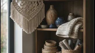
There’s a reason this color duo feels so right. Cream, unlike stark white, provides a warm, inviting foundation that envelops a room in softness. It’s a neutral that feels luxurious and comforting. Soft blue, on the other hand, is inherently calming.
It evokes clear skies and tranquil waters, helping to reduce stress and create a sense of peace and spaciousness. When used together, they strike a perfect balance. The warmth of the cream prevents the coolness of the blue from feeling sterile or cold, while the blue adds a breath of fresh air to the cream's quiet sophistication. The result is an atmosphere that is both restful and refined.
Color Theory in Action
From a design perspective, the success of blue and cream lies in the classic principle of balancing warm and cool tones. Most cream paints have warm, yellow, or beige undertones, which bring a cozy energy to a space. Blue, a quintessential cool color, offers a calming and spacious feel. Combining them creates a gentle, pleasing contrast that is easy on the eyes. Unlike high-contrast pairs that can feel jarring, the difference between a soft blue and a warm cream is subtle and harmonious. This allows you to build a layered, interesting room that feels cohesive and intentional without overwhelming the senses. The dominant warm neutral (cream) provides the canvas, while the cool accent (blue) adds depth and visual interest.
Get the Proportions Right
The key to making this combination work is in the headline itself: soft blue as an accent against larger cream surfaces. For the most sophisticated look, cream should be the dominant color, covering about 60-70% of the room. Think cream walls, a large cream-colored sofa, or a neutral rug that covers most of the floor. This creates a bright, airy backdrop. Soft blue should then be introduced in smaller, deliberate doses. This could be through a pair of velvet armchairs, a collection of throw pillows, the pattern in your curtains, or a statement piece of art. This approach allows the blue to pop without overpowering the space, drawing the eye and adding personality. A common mistake is trying to give both colors equal weight, which can disrupt the serene balance you’re trying to achieve.
The Right Shades of Blue and Cream
Not all blues and creams are created equal. For this pairing to truly sing, the specific shades matter. Look for soft, muted blues like powder blue, duck egg, sky blue, or a dusty, gray-toned blue. These shades have an inherent gentleness that complements the softness of cream. For the cream, opt for shades with warm, inviting undertones, such as ivory, beige, or a classic off-white. It's wise to test paint samples together in your room, observing them in both natural and artificial light. A cream that looks perfect in the store might appear too yellow or too gray next to your chosen blue once on the wall. The goal is a pairing that feels connected and complementary.
Ideas for Any Room
This versatile palette can be adapted for any room in the house. In a living room, anchor the space with a large cream sofa and bring in blue with patterned cushions and a wool throw. You could also paint a single bookshelf or cabinet in a soft blue as a focal point. In the bedroom, create a tranquil retreat with cream walls and bedding, accented by a soft blue upholstered headboard or a bench at the foot of the bed. For a kitchen, consider soft blue lower cabinets paired with creamy upper cabinets or a classic tile backsplash that incorporates both colors. Even in a bathroom, blue towels and accessories against cream-colored tiles can create a spa-like atmosphere. The key is to sprinkle the blue elements thoughtfully throughout the foundational cream space.