


Start with a Shared Color Story
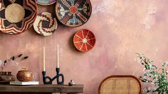
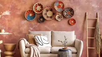
The single most important rule for successfully mixing patterns is to unite them with a cohesive color palette. Before you even think about prints, decide on a family of three to five colors. Often in boho design, this starts with a warm, earthy base
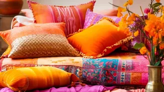
of cream, terracotta, or sand. Then, layer in your patterns—florals, geometrics, tribal prints—ensuring each one contains at least one or two of the colors from your core palette. This shared color thread is what allows a bold stripe to coexist peacefully with an intricate paisley; the eye registers the connection, creating harmony instead of a visual clash.
Play with Pattern Scale
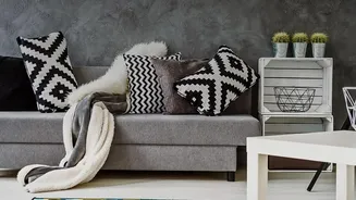
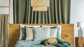
To prevent patterns from competing, you need to vary their scale. Think of it as a conversation: you need a lead speaker and supporting voices. A common design trick is to use a trio of scales: large, medium, and small. Your large-scale pattern should be the 'hero' and is best used on a significant item like a statement rug or duvet cover. Follow this with a medium-scale print, like a floral or geometric on throw pillows. Finally, add a small-scale, more subtle pattern on smaller accents like a lamp shade or a decorative box. This variation creates visual hierarchy and allows the eye to move around the room without feeling overwhelmed.
Let Texture Do the Talking
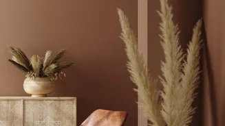
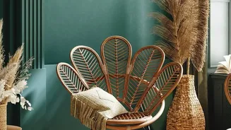
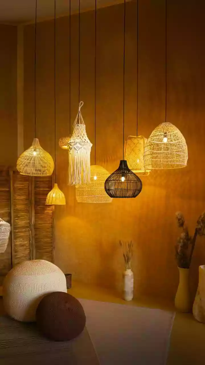
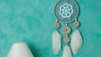
In bohemian decor, texture often acts as a subtle pattern. A chunky knit blanket, a woven jute rug, a macrame wall hanging, or a rattan chair all bring their own visual rhythm to a room. These textured elements add depth and a tactile quality that balances out the 'busier' flat prints. When you feel a room might have too many prints, swap one out for a heavily textured solid. The interplay between a smooth linen sofa, a rough sisal rug, and a plush velvet cushion creates a rich, layered look that is quintessentially boho without adding another competing pattern.
Ground the Look with Solids
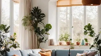
A room full of non-stop pattern can feel frantic. The secret to making it work is creating moments of rest for the eye. Use solid-colored items to ground your space and provide visual relief. This could be a neutral-colored wall, a solid sofa, or a simple, unadorned wooden coffee table. These solid anchors act as a calm backdrop that makes the patterns pop. They balance the composition and ensure the overall feeling is curated and intentional, not just a jumble of random items. Think of solids as the frame that makes your patterned artwork shine.
Follow the Three-Pattern Rule
If you're new to mixing patterns, a good rule of thumb is to stick to three. This is a manageable number that provides variety without veering into chaos. Choose your dominant 'hero' pattern first, then select two smaller, complementary patterns. Ensure they share a color palette and vary in scale as mentioned before. For example, pair a large-scale tribal print rug with medium-scale floral cushions and a small, delicate geometric pattern on a vase. This simple formula is a nearly foolproof way to create a balanced and stylish pattern mix.
Embrace Global and Organic Prints
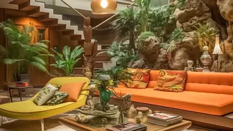
Certain types of patterns are hallmarks of the bohemian style, often reflecting a love of travel and nature. Lean into this by combining different types of prints, such as Moroccan rug motifs, Indian block prints, florals, and tribal geometrics. The blend of cultural and organic designs helps create that authentic, collected-over-time feel. Don't be afraid to mix a straight-lined geometric pattern with a soft, flowing floral one; the contrast is what gives the room energy and personality.