



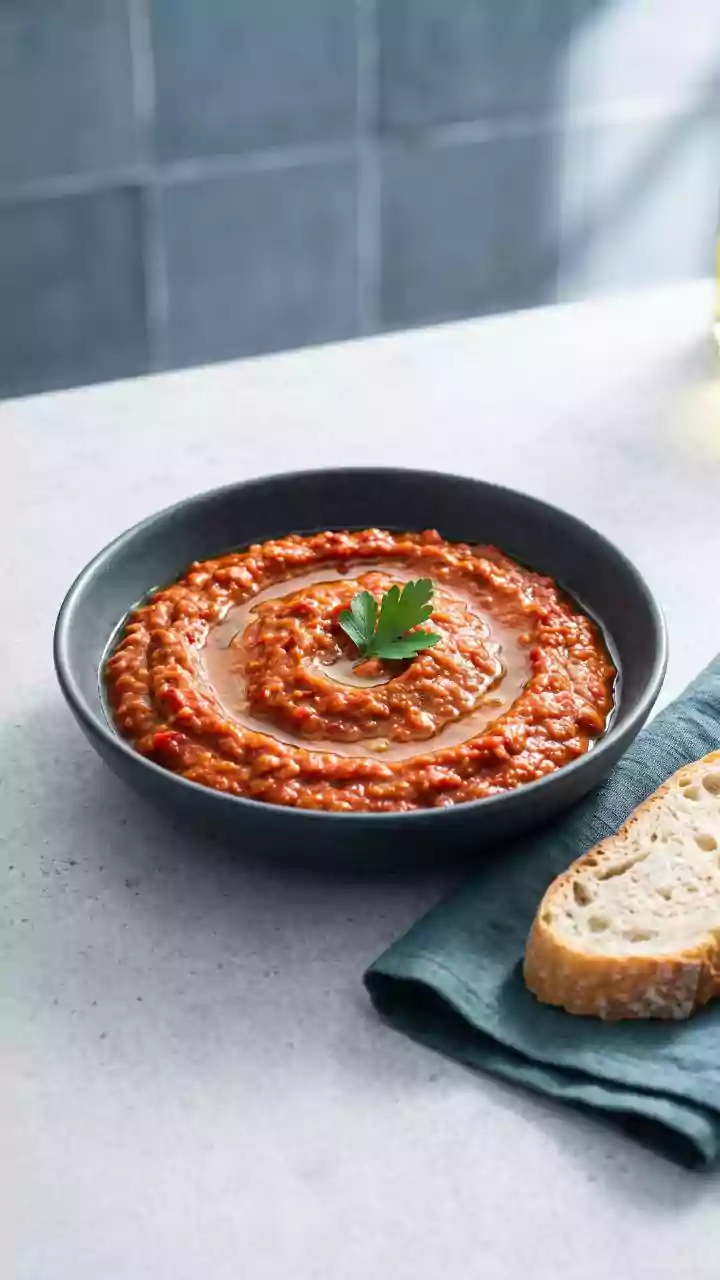



The First Bite is with the Eye
Our brains are wired to process visual information incredibly quickly. When it comes to food, this means that the arrangement, colour, and overall aesthetic of a plate create a set of expectations, a phenomenon known as expectation bias. Research shows
that we make food choices in a matter of seconds, often based entirely on visual cues that signal freshness, quality, and flavour. Studies have consistently demonstrated that when diners are presented with the exact same food, they rate the neatly or artistically arranged version as tasting significantly better than a messy one. This initial visual impression acts as a powerful filter, priming our senses for what's to come and fundamentally shaping our entire dining experience.
The Psychology of Colour and Texture
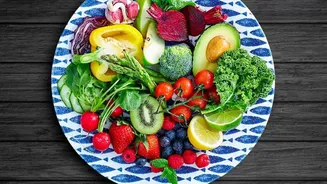
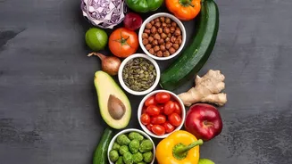
Colour is one of the most powerful visual cues our brains use to assess food. Bright, natural greens suggest freshness, while warm reds and oranges can stimulate the appetite. Our minds associate specific colours with certain tastes; red often signals sweetness, while brown can suggest a rich, roasted flavour. The contrast of colours on a plate can also enhance the visual appeal, making a dish more enticing. Similarly, surface texture plays a role. One study on oat biscuits found that people perceived biscuits with a more pronounced, explicit texture as healthier. However, the smoother, less-textured versions were rated as tastier and were more likely to be purchased, highlighting a fascinating disconnect between what we think is good for us and what we actually want to eat.
The Power of Pretty
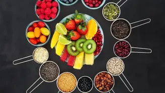
Humans are naturally drawn to order and symmetry, a concept known as classical aesthetics. Research from the University of Southern California found that when food presentation mimics patterns found in nature—like symmetry, balance, and order—we perceive it as not only more attractive but also healthier. In a series of experiments, participants consistently judged prettier versions of the same food to be more natural, more nutritious, less fatty, and lower in calories. This happens because our brains create a subconscious link: pretty equals natural, and natural equals healthy. This bias is so strong that even when people know a food is unhealthy, its attractive presentation can still lead them to believe it's a better choice.
The 'Health Halo' Illusion
This link between appearance and perceived healthiness gives rise to the 'health halo' effect. This is a cognitive bias where we allow one positive attribute—such as an 'organic' label or an attractive, fresh-looking appearance—to create a positive impression of the food as a whole. Marketers and restaurants use this to their advantage. A salad with vibrant toppings or a smoothie bowl arranged with perfectly symmetrical fruit might seem inherently healthy, even if they are loaded with high-calorie dressings or sugary additions. The health halo can trick us into underestimating calories or overconsuming something because we believe it's 'good for us', distracting us from its actual nutritional content.
How Restaurants Design Your Experience
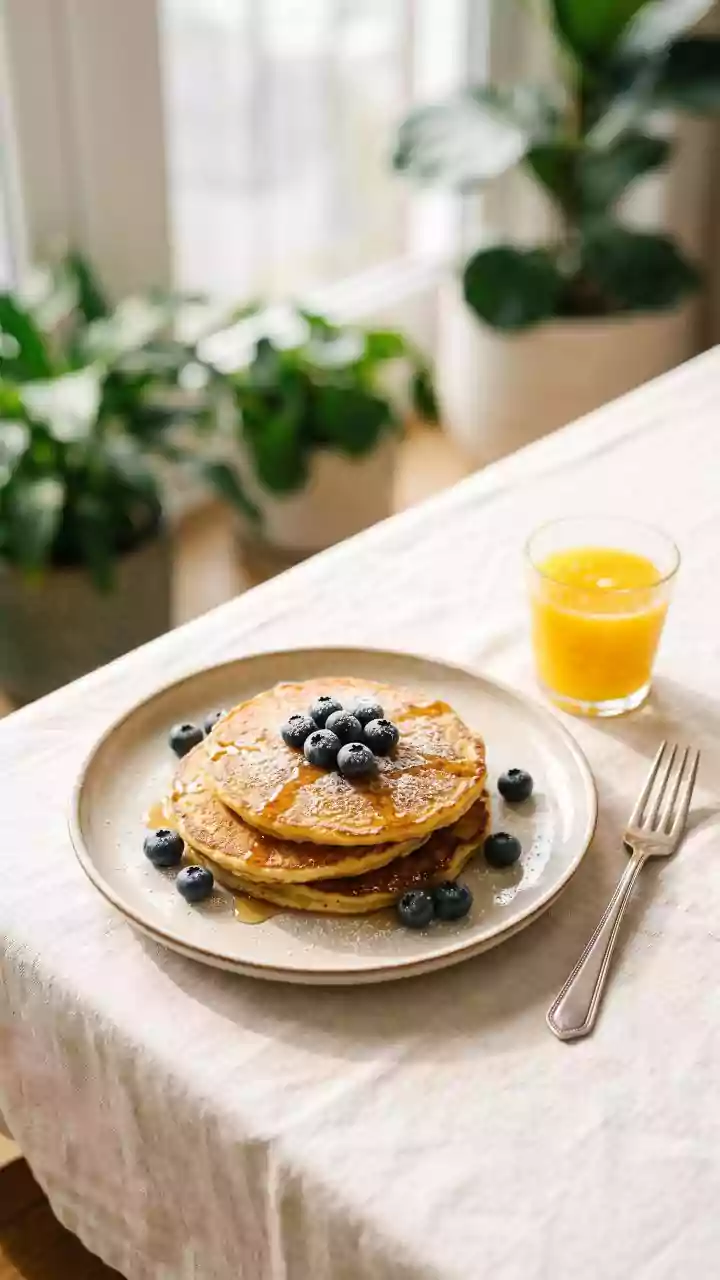
Chefs and restaurateurs are masters of this visual psychology. They understand that a thoughtfully arranged plate signals care, expertise, and quality, which in turn makes diners feel the meal is more valuable. Studies have found that diners are willing to pay more for food that is presented neatly. Even the plate itself matters. One study found that a dessert served on a white plate was perceived as sweeter than the same dessert on a black plate, due to the higher contrast. The careful use of empty space, height, and artful arrangements are all techniques designed to elevate your perception of flavour. In one study, an art-inspired plating style led diners to rate the food as 18% tastier than the same ingredients plated neatly but simply.