

Start with a Cohesive Colour Story
The single most important rule for successfully mixing patterns is to establish a unified colour palette. You can combine vastly different styles—florals with geometrics, for instance—as long as they share a few common colours. Begin by choosing one main
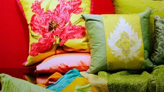
pattern to be your 'hero' piece, such as a bold floral rug or dramatic curtains. Pull two to four key colours from that design. Every other pattern you introduce should contain at least one of those shades. This creates a visual thread that ties the entire room together, making your choices feel intentional rather than random. A consistent colour story is the bridge that allows different prints to live in harmony.
Play with Pattern Scale
Once you have your colour palette, the next step is to vary the scale of your prints. Mixing patterns of a similar size can make a room feel busy and overwhelming, as they compete for attention. A tried-and-true designer approach is the rule of three: combine one large-scale, one medium-scale, and one small-scale pattern. Your 'hero' fabric will typically be the large-scale print. Follow that with a medium-sized geometric or stripe. Finally, add a small, subtle print like a tight check or a delicate dot. This variation in scale creates a visual hierarchy, allowing the eye to move comfortably around the room and appreciate each pattern individually.
Know Your Vintage Patterns
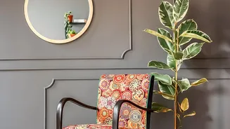
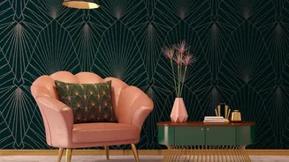
Familiarising yourself with a few key vintage pattern styles can make the selection process easier. Florals, from dense chintz and cabbage rose prints to more delicate botanicals, bring a soft, organic feel. Geometric patterns, like the bold chevrons and sunbursts of the Art Deco era or the clean lines of Mid-Century Modern designs, provide structure. Other classics include paisley, gingham, and stripes, each adding a distinct character. You don't need to be an expert, but understanding the difference between an organic floral and a structured geometric will help you create a balanced mix.
Balance Organic with Geometric
A successful scheme often balances curved, organic shapes with straight, geometric lines. A room filled entirely with florals can feel overly romantic or busy, while a space dominated by stripes and checks might feel too rigid. The magic is in the mix. Pair botanical curtains with a simple striped rug. If your sofa is covered in a classic plaid, soften the look with cushions featuring whimsical leaf or bird prints. This contrast creates a dynamic yet harmonious tension that feels sophisticated and well-designed.
Incorporate Solids and Texture
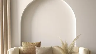
Patterns need room to breathe. The secret to a rich, layered look that doesn't overwhelm is the strategic use of solid colours and texture. These elements provide a resting place for the eye, preventing the space from feeling cluttered. Use a solid-coloured sofa as a backdrop for patterned pillows, or paint your walls a neutral shade to allow vintage print curtains to shine. Additionally, materials like velvet, linen, or chunky knits can act as 'neutral patterns', adding depth and tactile interest without competing with your main prints. This balance is what makes a room feel cosy and inviting, not just busy.