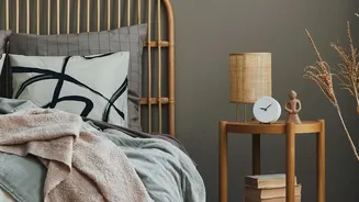



1. Anchor With a Cohesive Color Palette
The single most important rule for mixing patterns is to unite them with color. Before you even think about prints, decide on a palette of three to five complementary colors. This doesn't mean every pattern needs every color. Instead, ensure each fabric
or rug shares at least one or two hues with another piece in the room. For example, a large rug might feature terracotta, cream, and deep blue. Your pillows can then pick up those individual shades—one with a blue geometric print, another with a cream and terracotta floral. This shared color story creates a visual thread that ties everything together, making the mix feel intentional rather than accidental.
2. Play With Pattern Scale
To avoid visual chaos, it's crucial to vary the scale of your patterns. Using multiple prints of the same size makes them compete for attention, creating a busy, overwhelming effect. A tried-and-true designer formula is to combine three different scales: one large, one medium, and one small. Start with a 'hero' print—a large-scale pattern that will be your focal point, like on a statement rug or duvet cover. Then, add a medium-scale pattern, such as a floral or ikat on accent chairs or curtains. Finally, bring in a small-scale print through throw pillows or smaller decor items, like a subtle stripe or a small geometric design. This hierarchy allows the eye to move around the room comfortably.
3. Mix Different Types of Patterns
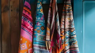
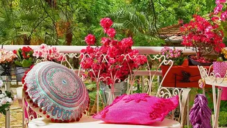
A truly authentic Bohemian look comes from mixing different styles of patterns from various origins. Combine organic shapes with structured ones for a dynamic yet balanced feel. For example, pair a flowing, curvy paisley print with a crisp, linear geometric like a chevron or diamond pattern. Classic Boho patterns include florals, paisley, and celestial motifs alongside global-inspired designs like ikat from Indonesia, kilim from Turkey, and suzani from Central Asia. Layering these different styles—a floral pillow on a chair upholstered in a tribal stripe, for instance—is what gives a room its collected, well-traveled, and personal character.
4. Use Texture as a 'Quiet' Pattern
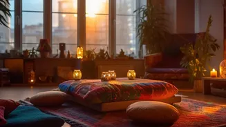
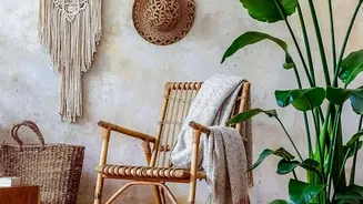
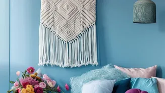
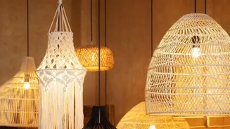
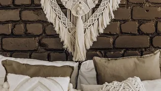
Texture is a secret weapon in pattern mixing. It adds depth and interest without visually competing with your prints. Think of textures like macramé wall hangings, chunky knit throws, jute rugs, woven baskets, or velvet cushions as 'neutral' or 'quiet' patterns. They provide tactile richness that enhances the layered look of a Boho space. These elements are especially important for giving the eye a place to rest amidst bolder prints. By interspersing your patterned items with strong textural pieces, you create a richer, more sophisticated and inviting environment that feels both stimulating and serene.
5. Don't Forget Solid Ground
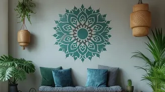
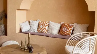
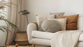
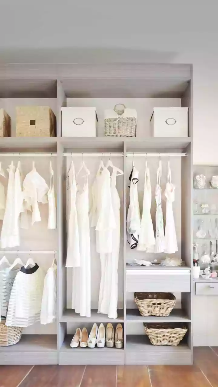
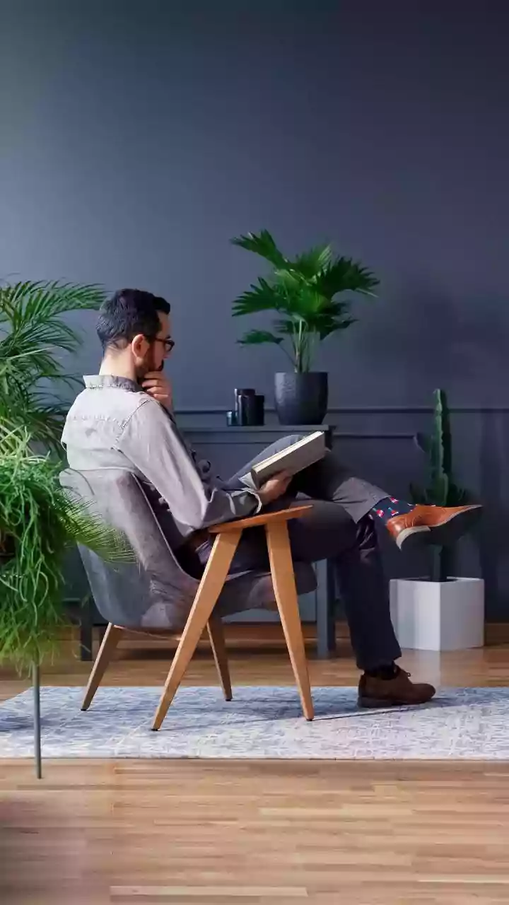
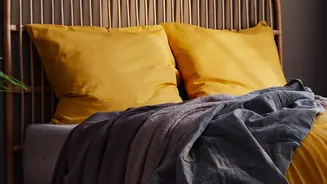
Just as important as the patterns themselves are the moments of calm in between them. Solid colors are essential for balancing a pattern-heavy room and preventing it from feeling overwhelming. Use solids on your largest surfaces, like walls or a sofa, to provide a neutral backdrop that makes your chosen patterns pop. A solid-colored sofa can anchor a collection of patterned pillows, while neutral walls allow a vibrant, patterned rug to take center stage. Aim for roughly half of the surface area in your room to be solid, giving your patterns space to breathe and shine.