

The Power of a Neutral Foundation
Before introducing any pattern, the first step is to establish a strong, neutral foundation. This doesn't mean your room has to be plain white or beige. Modern neutrals encompass a wide spectrum of calming, versatile hues, including soft greys, warm taupes,
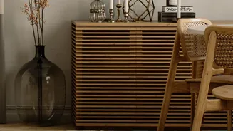
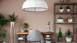
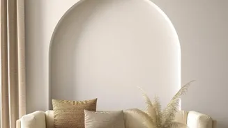
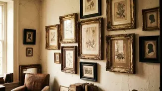
creamy off-whites, and even deep, earthy tones. By painting walls and choosing large furniture items like sofas or rugs in these shades, you create a serene backdrop. This neutral setting acts as a visual 'breather', allowing the intricate details of your chosen vintage patterns to become the focus without overwhelming the space. Think of your neutral base as the canvas upon which your patterned accents will be the art.
Applying the 60-30-10 Rule
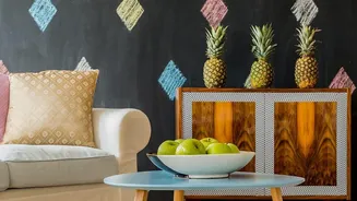
A classic interior design principle that works wonders for achieving balance is the 60-30-10 rule. This guideline helps you distribute colour and pattern harmoniously. Your dominant neutral shade should cover about 60% of the room—primarily walls and large furniture. The secondary colour or texture, perhaps a slightly different neutral or a natural material like wood, should make up 30%. This could be your curtains, accent chairs, or cabinetry. The final 10% is where your vintage patterns come to play. This 'accent' layer is for your statement pieces: throw pillows, a beautiful rug, a piece of upholstered furniture, or artwork. This measured approach ensures the patterns provide a pop of personality without creating chaos.
Layering with Texture, Not Just Colour
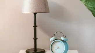
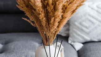
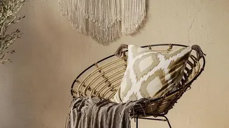
A neutral room is never boring when you introduce a rich variety of textures. Texture adds the depth and warmth that prevents a space from feeling flat or cold. Think about combining different materials within your neutral palette. Pair a smooth linen sofa with chunky knit blankets, velvet cushions, a rustic wooden coffee table, and perhaps a metallic lamp. The interplay between these different surfaces creates visual interest and a cosy, inviting atmosphere. When you layer textures, the room becomes a tactile experience, making the neutral background feel rich and intentionally designed rather than an absence of colour.
How to Mix and Match Patterns
Combining multiple vintage patterns is an advanced move, but it's achievable with a few key strategies. The most important rule is to vary the scale of the prints. Pair a large-scale pattern, like a bold floral or damask, with a smaller, more subtle design, such as a fine stripe or a small geometric print. This contrast in size helps the eye distinguish between the patterns, preventing them from clashing. To maintain harmony, ensure that the different patterns share a cohesive colour palette. If all your patterns incorporate shades of cream, grey, and a single accent colour, they will feel connected and intentional, creating a layered, curated look.
Start Small with Vintage Accents
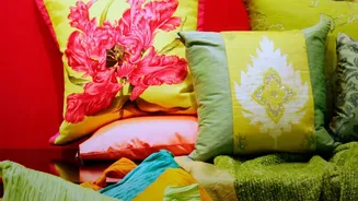
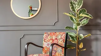
If you're hesitant to go all-in, start by introducing vintage patterns in small, low-commitment doses. This is an easy way to experiment and build your confidence. An antique-style rug can anchor a room and introduce pattern without being permanent. Swapping out plain cushion covers for ones with vintage-inspired prints like paisley or toile can instantly transform a neutral sofa. Other options include framed pieces of vintage fabric, patterned lampshades, or a single statement armchair upholstered in a classic print. These small touches can add immense character and a sense of history to a modern space.