




The Power of the Colour Block
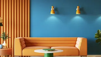
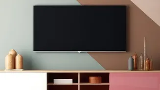
First, let’s be clear on what colour-blocking is. In interior design, it’s the technique of using two or more solid blocks of colour next to each other. Think of a deep blue accent wall next to a crisp white one, or a room where the lower third of the walls
are painted a different shade from the top two-thirds. Originating from modern art movements like the work of Piet Mondrian, the style uses colour itself to create structure and visual interest. It’s a powerful tool for defining zones in an open-plan space, highlighting architectural features, or simply injecting personality and energy into a room without relying on busy patterns. The goal is to create a striking, confident look that feels intentional.
The Blank Canvas Dilemma
While a bold block of colour is dramatic, it can sometimes present a design challenge. A solid-coloured wall, especially a large one, can lack a focal point. The eye can roam without a place to land, making the space feel unfinished or even overwhelming. Without a story or a point of focus, the colour is just... colour. This is where the concept of context comes in. The colour block is your stage; now you need to bring in the actors. Adding another layer, either through more paint or carefully chosen art, provides the narrative and depth the wall needs to feel complete and sophisticated.
Using Paint to Create a Focal Point
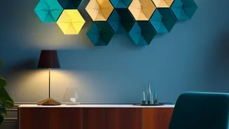
One of the most effective ways to add context to a colour-blocked wall is with more paint. This might sound counterintuitive, but using a contrasting or complementary colour to create shapes or patterns can add architectural intrigue. Consider painting a large arch behind a bed or a sofa to create a 'frame' for the furniture. You could also paint geometric shapes like rectangles or stripes to break up the solid colour and guide the eye. This technique is particularly effective for creating the illusion of features that aren't there, like mimicking the look of wainscoting or trim. Using another paint colour provides contrast and structure while maintaining the clean, graphic feel of colour-blocking.
Framed Art as a Storyteller
If paint adds architectural context, framed art adds personal context. Hanging artwork on a colour-blocked wall immediately provides a focal point and tells a story. On a bold background, the choice of art is crucial. For a dramatic, dark wall, art with plenty of white or light-coloured space can create a stunning contrast. Conversely, on a light-coloured wall, a dark or vibrant piece of art will pop. The key is to choose art that either complements the wall colour or provides a deliberate, high-impact contrast. Pay attention to the frame as well; a simple black, white, or natural wood frame often works best, allowing the art and the wall colour to be the heroes. You can even paint a coloured rectangle behind a gallery wall to unify the arrangement and make it feel more intentional.
Which One Should You Choose?
So, should you reach for another paintbrush or start shopping for prints? The choice depends on your goal. If you want to add architectural definition, create zones, or play with geometric forms, using more paint is a fantastic, budget-friendly option. It keeps the aesthetic modern, graphic, and clean. If your goal is to inject personality, tell a story, or introduce a more organic or detailed element into the space, framed art is the ideal choice. It offers a window into your tastes and can soften the bold, graphic nature of the colour block. Of course, there's no rule against using both. A painted arch can serve as the perfect backdrop for a single, stunning piece of art, creating a layered and professionally designed look.