

Embrace the Earthy Tones of the 70s
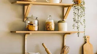
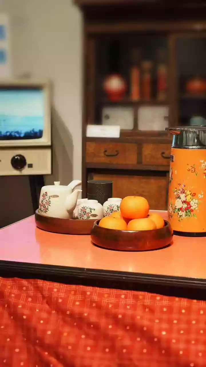
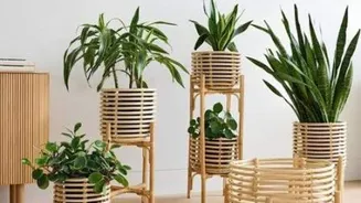
The 1970s were defined by a palette drawn from nature. Think warm, comforting shades like mustard yellow, burnt orange, olive green, and rich terracotta. These colours pair beautifully with natural materials like wood and rattan, which are staples in many
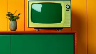
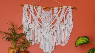
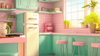
Indian homes. Instead of painting an entire room in avocado green, which can feel dated, use it on a single accent wall or for kitchen cabinetry. Mustard yellow cushions, a burnt orange throw, or terracotta pots can introduce this earthy vibe without overwhelming the space, creating a cosy and grounded atmosphere.
Channel the Glamour of Art Deco
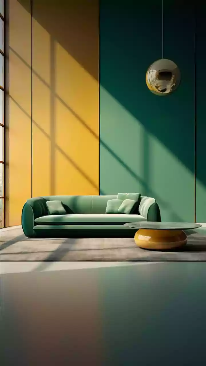
For a touch of unapologetic luxury, look to the Art Deco period of the 1920s and 30s. This style is all about bold, saturated jewel tones and high contrast. Deep emeralds, sapphire blues, and rich ruby reds, often paired with black, cream, and metallic accents like gold or brass, define this look. These colours work exceptionally well in living rooms or bedrooms where you want to create a sense of drama and sophistication. Consider a velvet armchair in a deep jewel tone, a lacquered console table, or a rug with a bold geometric pattern to bring this glamorous era into your home.
Go Bold with Mid-Century Modern Hues
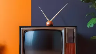
The Mid-Century Modern (MCM) style of the 1950s and 60s is known for its clean lines, organic forms, and functional design. The colour palette reflects this optimism, often pairing warm wood tones with pops of vibrant colour. Think cherry red, turquoise, or sunny yellow used as accents against a more neutral, earthy background. Unlike Art Deco's opulence, MCM uses colour more playfully. This style is perfect for adding a dash of personality to a minimalist space. A brightly coloured door, a statement chair, or abstract artwork can capture the fun-loving spirit of the MCM era.
Create Calm with Muted and Dusty Shades
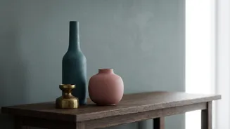
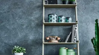
If bold colours feel too intimidating, you can still achieve a vintage look with softer, more muted tones. Vintage palettes often feature desaturated or 'dusty' versions of colours, like faded rose, sage green, and soft blues. These shades create a calming, nostalgic feel and are incredibly versatile. They can act as sophisticated neutrals, providing a gentle backdrop that allows furniture and decor to stand out. A colour palette of ivory, clay, and indigo wash can make a room feel both timeless and serene, working beautifully with traditional Indian textiles and crafts.
Start Small with Accents and Textiles
You don’t need to repaint your entire house to embrace vintage colours. The easiest way to start is by introducing them through smaller, less permanent items. Textiles offer a fantastic opportunity to play with colour. Look for Kantha quilts, block-printed cushions, or embroidered throws in vintage-inspired hues. A statement rug, a piece of artwork, or even a collection of ceramic vases can serve as the perfect vehicle for a pop of vintage colour. This approach allows you to experiment with different palettes and see what works best in your space before making a bigger commitment.
Balance is Key: Mix Vintage with Modern
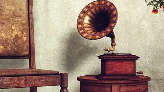
The secret to making vintage colours work in a contemporary home is balance. A room drenched head-to-toe in a single retro palette can feel more like a time capsule than a modern living space. To avoid this, pair your chosen vintage shades with plenty of modern neutrals like white, beige, or grey. This contrast keeps the look fresh and intentional. For instance, a vintage-hued accent wall is best balanced by neutral colours on the other walls. Similarly, traditional Indian elements like brass decor or dark wood furniture are enhanced when set against a calm, contemporary backdrop.