




A Legacy Born from Speed
Racing stripes were never about style in the beginning; they were about function. The origin is often traced back to American sportsman Briggs Cunningham, who in the 1950s painted two blue stripes on his white race cars for the 24 Hours of Le Mans. In
an era of national racing colours—red for Italy, green for Britain—Cunningham's stripes made his American cars instantly identifiable to his pit crew and officials at over 150 mph. The trend was cemented in the 1960s by Carroll Shelby, whose iconic white-and-blue Mustangs and Cobras dominated the track. Those stripes, known as Le Mans or Rallye stripes, were a declaration of performance heritage. Soon, what worked on the track was used to sell cars on the street, and stripes became synonymous with the power and aggression of the muscle car era.
The Deliberate Break from Symmetry
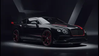
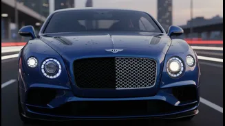
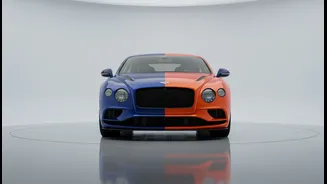
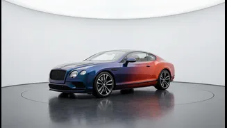
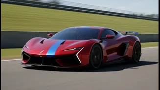
For decades, the balanced, symmetrical stripe was the default. It communicated power and precision. But then, a handful of designers decided to break the rules. The off-centre stripe, often called a 'driver's stripe,' emerged as a subtle but significant act of rebellion in car design. One of the most famous early proponents was the Dodge Viper. Special editions like the VooDoo II ACR featured a prominent stripe offset towards the driver's side. This wasn't a mistake; it was a statement. By abandoning perfect symmetry, the design draws attention to itself and forces a second look. It suggests that this car is different, that it doesn't conform to the standard rules of aesthetics. This small shift creates a visual tension that perfectly complements the aggressive nature of a high-performance machine.
The Psychology of a Crooked Line
Humans are naturally drawn to symmetry. In nature, it suggests health and stability. In design, it feels balanced and calm. Asymmetrical design, therefore, can feel jarring or dissonant if not handled correctly. But in the context of a supercar, that's exactly the point. An off-centre stripe disrupts the car's perfect, machine-made balance and injects a dose of human imperfection and intent. It’s a visual cue for dynamism and motion, making the car look like it's already in action. Some argue the placement is a direct nod to the person in control; by aligning the stripe with the driver's seat, it visually centres the entire purpose of the vehicle on the driving experience itself. It becomes a mark of a driver-focused machine, not just a beautiful object.
Modern Masters of Asymmetrical Attitude
The trend has been embraced by some of the most revered names in performance. Ford, with its GT Heritage Editions, has frequently used asymmetrical accents to honour its racing legacy. The 2021 edition, celebrating a win at Daytona, featured asymmetrical Race Red accents, including on the roof edge and rear wing, to invoke the emotion of speed. Dodge continued the tradition with its final run of Vipers, where multiple special editions featured a 'driver stripe' in a contrasting colour, making it a key part of the car's identity. Even the 2026 Chevrolet Corvette has introduced an asymmetrical stripe package, marketing it as an artistic statement that reflects individuality as much as speed. These are not afterthoughts; they are carefully considered design choices that imbue the cars with a unique character right from the factory.