






The Soothing Psychology of This Classic Duo
Colour has a profound subconscious impact on our mood and perception of a space. The combination of cream and pale blue is a masterclass in emotional design, creating a harmony that feels both natural and sophisticated. Cool tones like blue are consistently
linked to calmness, concentration, and serenity. Specifically, pale blue evokes the openness of the sky and sea, which can make a room feel more expansive, airy, and light. Cream, a warm and gentle neutral, provides the perfect balance. It brings a softness and inviting warmth that prevents the coolness of blue from feeling stark, resulting in a palette that is both refined and incredibly welcoming. This pairing's enduring appeal lies in its ability to create a space that feels balanced and instantly soothing to the eye.
Your Anchor Piece: The Cream Sofa
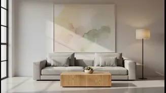
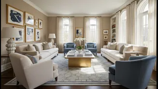
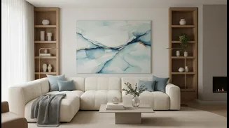
The cream sofa is the ideal foundation for this restful design. As a versatile neutral, it acts as a blank canvas, allowing you to easily introduce accent colours and refresh your decor over time. When choosing your sofa, consider both the shade and the material. Creams range from crisp ivory to warmer, sandy beige; hold swatches up in your room to see how they interact with your natural light. For busy households, practicality is key. Modern performance fabrics offer stain resistance without sacrificing a soft feel. A cream sofa brightens a room and provides a perfect backdrop, but to ensure it doesn't get visually lost against light walls, you need to anchor it. This is where the art comes in.
Choosing Your Statement Pale Blue Art
The pale blue art above your sofa is more than just decoration; it’s the focal point that solidifies the room’s tranquil theme. Hanging an oversized piece of art is an effective way to define the seating area and draw the eye. You have endless options for incorporating pale blue. Consider a large abstract canvas with washes of cerulean and sky blue, a serene coastal photograph, or a gallery wall of smaller prints that share a common blue-and-cream palette. The art should complement the tone of your sofa. Pay attention to the frame as well; a simple light wood or a metallic gold or brass frame can add another layer of warmth and sophistication to the overall look.
Layering With Textures and Accents
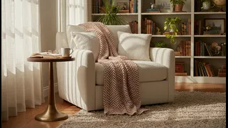
To elevate the space from simply decorated to expertly designed, focus on texture. A room dominated by two colours needs textural variety to give it depth and interest. Introduce different materials through your accessories. Think about a chunky knit throw blanket in a cream hue draped over the sofa, velvet cushions in a slightly deeper shade of blue, or a jute or wool rug underfoot with a subtle pattern. Natural wood is another excellent addition, whether it's a light oak coffee table or wooden picture frames, as it pairs beautifully with blue and cream. For metallic accents, brushed brass or soft gold add a touch of warmth and luxury that complements the colour scheme perfectly.
Weaving the Palette Throughout the Room
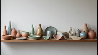
While the sofa and art are the main players, repeating the colours in smaller doses throughout the room will create a cohesive, intentional design. Echo the pale blue from your artwork in a few throw pillows, a decorative vase on a bookshelf, or the pattern in your curtains. You don't need to be rigid; using varied shades of blue, from soft sky to a slightly deeper navy as a minor accent, can add dimension. Similarly, bring in different tones of cream and off-white in lampshades, candles, or other small decor items. This repetition creates a visual rhythm that guides the eye peacefully around the space, reinforcing the overall feeling of calm and completeness.