



First, What Is Colour Blocking?
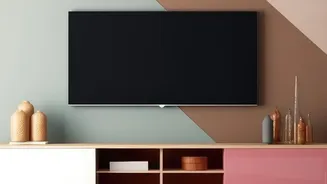
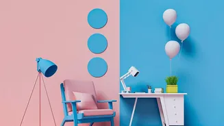
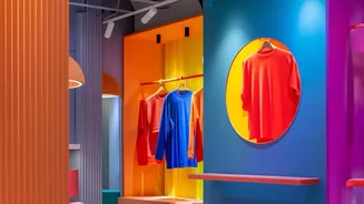
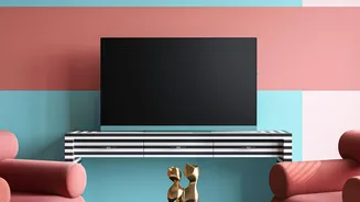
Colour blocking is an interior design technique where you use two or more solid blocks of colour on a surface. It’s more than just painting a wall two different shades; it’s about creating a deliberate, graphic statement. The shapes can be geometric—like
rectangles, stripes, or arches—or more free-flowing. This approach can add personality, create a focal point, or even highlight architectural features in a room. Originating from the art world, notably the work of Piet Mondrian, it has become a timeless trend in both fashion and home decor for its ability to add modern, artistic flair.
Start with the Colour Wheel
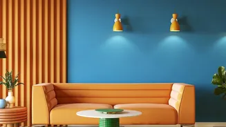
To balance colours effectively, a basic understanding of the colour wheel is your best tool. It’s not about memorising theory but seeing relationships. The main concepts to know are warm versus cool colours and a few key pairing strategies. Warm colours (reds, oranges, yellows) feel energetic and make a space feel cosier, while cool colours (blues, greens, purples) are calming and can make a room feel larger. For pairings, there are three simple schemes: complementary colours are opposites on the wheel (like blue and orange) and create high-energy contrast. Analogous colours sit next to each other (like blue and green) and create a harmonious, soothing feel. Triadic colours are evenly spaced (like red, yellow, and blue) and offer a balanced vibrancy.
The 60-30-10 Rule: A Simple Formula
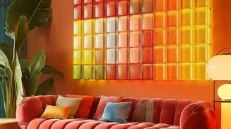
One of the most practical tools in interior design is the 60-30-10 rule. This guideline suggests a simple ratio for creating a balanced colour scheme. Your dominant colour should take up about 60% of the space, typically on the walls or large furniture. A secondary colour should cover 30%, adding interest through things like curtains, an accent chair, or a larger section of your colour-blocked art. The final 10% is for an accent colour—a pop of boldness found in throw pillows, small decor, and the most vibrant part of your artwork. This formula prevents any one colour from feeling overwhelming and ensures the final look is layered and cohesive.
How to Pick Your Palette
Instead of starting from scratch, look for inspiration within the room itself. Your colour-blocked art doesn't have to introduce entirely new colours; it can be a powerful tool to tie existing elements together. Look at your sofa, a favourite rug, or even a piece of clothing. Pull two or three shades from that object to form your palette. This ensures the final artwork feels integrated rather than random. If you have neutral walls (the 60%), your furniture might be the secondary colour (30%), and your wall art can provide the final accent pop (10%). Or, if the wall art is a large mural, it might contain all three colours, reinforcing the room's entire scheme.
Beyond Colour: Texture and Saturation
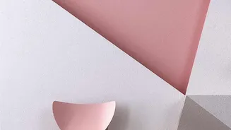
A successful colour-blocked piece isn't just about the hues; it’s also about their properties. Pay attention to saturation—how intense or muted a colour is. A common mistake is mixing colours of different saturations, like a jewel tone with a pale pastel, which can feel disjointed. For a more cohesive look, try pairing colours with a similar intensity, like two pastels or two rich, deep tones. Also, consider the finish of your paint. A matte finish will absorb light and feel soft, while a satin or gloss finish will reflect light and add another layer of contrast. This textural difference can add depth and sophistication to even a simple two-colour design.