




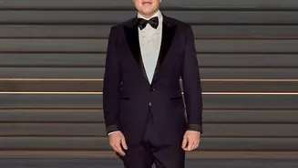
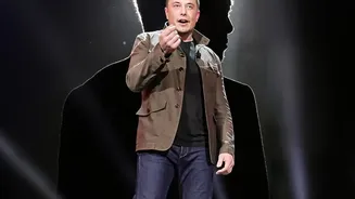

It’s a debate you probably didn’t know you needed: a tech billionaire versus centuries of grammatical tradition. Elon Musk weighed in on the proper use of the em dash, and in doing so, opened up a surprisingly lively front in the culture wars.
The Proposal That Dashed Expectations
In a post
on his social media platform, X, Elon Musk made a declaration that sent ripples through the worlds of writing and graphic design. He stated, 'The rules of English need to change to put spaces between the em dashes, as they presently too much resemble a hyphenated word, rather than a parenthetical phrase'. He went on to add that the em dash '—' is an 'unpleasantly long a line' and that the shorter en dash '–' is a better length. The suggestion, a response to another user's post, quickly shifted the conversation from science fiction to sentence structure, igniting a classic internet debate.
The Case for Spaced-Out Dashes
Musk's argument centres on readability. Without spaces, a phrase set off by em dashes—like this one—can feel cramped and look like a long, hyphenated word at first glance. Adding a space on either side — as Musk prefers — creates visual breathing room. This is not a totally new idea. The Associated Press (AP) style guide, used by most newspapers and many online publications, has long called for spaces around the em dash. Proponents argue that in the fast-scrolling world of digital text, clarity and scannability are paramount. A spaced dash is easier to process, especially on small screens, preventing the reader from stumbling over a dense block of text. It separates the parenthetical thought more distinctly from the main sentence, fulfilling its purpose with greater visual emphasis.
The Traditionalist Pushback
On the other side of the argument are the traditionalists, who champion the unspaced em dash. This is the style dictated by The Chicago Manual of Style (CMOS), the bible for book publishing and many academic journals. According to this school of thought, the em dash is a connector. Its power comes from its ability to fuse a thought directly into a sentence without the formal separation of parentheses or the softer pause of a comma. Adding spaces weakens this connection, making the dash feel more like a full stop. For purists, the unspaced em dash is elegant, efficient, and typographically clean. They argue that readers quickly learn to distinguish it from a hyphen and that changing the rule is a solution in search of a problem.
A Dash of Digital Disruption
This seemingly minor squabble over punctuation is about more than just style guides. It's a reflection of how language evolves in the digital age. For centuries, grammatical and stylistic rules were handed down by a small group of authorities: publishers, academics, and style guide editors. But platforms like X, and influential figures like Musk, can now introduce and popularize stylistic changes from the bottom up. Language on the internet is more conversational and visual. Punctuation is often used for tone and emotion—think of the aggressive period at the end of a text or the enthusiastic overuse of exclamation points. In this context, Musk's preference for a more visually intuitive dash makes a certain kind of sense. It prioritizes the user experience over historical convention, a very tech-centric way of looking at the world.