






The Chameleon of Colours
So, what exactly is taupe? At its core, it's a complex neutral that sits somewhere between brown and grey. But to call it a simple mix is to sell it short. Taupe is a chameleon, with its character shifting depending on its undertones. Some taupes lean
cooler with hints of violet or green, while others feel warmer with touches of pink or yellow. This inherent duality is its superpower. Unlike pure grey, which can feel stark, or a straightforward brown, which might seem heavy, taupe offers a perfect equilibrium. Its name comes from the French word for mole, referencing the animal's earthy, grey-brown fur, a colour that is both muted and rich. It's this complexity that allows it to adapt so beautifully to different lighting and surrounding colours, making it a cornerstone of modern interior design.
The Psychology of Balance
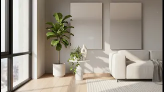
The power of taupe isn't just aesthetic; it's psychological. The colour evokes a sense of calm, stability, and quiet confidence. In a room, it provides the grounding comfort of brown while maintaining the sophisticated, modern edge of grey. This creates a space that feels both welcoming and refined, a rare achievement in the world of colour. Because it doesn't shout for attention, taupe acts as a stabilizing force, allowing other elements in the room—be it a vibrant piece of art or the rich grain of a wooden floor—to stand out. It fosters a feeling of emotional neutrality and visual comfort, making it an ideal foundation for spaces designed for relaxation and clarity, such as living rooms and bedrooms.
Pairing with Cool Greys and Metals
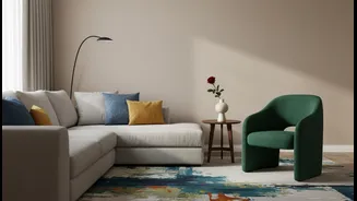
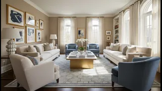
One of taupe's greatest strengths is its ability to soften a palette dominated by cool tones. If you have grey furniture, slate floors, or chrome and silver fixtures, introducing taupe can prevent the space from feeling sterile or cold. A warm taupe on the walls can provide a subtle contrast to a cool grey sofa, making the entire arrangement feel more inviting. The key is to play with tones. A light, cool taupe with violet undertones can create a sophisticated, layered look when paired with charcoal grey. For a more contemporary feel, contrast is your friend: pair a dark, dramatic grey with a lighter taupe to add depth and interest while maintaining an elegant, neutral palette.
Harmonising with Natural Warmth
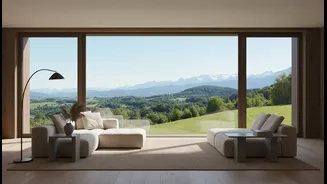
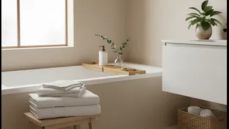
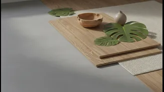
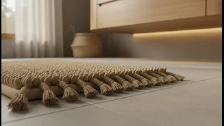
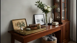
On the other side of the spectrum, taupe works wonders in spaces rich with warm, natural materials. Think oak or walnut furniture, jute or sisal rugs, linen curtains, and brass or gold accents. In this context, a cooler-toned taupe can provide a touch of modern balance, preventing the room from becoming overly yellow or rustic. It tones down the warmth without extinguishing it. For example, taupe kitchen cabinets are a popular choice to pair with warm butcher block countertops or wooden floors. The neutral shade provides a clean, contemporary feel that still feels connected to the natural elements in the room. This balance is what makes taupe a staple in styles like Japandi and modern farmhouse design.
More Than Just Walls
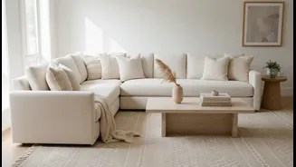
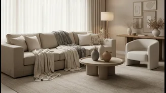
While an excellent choice for paint, taupe's unifying magic extends far beyond walls. Consider a large taupe area rug to anchor a room that features both a grey sofa and a wooden coffee table. Taupe upholstery, whether on a sofa or dining chairs, can serve as a timeless foundation piece that allows you to switch out accent colours—like navy blue or emerald green—with the seasons. In the bedroom, layered taupe bedding and textiles with different textures, such as velvet, linen, and chunky knits, can create a serene, sanctuary-like atmosphere that is both visually interesting and incredibly cosy. From curtains and cushions to cabinetry, using taupe as a consistent thread helps to weave together disparate elements into a cohesive and sophisticated whole.