




First, What Is Colour-Blocking?
At its core, colour-blocking is an interior design technique that uses two or more solid blocks of colour to create a deliberate, structured look. Think of it as moving beyond a simple accent wall to create intentional shapes, patterns, and zones using
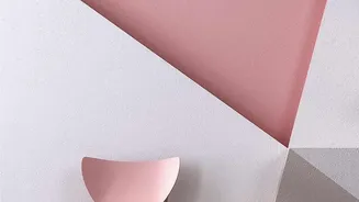
contrasting or complementary shades. The goal is to add drama, highlight architectural features, or simply inject personality into a room. Whether you're creating geometric patterns, a two-tone split wall, or a simple arch, you're using colour itself to build visual interest and guide the eye. It’s a trend that allows you to be both playful and sophisticated, transforming a plain wall into a purposeful design statement.
The Architectural Approach: Using Paint
Using paint is the most common and impactful way to execute colour-blocking. It allows you to create large-scale, architectural effects that can fundamentally alter the perception of a room. For example, painting the bottom third of a wall a darker shade can ground the space and give a sense of cosiness, while a lighter top half creates an illusion of height. Vertical stripes can make ceilings feel taller, and horizontal ones can make a room seem wider. Paint is also ideal for defining specific zones, like creating a colourful arch to frame a desk or reading nook, giving that area its own distinct identity. This method is permanent and integrated, treating the wall itself as the canvas. The commitment is higher, but the result is a bold, seamless look that feels fully intentional.
Flexible and Focused: The Framed Art Method
If committing to painting geometric shapes on your wall feels too daunting, framed art offers a brilliant and flexible alternative. Using large, bold artworks is a simple yet effective way to introduce colour-blocking into your space. A large canvas with solid fields of colour or a graphic print can act as a focal point, anchoring the room’s colour scheme without the need for painter's tape and multiple coats of paint. Art provides a concentrated block of colour that can be easily moved or swapped out as your tastes change. Furthermore, you can use art to complement a painted block, for instance, by placing a piece with contrasting colours inside a painted arch to create a layered, dynamic effect. This approach allows for experimentation with less risk, making it perfect for renters or those who prefer to evolve their decor more frequently.
How to Choose Your Colours
Whether you choose paint or art, your colour palette is crucial. A helpful guideline for beginners is the 60-30-10 rule: 60% of the room should be a dominant colour, 30% a secondary hue, and 10% an accent shade. To find combinations that work, consult a colour wheel. Complementary colours (opposites on the wheel, like blue and orange) create high-impact, energetic looks, while analogous colours (next to each other) produce a more serene feel. You can also try a monochromatic approach by using different tones of the same colour family for a subtle, sophisticated effect. Also, consider the intensity; if you choose a bold primary colour, pair it with other equally bold shades to maintain balance.
Paint and Art Working Together
The choice isn't always one or the other. Paint and framed art can work in beautiful harmony. A painted colour block can serve as a backdrop or 'mat' for a piece of art, making a smaller piece feel more substantial and intentional. Imagine a soft, painted arch on a wall, with a vibrant abstract print hung at its centre. The paint defines the space, while the art adds texture, detail, and a focal point. This layering technique creates depth and sophistication. The painted shape grounds the artwork, connecting it to the wall and preventing it from feeling like it's 'floating'. By combining both methods, you get the architectural benefit of paint and the focused beauty of art.