


What Are We Looking At?
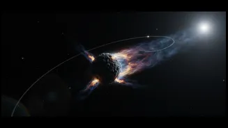
An orbit graphic is a visual prediction of an object's path through space. These are generated by organisations like NASA's Center for Near-Earth Object Studies (CNEOS). They are not showing a fixed track like a railway line in the sky. Instead, they
represent the best guess based on the data available at the time the graphic was made. When an asteroid is first discovered, astronomers may only have a few data points from a short period of observation. These initial observations are used to create a preliminary orbit, but it comes with a great deal of guesswork. Think of it less as a definitive map and more as an early, developing forecast.
The Critical Element of Time
One of the most common misunderstandings comes from looking at a 2D map of 3D space. An asteroid’s orbit might cross Earth's orbit, but that means nothing if they aren't at the same point in space at the same time. The solar system is a vast, dynamic place. Earth travels at about 107,000 kilometres per hour around the Sun. An asteroid crossing our path millions of kilometres ahead of us or behind us poses no danger at all. This is why the date of a potential close approach is so vital. The graphic must be understood not just as a path in space, but a path in space and time.
Introducing the 'Cone of Uncertainty'
This is the most important concept for understanding asteroid predictions. Because initial observations are limited, astronomers can't pinpoint the asteroid's exact path. Instead, they project a range of possible trajectories into the future, which fans out from the object's current position like the light from a torch. This is the 'cone of uncertainty'. Any predicted impact is simply a statement that Earth's future position falls somewhere inside this cone. It does not mean a collision is certain or even likely. It just means, based on the early data, it cannot yet be ruled out.
Why Predictions Change
This is why you'll often see news stories where an asteroid's impact risk first appears, then seems to rise, before suddenly dropping to zero. It’s a natural part of the scientific process. As telescopes continue to track the asteroid, they gather more data over a longer arc of its orbit. Each new observation helps to refine the trajectory. With more data, the 'cone of uncertainty' shrinks. Initially, as the cone gets smaller, Earth might still be inside it, making the calculated probability of impact go up. But eventually, with enough data, the cone shrinks to a point where it no longer overlaps with Earth's position at all. At that moment, the risk is ruled out.
A Classic Example: Apophis
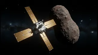
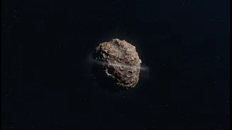
A perfect real-world example is the asteroid 99942 Apophis. When it was discovered in 2004, initial calculations showed a startling 2.7% chance of it hitting Earth in 2029. This gave it the highest-ever rating on the Torino Impact Hazard Scale. The graphic of its potential path looked terrifying. However, as astronomers continued to observe Apophis, they gathered more data. These follow-up observations refined its orbit, shrinking the cone of uncertainty. By 2021, not only was the 2029 impact ruled out, but scientists confidently declared that Apophis poses no threat to Earth for at least the next 100 years. The system worked exactly as it should: an initial alert based on uncertain data led to more focused observation, which ultimately eliminated the threat.