





Defining the Design Duo
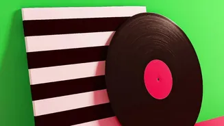
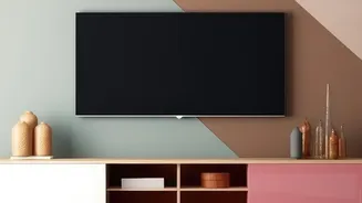
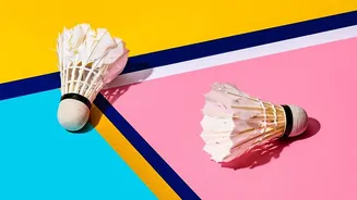
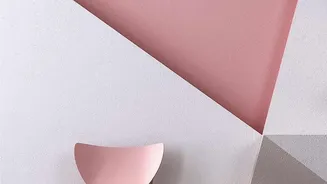
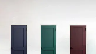
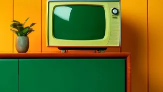
Before we dive into their partnership, let’s get to know the two key players: colour-blocking and negative space. Colour-blocking is a design trend that uses two or more solid, often contrasting, blocks of colour. Think of a canvas with bold geometric
shapes or a wall painted with two distinct, vibrant hues side-by-side. It’s a technique meant to add drama and highlight features. On the other hand, negative space—also known as white space—is the empty area surrounding and between the subjects of an image. In a room, it’s the blank part of a wall, the floor area around a piece of furniture, or the gap between two paintings. It's the visual “breathing room” that gives our eyes a place to rest.
The Power of the Pause
Negative space is far from wasted space; it's an active and powerful component in any composition. Its primary job is to create balance and prevent a room from feeling cluttered or chaotic. When every corner is filled, our eyes don’t know where to land, which can create visual fatigue and even psychological stress. By providing a pause, negative space helps reduce this cognitive load, allowing our brains to process what we're seeing more efficiently. It guides the viewer's eye, drawing attention to the key elements in a room—like a stunning piece of art or a statement chair. Think of how a museum presents a masterpiece: often, it's a single painting on a large, empty wall, which elevates its importance and allows you to fully appreciate it.
The Perfect Partner for Bold Colour
So, why is negative space especially critical for colour-blocked art? Bold, vibrant, and contrasting colours demand attention. Without sufficient breathing room, a collection of colour-blocked pieces can quickly become overwhelming. Negative space acts as a quiet backdrop that makes those bold colours truly pop. It prevents a dynamic artwork from descending into chaos by providing visual balance and harmony. The emptiness around the blocks of colour enhances their impact, making the entire composition feel more intentional and sophisticated. It allows each hue to have its own moment without competing, creating a look that feels both energetic and orderly.
Bringing the Look Home
Incorporating this principle into your own decor is easier than it sounds. First, consider the artwork itself. Look for colour-blocked prints where the artist has already used negative space within the composition, balancing bold shapes with empty areas. When arranging a gallery wall, resist the urge to fill every inch. Start with an anchor piece and give it extra room to breathe before adding others. Maintain consistent spacing—generally a few inches—between each frame to create a polished, organized feel. You can also use wide mats within your frames to introduce an extra layer of negative space, which helps focus the eye on the art itself. Finally, remember that the wall is your canvas. A light-coloured wall can act as a great field of negative space, making the artwork feel airy and prominent.
Common Mistakes to Avoid
The most common pitfall is simply too much stuff. Believing that every surface needs an object can lead to a cluttered and visually stressful environment. With colour-blocked art, this is especially true. Avoid arranging multiple, busy pieces too closely together, as their vibrant energies will clash instead of complement. Another mistake is forgetting about scale. A small piece of art on a massive wall can feel lost, while a huge piece in a tiny room can feel oppressive. The goal is balance. Don't be afraid to leave a wall blank if another wall is already a focal point. Sometimes the most powerful design choice is to do nothing at all, allowing the existing elements in the room to shine.