



Understanding the Foundation: What is a Neutral?
Before picking a dominant shade, it's essential to understand what makes a colour “neutral.” Most people think of just white or cream, but the family of neutrals is much broader. It includes a range of versatile, low-intensity shades like beige, ivory,
taupe, grey, and even black. These colours work as a perfect backdrop because they don't fight for attention. They create a calm, sophisticated canvas that allows other elements, like furniture, artwork, or accessories, to truly stand out. Because they are timeless, they form a wise foundation for any design, ensuring your choices won't feel dated as trends come and go. In Indian homes, neutrals beautifully complement traditional materials like wood and metal, allowing colourful textiles and decor to shine.
How to Select Your Dominant Neutral
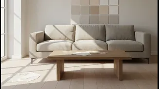
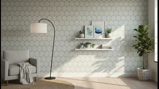
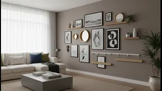
Your dominant neutral will be the main colour, setting the tone for the entire look. It’s the shade that will cover the most surface area, such as the walls in a room or the largest piece of clothing in an outfit, like a kurta or trousers. When choosing, consider the mood you want to create. Warm neutrals like beige, cream, or soft taupe tend to create a cosy, inviting atmosphere. In contrast, cool neutrals like crisp white or light grey can make a space feel more modern, fresh, and spacious. The amount of natural light is also a key factor. A bright, sun-filled room can handle a deeper, warmer neutral, while a smaller, darker space might benefit from a lighter, cooler shade to feel more open. Pay attention to undertones—a grey with blue undertones feels serene, while one with brown undertones feels warmer.
The Role of the Supporting Colour
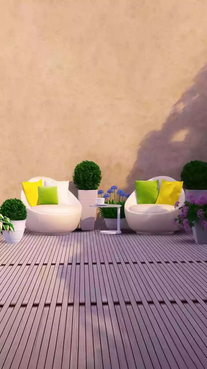
Once your dominant neutral is in place, it’s time to introduce the second colour. This shade is the “supporting actor” in your design story; its job is to add personality, depth, and visual interest without overwhelming the calm foundation you've built. This supporting colour can be another, slightly different neutral for a subtle, layered look. For example, you could pair sand beige with a warm cream for a soft and inviting palette. Alternatively, you can make a bolder statement by choosing a vibrant hue as your supporting colour. Shades like emerald green, deep navy, terracotta, or even a bright turmeric yellow can work beautifully against a neutral base. This splash of colour can be introduced through a feature wall, a sofa, a colourful rug, a piece of art, or in fashion, through a dupatta, handbag, or blazer.
Putting It All Together: Proportion is Key
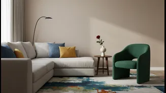
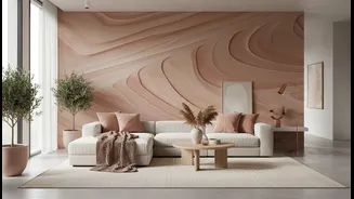
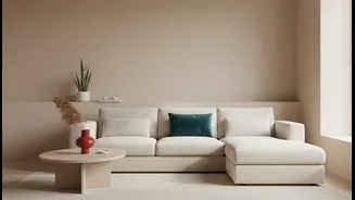
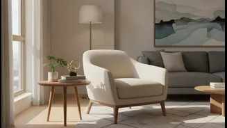
A well-known guideline in interior design that translates perfectly to this principle is the 60-30-10 rule. While our headline focuses on two main colours, this rule helps understand their balance. Think of your dominant neutral as making up roughly 60-70% of your space or outfit. The supporting colour would then take up about 20-30%. The final 10% can be a small, tertiary accent, or simply variations in texture and tone of your two main colours. For a living room, this might look like beige walls and a large sofa (the dominant neutral), a blue armchair and curtains (the supporting colour), and brass or wooden accents. In fashion, it could be a cream-coloured salwar kameez (dominant neutral) paired with a rich red bandhani dupatta (supporting colour), finished with gold jewellery. This balance ensures the look feels intentional and not chaotic.
Don't Forget Texture and Tone
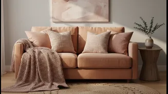
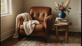
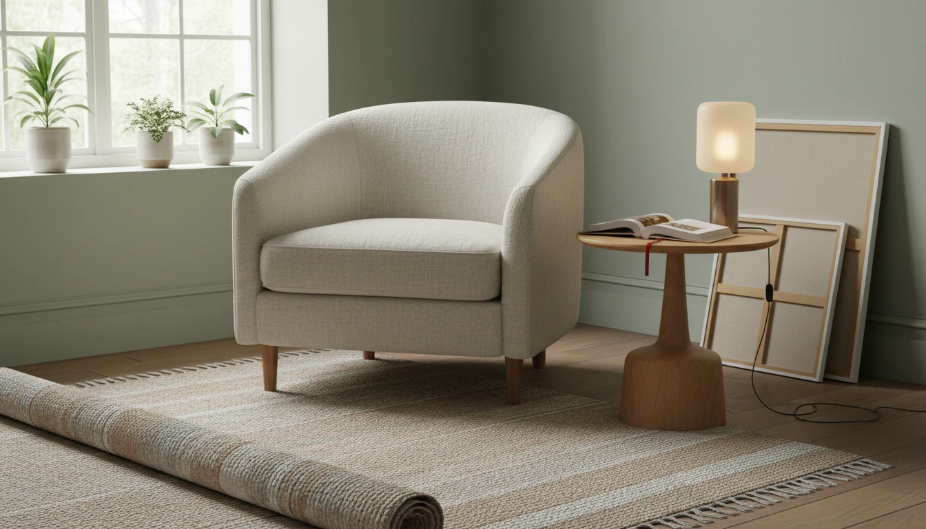
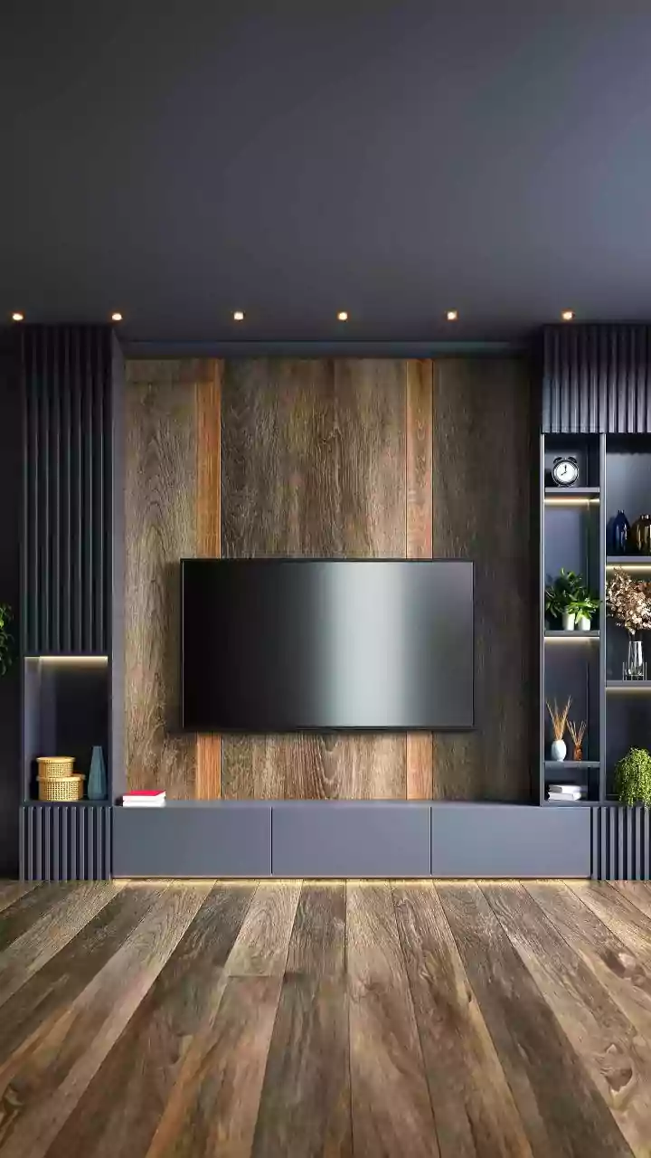
A palette built on a dominant neutral and a supporting colour doesn't have to be flat. The secret to adding depth and sophistication is to play with different textures and tones. In a room, you can layer various shades of your dominant neutral—for example, combining off-white walls with a slightly deeper cream rug and light beige cushions. Introduce different materials like linen curtains, a velvet sofa, a jute rug, or a smooth wooden coffee table. Each texture interacts with light differently, adding richness to the overall scheme. The same applies to fashion. An outfit with a single dominant neutral is instantly more interesting when you mix fabrics like cotton, silk, or wool. This layering of textures and subtle tonal shifts creates a dynamic and polished look without adding more colours.